website stats

Monday, March 13, 2006

Ice Ice Baby

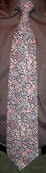
(Or "Ice Ice Timmy," as they say on South Park.) The label on this necktie reads simply "Ice;" good luck tracking that down on Google. I am always pleasantly surprised at the tie selections in off-brand menswear stores such as K&G (where I got my Vernor Panton tie) and Men's Wearhouse. Somewhere out there people are making ties that completely ignore current fasion trends, which is great if you don't want to look like everyone else. I bought this one on Ebay, but it has the feel of a K&G tie, and maybe it was. The floral pattern brings to mind Peter Max's classic silkscreen style ("Cosmic '60s", he calls it), as opposed to his later "NeoMax" comeback style, which is not as exciting. A common misconception is that Peter Max animated the Beatles' Yellow Submarine, when in fact the responsible artist was Heinz Edelmann. Edelmann himself addresses that "common knowledge" in a Baltimore radio interview in 1993: "Well, I've heard rumors. But, you know, if one goes by the books about official history, there have been hundreds of creators of Submarine. And at that time a lot of animators also claim to have taken part in the production who did not within a thousand miles of the studio." Cartoonist Bill Plympton got the staight dope from Milton Glaser (another apparent influence on Peter Max): "I asked him about the whole Peter Max vs. Heinz Edelmann debate, and his version goes something like this: he was contacted by Al Brodax, the producer of Yellow Submarine, to design the film. He felt he was too busy to spend a year in London, and he recommended Mr. Edelmann (although he never met Heinz until that night at SVA). At the same time, Peter Max was a student intern-type at the famous Pushpin Studios [Glaser's graphic design firm--BV.], and was soon to become a famous new-age painter. When the film opened, Peter claimed to have influenced the design of the movie, when in fact he was influenced by Glazer and Edelmann - he's great at self-promotion, and now the whole country thinks Peter Max created Yellow Submarine." And his name is the first to come to mind when confronted with a "Cosmic '60s" design.

In other news, Michael Segers of Knot a Blog has popped in to note that another tie blog has come online: check out Will's Vintage Ties at http://vintageties.blogspot.com/ for a nice selection of vintage beauties from the '40s. In fact, Michael and Will have sparked my own interest in ties of that era, and I now have a few cool ones to display right here in the upcoming weeks. Hooray for neckties!

Friday, March 10, 2006

Bad pun alert

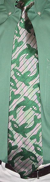
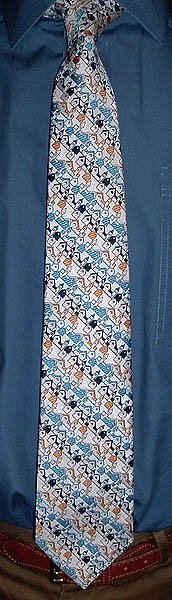
This tie is suitable for work, for a nice dinner out, or relaxing at a bar; it is indeed an all-porpoise tie. Ba-dum! Don't say I didn't warn you. Ouch! Stop hitting me! (And if you think I only bought this tie so I could make that joke, you'd be pretty much correct.) The tie is by French designer Jean Charles de Castelbajac, who designed Farrah Fawcett's Charlie's Angels outfits way back when (when she was Farrah Fawcett-Majors). I'd never heard of JC de Castelbajac until I got this tie, but he seems to be quite popular in England. His designs stand out more for their audacity than for their aesthetic qualities; I submit this necktie as a case in point.

Giraffic Park

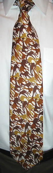
I present to you--the cameleopard! Yes, those abstract-looking splotches are really silhouettes of giraffes (Giraffa camelopardalis), in three shades of brown. Giraffes are the tallest animals on earth, adult males generally reaching 16-18 feet in height. The most famous giraffe has to be the cartoon Geoffrey Giraffe, mascot of Toys R Us. The character was created by Mike Edgett, who talks about it in this article. Among other things, I learned that the national chain originated in this very region; the Toys R Us store I visited as a child must have been one of the first ones (or one of the first fifty, at least). Today the building no longer houses Toys R Us, but a Value Village thrift shop (source of some of the ties displayed on this blog). Everything changes; even Geoffrey is no longer a cartoon, but a more realistic-looking animatronic giraffe.

The tie is by Givenchy, founded in 1952 by Hubert de Givenchy in Paris. Givenchy rose to fame by catering to Hollywood types, most notably Audrey Hepburn. Of course the real measure of a designer's achievement is his neckties, and Givenchy designed some pretty sweet ones. In the 1980s, Givenchy joined the ranks of many luxury fashion houses that have been gobbled up by the LVMH juggernaut; Givenchy himself retired from fashion design in 1995.

Wednesday, March 08, 2006

Magic carpet ride

I never thought I'd invoke Steppenwolf to describe a necktie, but the jumble of Persian rugs on this Rafaello tie pointed straight to it. Mrs. Veneer and I saw a fascinating exhibit on the history, construction, patterns, and traditions of Anatolian carpets at the Textile Museum (near Dupont Circle in Washington) a few years ago, which is catalogued in this book. Some of the carpets on display were hundreds of years old; the work and craftsmanship that went into them are truly amazing. The floral patterns on this tie are less stylized, but it's a nice kaleidoscope of colors and the variety and complexity of the patterns provide many avenues for the eye to wander through. My favorite contemporary designer of floral rugs is Kim Parker; her designs also grace other home furnishings too, but no ties yet, darn it.

Tuesday, March 07, 2006

Another impostor

Last week was heavy on the abstract geometrics, so this week I'm wearing some more representational ties, i.e. ties with pictures of something on them. So today: flowers! Any distinctive and popular design is bound to be copied sooner or later (see my recent Pucci and Leonard copies); imitation is the sincerest form of flattery, after all, but it also sells. Liberty of London florals are certainly some of the most distinctive ties of the last century, so there are also plenty of faux Libertys to choose from. This one is from J.T. Beckett, and is a pretty good approximation of a Liberty, though the color printing doesn't line up quite as well (click picture for a larger version and better detail). At 65 inches long it's the longest tie I've ever had. But even if you're not extra tall, don't be put off by an extra-long tie--you can make a long tie shorter, but you can't make a short tie longer. I brought this one to a reasonable wearing length by tying it in a loose Full Windsor knot. Or if you don't want to go to all that trouble, tying your preferred knot with an extra wraparound at the end should also do the trick. (In case you were wondering, I usually use the Pratt/Shelby knot; the knot "eats up" more length than the popular Four-In-Hand, and gives a more triangular knot.)

Sunday, March 05, 2006

Deeper Than Blue

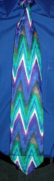
The super-saturated blue in this shirt and Villa Bolgheri tie prompted the phrase "Deeper Than Blue" into my head; it's the title of a song on the Red Movies album by Play, released in 1983 by Survival Records. They had a great roster of artists who all worked in the synth-pop vein, such as Tik & Tok, Richard Bone, and Thirteen at Midnight. They all bear the unmistakable sound of the Roland TR-606 drum machine. Play's music sounds similar to Depeche Mode, combining the instrumentation of their first album with the melancholy tone of their second. Sadly, Red Movies is another album that never made it to CD.

The tie is a pattern that can only be described as "bold zigzags." Or maybe "ocean frequencies." Or "mountains of the sea." Feel free to add your own suggestions.

Thursday, March 02, 2006

Back to basics

It seems I've worn more Gene Meyer ties than any other brand since I began the blog in August; I must really like them! The Artcyclopedia defines Minimalism as "a form of art in which objects are stripped down to their elemental, geometric form, and presented in an impersonal manner." That holds true for most Gene Meyer ties (although some are very playful, and thus personal), including this one. I thought I had worn the most minimalist of Gene Meyer ties back in December, but today's is even moreso. The only thing that could be more minimal would be a solid-color tie, and those don't count! I think I only have two or three more Gene Meyer ties in the queue; I better start looking for more.

The Geometry of Style

You can't go wrong putting together right-angled shapes of different colors any which way you want. That's really all there is to this uncredited tie of 1970-ish vintage, though it is distinctive for being made of silk and not polyester. The next level of complexity would be for the shapes to overlap and have their colors blend; next would be introducting diagonals; and finally, curved shapes. If I had thought about it ahead of time I probably could have illustrated that progression in consecutive posts; but I didn't. But now that I've thought of it I can start putting a set together for a future theme week. (Anything that gives me an excuse to handle ties!)

Tuesday, February 28, 2006

Plaid

Here's a standard pattern you've never seen here before: plaid! Plaid (or properly, Tartan) has been worn in Scotland for thousands of years (possibly), though the first written records of it come from the mid-16th century. According to this history of Tartan, the different patterns were originally simply regional, and not claimed by particular clans. The notion that Clans had their own Tartans appears to have been promoted after the Jacobite revolution was put down (1746) and Highland culture was abolished by the Crown. Instead, new Highland regiments of the army were assigned specific Tartans; the fact that each regiment was composed primarily of members of a particular Clan gave rise to the common wisdom of the Tartan/Clan relationship, and the Clans went right along with it. An authoritative article on the correct wearing of the plaid can be found at the Scottish Tartans Authority website (naturally).

This tie is not really an "authentic" Tartan, having been woven in Como, Italy (for Sacha) in iridiscent silk, but it is not a far cry from the MacPherson pattern. Donaldson's of Crieff has a nice Tartan Finder on their website, as does the venerable Lochcarron of Scotland.

Jimmy Pike

I've displayed a couple Desert Designs ties before (here and here), but this is the first with a design by Jimmy Pike (1940-2002), the "first internationally known Western Australian artist". In fact, Desert Designs was born out of the recognition of his talent, founded by his art teachers Steve Culley and David Wroth in 1984 to promote his work. The figure repeated on this tie looks like Djungarabaja, the Little Chicken Hawk, who stole fire from a camp of women in the bush. (I've discovered there is actually no such bird as an Australian chicken hawk; it's a generic term for just about any bird of prey, but most commonly the brown goshawk and the collared sparrowhawk.) A bunch of Jimmy Pike ties can be seen on the neckties page of the Rainbow Serpent website (scroll down). A large sample of his prints can be seen here; and a more colorful selection here.

Saturday, February 25, 2006

J. Blades

I call this style of tie "heavy scribbles:" scribbles because that's what the lines resemble, and heavy because it evokes the work of Modern sculptors such as Henry Moore and Barbara Hepworth (sculptures being heavy). The tie is by J. Blades and Co., about which I can find nothing except a page of deco nightmares for sale at ABC Neckties.

In a first, I'm including a picture of a tieless shirt as well. Mrs. Veneer and I took our three older kids to see Duncan Sheik at the Birchmere tonight. While I've worn a tie to a concert before, this one would include dinner, so I changed into a casual shirt after work. It's one of the saucy Kenneth Cole shirts I mentioned a few days ago. Wouldn't that make a great tie? The concert was marvelous, slightly marred by a woman at the next table who thought that we had all come to hear her repartee; on the plus side, she did badger Duncan into playing the rarely-performed "Serena," which was nice. We took the kids to meet him after the show, and they were very impressed, so much so that they've been listening to Duncan's CDs instead of Green Day since then (thank goodness!). He's such a great guy!

Thursday, February 23, 2006

Marja Kurki

Chances are, when you think of necktie designers from Finland, Marja Kurki is the first name you think of (if any at all). Probably the only one, too (but who hasn't wished that Marimekko made ties?). Marja Kurki started making scarves in 1975, and in 1976 founded Marja Kurki, Ltd. After a brief period when the company was owned by the aforementioned textile powerhouse Marimekko (1988-1991), the Kurki family bought it back, and it now has offices in Sweden, Denmark, and China. An article from 2000 mentions a New York office, but that must have closed since then. Like her German counterpart, Anne Surkamp-Kramer, Marja Kurki appears to do a thriving business designing corporate and "affinity" neckwear in addition to the fashion lines.

You might think this an unusually tasteful and restrained design for me, and you'd be right, but I find something very appealing in the repeating image of birds in scrub, and I like the colors. I especially like the yellow-green accents in the otherwise blue pattern, which I have tried to bring out by matching them with the shirt. The ensemble did pass the only test that is important to me: Mrs. Veneer liked it!

Wednesday, February 22, 2006

Flat bottomed ties...

You make the rockin' world go round. (Determining the source of that slightly off-color reference will be left as an exercise to the reader.) Rooster is another vintage brand with great name recognition (see also Wembley), its claim to fame being popularizing the square-tipped tie in the 1960s. Most of them were skinny and made of cotton; while this is cotton too, at about three inches wide it has more timeless dimensions. I'll describe the pattern as an abstract expressionist batik mosaic, if there are no objections. The Rooster brand is still around, and available online through Boardroom Ties in patterns that largely ignore the marque's storied past. Square-tipped ties are still around too, but they are mostly solid-colored knit ties, whose method of construction necessitates a square end. (Occasionally a designer will make a real statement with a flat-bottomed tie, I had a fantastic psychedelic floral by Alexander Shields, if I still have a picture of it I'll post it someday because it is guaranteed to make you smile.)

Tuesday, February 21, 2006

Kente cloth

The traditional kente cloth of Ghana is instantly recognizable by its warm hues and strong patterns. As with the batik fabric of the Pacific islands, kente cloth was originally the garb of royalty. Genuine kente cloth is woven in narrow strips on a small loom; the strips are then sewn together into full garments worn for ceremonial occasions. The patterns in the cloth have symbolic meaning; the "pinwheel" pattern on this tie symbolizes "resistance against foreign domination, superior military strategy." (The other parts I'm not so sure of.) Kente cloth should be worn with a vertical-horizontal orientation, not diagonally as on this tie. But then this is just a printed imitation of kente (by Gianno, cotton) and not the real thing. Real kente ties are available (at surprisingly low prices) from africancraft.com and Gold Coast Africa, to name just a couple that came up at the top of a Google search.

Monday, February 20, 2006

Details

If you look closely, you may be able to make out the fine houndstooth check pattern of this tie. Hahahaha! What you see here is an example of "supergraphics," the pop-art era practice of simplifying designs and blowing them up to gargantuan proportions. It really worked well for things like signage, and you can still see it some places. There's a convenience store along route 83 in Pennsylvania that still stands out by virtue of its supergraphic-emblazoned facade:

Gas

Food

Drink


Or something to that effect. Of course, houndstooth is not really a printed design, but a woven design. My efforts to find the origins of the houndstooth weave pattern were stymied by a complete void of relevant information on the internet coupled with my own refusal to go to an actual library (full of "books") to research it. Thankfully, another blogger was after the same thing, and a thoughtful visitor left a plausible (though unverifiable) explanation in the comments section of this page. But it's good enough for me.

Saturday, February 18, 2006

Pucci, sort of

Yesterday I wore a Leonard-inspired tie, so today I chose a Pucci-inspired tie to continue in the "influenced by" vein. The bold color contrasts and intense angles of the patterns in the various "windows" of this tie would simply not have existed without Emilio Pucci's pioneering explorations of line and color; and the oval grids (one at each edge) are straight out of Pucci's repertoire. Even so, this tie does not achieve the same panache and unlikely balance as a genuine Pucci; Pucci himself was a true artist with a singular talent, often imitated but never duplicated, as the cliché goes. I can't attribute this tie, as it has no labels left on it. It is extra long (60+ inches), but I am not extra tall, a discrepancy easily resolvable by tying a Full Windsor knot. (If a Full Windsor still leaves the tie too long, give it one more wraparound before tucking the blade through the knot.)

Friday, February 17, 2006

Leonard of Paris, sort of

I can't find a history of the Leonard of Paris luxury necktie marque anywhere online, but from what I have gleaned from various ebay listings over the years, Leonard himself began his career as a protege of Emilio Pucci before striking off on his own. The classic Leonard tie design features a dark background and one or two bands of thin stripes (one of them usually containing the text "LEONARD") with flowers emerging from them; see the bottom row of ties on this page for examples. The second category of Leonard ties is the Hermés/Ferragamo style, with a small, clever motif repeating throughout the fabric (as in the top two rows of ties on that page). The third and final category of Leonard designs is the whole-tie picture, usually with a floral motif and often including other iconic images, such as lyres or chivalric horses. This American-made Montage by Belle tie, then, is almost certainly "inspired by" that third category of Leonard ties, though a bit less subtle, perhaps. The quality of the silk is nowhere near the fine Leonard fabric, but then look at the price of a Leonard tie! With a copy you get a similar visual effect at a fraction of the cost. Thanks, Belle. Thelle!

And a-one, and a-two...

What do they call those people who follow musicians around? No, not groupies... Drummers! Ouch! Drummers are much maligned, inspiring page upon page of drummer jokes, such as this one and this one. But of course players of any musical instrument have their own foibles to be made fun of, as on this all-instrument jokes page. All of which is just a roundabout way of getting to, look at all the drummers on this tie! It's a classic drummer silhouette, with a basic drum kit and sticks in the air. He has short hair and appears to be wearing a suit, he's probably a drummer in a swing band. The tie has a very busy jacquard weave and is by Bagutta of Italy, or so the label says.

Wednesday, February 15, 2006

Kenneth Cole

Kenneth Cole was born into a shoemaking family, his father Charlie having originated the Candie's line of women's shoes. He started his own company in 1982 with a line of women's shoes, and has since branched out into just about every category of clothing through his own designs or licensing arrangements. I like the clean lines of his menswear, and I've recently acquired a couple casual shirts with particularly saucy prints for those rare occasions when a necktie is inappropriate. His ties are pretty good, with many of the Reaction line (of which this is an example) bearing some strong similarities to Gene Meyer's bold geometrics. I got this one a couple years ago when I was building up my "retro lounge" category: the diamonds are reminiscent of 50's ties (think L.A. Confidential) with off-kilter crisscross lines added to modernize it. Kenneth Cole trivia: he is married to Mario Cuomo's daughter, Maria.

Another fabric marbler has popped in for a visit! Check out the beautiful designs over at marbledfabric.com.

Off the record, on the QT, and very hush-hush...

Monday, February 13, 2006

See the pyramids along the Nile

Most Egyptian-themed ties confine themselves to hieroglyphics or figures from Egyptian epic artworks. But here is one that includes a bit of architecture, namely the pyramids (alternating with Nefertiti and a hieroglyphic stele in the band just under the yellow stripe). (The pyramids are one of the world landmarks you can roll up onto your katamari in We ♥ Katamari, along with the Taj Mahal, Angkor Wat, Big Ben and the Houses of Parliament, the Great Wall of China, the Easter Island stone heads, etc. Now that's fun!) The tie is polyester by Oleg Cassini (like Marchese Emilio Pucci di Barsento, a bona fide aristrocrat; a French Count!), and bears a "Morey's Man Two, Boulevard Mall" label/keeper, which hearkens back to an era of independent menswear boutiques.

I've accumulated enough Egyptian ties for a theme week, but there is a certain sameness to them that contraindicates wearing them all in a row, as they say in physicians' lingo. But it reminds me that the excellent worldbeat Nile Song by Eric Random and the Bedlamites, from the mini-LP Ishmael, has yet to be issued on CD. Their earlier material has recently been issued on CD by LTM Music as Subliminal (1980-82), so maybe the 1986 material is on the way!

Friday, February 10, 2006

Ozomatli

What look like abstract geometric patterns on this ocean-blue polyester tie turn out to be monkeys! I know they're monkeys because of the tails. But their mouths are oddly round, like fish mouths, and what's with all those circles? Are the monkeys juggling, or are they underwater and the circles are air bubbles? And are those fins on the monkey's heads? Or is this a modern depiction of Ozomatli, the monkey who symbolized the eleventh day of each month of the Aztec "sunstone" calendar, and was always depicted with a mohawk? Maybe that's it. No labels on the tie (but the fabric is obviously polyester), so no attribution possible. But it's more fun than a...barrel of monkeys!

Thursday, February 09, 2006

Gino Pompeii

Bridging the gap between Mod and Disco is this handmade Italian tie from Gino Pompeii (an arm of the neckwear giant Randa/Wemco). I actually got it out to wear with a black and yellow ensemble about a year ago, only to discover when I got it out of the stygian murk of the bedroom that it was not black, as I had thought, but navy. Then there was the problem of the disconnected keeper, which I have now happily solved. So here it is in all its near-primary-color glory, with appropriately-hued shirt and pants. The vaguely Pantonesque pattern is of woven polyester; Terytal polyester, to be exact, a polyester so rare that a Google search turns up only one entry, and that's a translation of a Russian article about surgery!

On a different note altogether, you know what make great computer screen backgrounds? Contemporary rugs! Check out all the cool rugs at addarug.com; find a rug you like, look at the largest available picture of it, save it, rotate it, then set it as your wallpaper in stretched mode. You could even use your browser to set it as wallpaper, but I like to fill the screen while keeping some semblance of the original dimensions. Rug photos have the advantage of having more texture and softer edges than most graphics of electronic origin.

Wednesday, February 08, 2006

The tie bar problem solved!

The reason it took me so long to wear this x'Andrini tie is that it has no keeper on the back, so I would have to wear a tie bar to keep the tail end from swinging out and showing, which it shouldn't. However, the tie is too thick for my tie bar. And I don't like wearing a tie bar anyway, as it breaks up the flow of the tie's pattern. (Even my eight-year-old daughter thinks so; once when I was wearing the tie bar, she said, "What's that line on your tie?" I told her it was a tie bar, to keep the tail end hidden. She replied, "It looks...bad." Exactly.) But last night, I chanced across a solution in the form of this seemingly worthless piece of packaging material:

I found it in my room; it's a plastic clip from a new dress shirt, one that holds the shirt onto the cardboard. Or it might be the clip that holds the front of a pair of pants together in the store. Anyway, the seam of the back of a tie has widely-spaced stitches, so it's no problem to slip the longer end of the clip underneath the seam, then the tail end of the tie will slide right in. It's on the tie in the picture; you can't tell, can you? And it stayed in place all day! Hallelujah! So next time you get a new shirt or pair of pants, keep the clip, it could come in handy. (I have several ties missing a keeper, and for the blog I've been cheating: Mrs. Veneer takes the picture, then I put on the bar and go to work. But no more!)

Tuesday, February 07, 2006

Nina Ricci

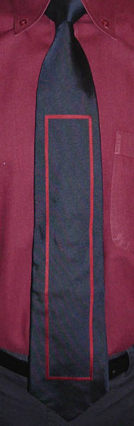
This tie from Nina Ricci of Paris is so sophisticated, with its solid block of deepest navy framed by just a bit of dazzling woven silver stripe-boxes, it doesn't belong on a middle-class guy like me, it really belongs on a European billionaire with a dark blue double-breasted suit, sterling silver cuff links, and a chateau in every canton of Switzerland. Perfect for a night at the casino, it also adds a little bit of vicarious élan to a day job of, say, systems analyzing. (I had to wear it a little long to get enough silver to come through the knot and be visible.) The crease down the middle indicates an overzealous pressing at some point in its history, and thus serves as an object lesson in how not to iron a silk tie. Don't press down hard! Just go over it lightly--barely touching--on your iron's lowest steam setting. A little steam won't hurt silk, it was most likely steamed to set the dyes in the first place. You can press down on the edges a little if they're getting rounded, but be careful not to bunch it up and introduce new creases. A non-stick iron works best; I am quite pleased with my T-Fal Ultraglide.

André Jacques

While not an actual theme week, I am making an effort this week to wear some of the ties that have been hanging in my bedroom for over year (or two) that I haven't gotten around to wearing yet. This vintage polyester tie by André Jacques (probably not the same Andre Jacques who owns this Battlestar Galactica fansite) comes from England and has a very unusual pattern, evocative of terraced stone retaining walls viewed from above, or perhaps sidewinder rattlesnake tracks. I've been seeing this tie at the start and close of every day for so long that it's going to feel odd not seeing it anymore as it's consigned to the "worn" closet. But it will leave space for a new tie on the bedroom rack. Yes, neckties are not just fashion accessories, they can also be room decor!

Saturday, February 04, 2006

(Post)Modern art

I'm not sure if the design on this Salvatore Valeriano tie counts as Modern or Postmodern, so I'm hedging. The colorful, abstract forms are reminiscent of the paintings of Modern greats Miro and Kandinsky, though they seem to have been simplified even further (and from what I can tell, Postmodernism is all about combining and simplifying historical forms to the point of cartoonishness--see Memphis Milano). The background is all multicolored dots similar to those found in Australian Aboriginal art, or a color blindness test pattern. Or, it could just be 80's New Wave.

Friday, February 03, 2006

Moth Marblers

From Moth Marblers of Sausalito, California, comes this double-marbled necktie: one layer of traditional peacock pattern overlaid with...well, some other pattern which seems to be some sparse, long swirls. Marbled ties usually have enough colors in them to complement a" shirt such as this one; I'll remember that for next time, I have a lot more marbled ties stored up. (The marbled ties I've displayed here so far are just the tip of the iceberg!)

Incidentally, I just found the Cynscribe Calligraphy Directory, which includes the most comprehensive collection of marbling links I've seen. It's an old page with a lot of dead links (including the Moth Marblers link), but if you keep clicking you'll find plenty of active marbling sites to dazzle your eyes, and kits if you want to try it yourself.

Tuesday, January 31, 2006

Boomerang Gang

Bulurru of Australia is the self-professed "market leader in the production and distribution of authentic Aboriginal Art based products," including...neckties! This tie's label says it's polyester, which surprised me because it really does feel like silk.

I could go on about Aboriginal Art here, but instead the boomerang theme of this tie has prompted a reminiscence about a 1985 trip to London (because I saw the band Boomerang Gang at the legendary Marquee Club, where the Rolling Stones had played in their early years; too bad I didn't see a band with more staying power, but I was only there for a short time). My family and I (which at that time meant me, my parents, and my brother, though now it means me, my wife, and our kids) went to London after a week in Germany; my college-radio buddy Ira was going to be in London at the same time. Before we left the States Ira told me to meet him at the Alien Sex Fiend concert. Well, that turned out to be the night before we got to London. So I picked up the music papers to scour the concert listings and figure out where I could find Ira. I figured he would probably go to see Nik Turner's Inner City Unit (and I would have gone to that anyway), so I went. I walked into the hall and there was Ira, waiting for me. "I knew you'd be here," he said. So we met up after all and spent some quality hanging-out time in London. Other musical highlights of the trip included seeing the Red Hot Chili Peppers' first UK show ever (at Dingwall's in Camden), and Jayne County (née Wayne County, whose signature song is "Man Enough to be a Woman") in Croydon. I bought so many records on that trip my luggage was over the airline weight limit! Ah, that was fun. (Incidentally, you can download almost all of Inner City Unit's catalog on Dead Fred's website!)

Off the bias

Well, I managed to find a tie pattern with a perpendicular orientation to match the perpendicular orientation of this shirt pattern (and colors in the same ballpark, roughly), as opposed to my previous "wrong angles" post. But, the tie is perpendicular because the silk is not cut on the bias, and sure enough, the tie was twisting below the knot all day. So kudos to Jesse Langsdorf, who patented the on-the-bias "Resilio" necktie construction method in 1924; it really does make a difference. This tie is from Mark Chrisman of Florida, made of "imported English silk foulard." The print style on the labels indicates it's of some vintage; I'll stick with my usual guess of 1970. Construction aside, I love this tie, but I'd like to see the pattern on something big enough for it to repeat more, like a shirt. I won't hold my breath, though.

Saturday, January 28, 2006

Tundra: Canadian Coogi

Tundra of Canada has been making clothing for over 70 years, but I'm not sure how long they've been making Coogi-style sweaters. From what I have seen, they're every bit as good. Also like Coogi, Tundra has made some neckties as well, mostly with a printed design, but some, like this, with a phantasmagorical weave of a whole rainbow of silk threads, somehow stitched and sewn into a three-dimensional, almost topographical, texture. This is hands-down the most incredible fabric I own. The only reason this tie is going to show up on ebay in the near future is that I have another one just like it, which I will be keeping.

Friday, January 27, 2006

Todd Oldham

I know what you're thinking: "Oh no you di'ent wear that tie with that shirt!" Oh yes I did. And no one said a word. Either they're used to it by now, or they thought I must have finally snapped. Sometime during his tenure as a high-end fashion designer and MTV style guru, Texas-born Todd Oldham managed to put out a line of neckties as well. I've only ever seen two of them, and they both exhibit a near-flawless melding of retro and contemporary design influences. This example hearkens back to 1970-ish "kitchen-sink" scarf designs, but avoids the baroque intricacies that I feel mar so many of those period pieces. Oldham has forsaken fashion design for interior design, bringing mid-century modern to the masses through DIY books and his line of furniture and accessories for La-Z-Boy. He may even be La-Z-Boy's savior, having found a way to make their furniture appeal to the under-50 demographic. In fact, his line is so successful that an entire Todd Oldham by La-Z-Boy store has just opened in New York. The furniture looks great, but won't work in my house; having four kids dictates super-durable (and heavy) This End Up furniture, beside which Oldham's line is positively dainty.

Thursday, January 26, 2006

Beau Brummell

George Bryan "Beau" Brummell (1778-1840) was the O.D. (Original Dandy), a man whose fastidious and stylish dress sense (dark suits with fancy neckwear) set the course of modern gentlemanly fashion. As such he is the spiritual godfather of this blog. And he inspired a namesake tie maker; today's tie is a "Mr. John by Beau Brummell" with a little bit of flower power, a little bit of art deco, and a whole lot of polyester. Here's another one; wow! It was all I could do today to keep from grabbing everyone's hand and shouting, "What will it take to put you in a brand new Pacer today?"

I've just discovered a couple great web resources: the most comprehensive essay on the history of neckties I have yet seen, by Willy J. Spat; and Dandyism.net, a website celebratory of all things dandy, which I will spend the next few hours reading. And coveting.

Wednesday, January 25, 2006

Oh, well, a touch of grey...

Kind of suits you anyway. (Yeah, Grateful Dead. True Deadheads turn up their noses at the band's hit single efforts, but I've always enjoyed them: "Touch of Grey," "Alabama Getaway," "Shakedown Street"... That's all that come to mind right now, but they're real toe-tappers.) It seems like just a couple weeks ago that I was heaping scorn on gray, and here I am today in gray from head to foot. (Literally! I wear a gray hat outside, and I wore gray socks.) I just can't stay mad that long. It helps that Cosette of Austin, Texas, has imbued this gray hand-marbled tie with a sense of mystery, with two layers of marbling and faint wisps of brighter colors mixed in among the murk. And no, nobody splattered glue on it, be nice!

Monday, January 23, 2006

Architect Superstar

This tie was "made exclusively for Rice University, designed by John Outram." The connection to Rice University is not immediately apparent; it doesn't seem to refer to the university's athletics mascot, the owl, except for maybe in a late-onset schizophrenic way a la Louis Wain's cat paintings. It's actually a ceiling mural (properly, the Steve and Sue Shaper Ceiling of Martell Hall) from Anne and Charles Duncan Hall, a remarkable buidling designed by British "philosopher-architect" John Outram for Rice's departments of Computational and Applied Mathematics, Computer Science, and Statistics, and completed in 1997. (Those in the fundraising business will note the abundance of "naming opportunities.") According to Outram, Rice's own architecture faculty has thoroughly denounced the building, but everyone else quite likes it. There is a wealth of information about the project on the John Outram Associates website, which can make your mind reel after a while if you're not a regular consumer of architectural theory. Is there a meaning to this bizarre pattern? You bet there is! While Outram has not yet posted it to his own website, some of his explanations of it are transcribed on this page of the "unofficial" Duncan Hall website, which also includes more readable summaries of Outram's design theories.

This reminds me of another new whiz-bang buidling for computer types, Frank Gehry's Stata Center at M.I.T., where my brother has an office. To me it looks just silly, and my brother isn't thrilled with it but doesn't hate it either. What does John Outram think of Frank Gehry?
Well, well, well! Still, for all his implications that he is the greatest architect alive, Outram's buildings look pleasant and seem to be highly functional. I'll have to make a point of visiting one someday. And I haven't seen such a great tie design from an architect since Boxelder's architect lines, which now include a Santiago Calatrava design! And not only that, you can now buy single ties directly from Boxelder!

Saturday, January 21, 2006

Dad's Ties Week, Day 4: Crossword Puzzle

Once upon a time in "downtown" College Park, there was a menswear store, where one could actually buy a suit, or a sportcoat, or a necktie, and it was at that store that Mom bought this tie for Dad sometime in the early 1970s. Dad balked at it at first, thinking it was just too much; but when he wore it for the first time people admired it, so it got added to his wardrobe. The design captures the zeitgeist of the era, and thus has a lasting appeal; however, the materials are not quite up to the task. The polyester fabric will undoubtedly last forever, but the colors retain just a fraction of their original brilliance, especially the green and purple squares. I've punched them up a little in the picture, but they are still noticeably faded. The maker label has also been lost, so the designer will have to remain anonymous until someone can clue me in.

I know the color coordination between the tie and shirt is less than ideal, but to paraphrase Donald Rumsfeld, "As you know, you go to work with the clean shirts you have. They’re not the shirts you might want or wish to have at a later time." So this is the best I could do with the resources at hand. Next week will be a different sort of theme week. Nearing the end of my 30-shirt rotation, I will have to choose ties to match the shirts, rather than the other way around, which is my normal procedure. But I am up to the challenge!

Thursday, January 19, 2006

Dad's Ties Week, Day 3: Random House

Dad calls this Pierre Cardin tie his "Random House" tie, because of the resemblance of its repeating buildings (woven, not printed) to the Random House logo:

(This is a modernization of the original logo, designed by artist Rockwell Kent in 1927.) We had near-constant exposure to that logo, as it graced the cover of the massive dictionary that was the standard reference book in our house. Later on, I lived for a couple years within view of the gargantuan Random House distribution center on Bennett Cerf Drive in Westminster, Maryland.

A few years ago my parents were off on one of their world trips, and I got the notion to wear this tie to work one day. So I looked through Dad's tie rack for quite some time (believe it or not, he has a lot of ties), but I couldn't find it. It turned out that it was the one tie Dad took with him on the trip! Great minds think alike.

Wednesday, January 18, 2006

Dad's Ties Week, Day 2: Liberty Skulls

Dad calls this his "skull" tie: inside some of the powder-blue areas are shapes that look like human(oid) skulls. (Click on the picture for a larger rendition.) Of course, as a child I thought that was really cool; as an adult, I still do! A Liberty of London tie is the last place you'd expect to find skulls, but there they are. Dad bought this tie at Hecht's in Landover Mall right after it opened in 1972. Landover Mall was the shining star of retail in Prince George's County, sitting right on the Capital Beltway and boasting 1.3 million square feet of space, the second-largest mall in the Washington area (Tyson's Corner being first). It was worth driving farther than our neighborhood theater to go to the movies at Landover: I saw first runs of Star Wars and Dino De Laurentiis's King Kong (no match for Peter Jackson's amazing remake, which I just saw over the weekend) there. But in the 80's the mall fell into disregard, and then into a long, painful decline, chronicled through some personal reminiscences and recent photos at deadmalls.com. (And yes, while the mall is a shuttered, empty hulk, the Sears is still open!) But about the tie: it's cotton, as Liberty's most popular floral ties have been, probably of their special Tana Lawn cotton. You may notice that the tie is quite narrow for 1972; it didn't used to be! Dad had it tailored down to a reasonable width when wide ties became unfashionable, and thereby got a couple more decades of wear out of it (and counting).

Tuesday, January 17, 2006

Dad's Ties Week, Day 1: Arts and Crafts

(If you've clicked over here from 52 cupcakes, you might like this tie; not cupcakes, but the closest thing I have!)

One factor in my passion for neckties is probably having grown up with a father who wore fabulous ties. Dad, a retired botany professor, has graciously lent me some of my favorite ties of his, all of which made an impression on me in my formative years, to feature on the blog this week. Several years after Dad's retirement, I now work at the same university where he worked, and this week his ties will liven up the campus once again. He bought this one from a vendor at a sidewalk arts & crafts fair in Ann Arbor, Michigan, in 1967. He would wear this tie to deliver his biannual lecture on induction of flowering. Which wasn't nearly often enough, if you ask me (as if I have room to talk). The tie is hand made of a heavy cotton fabric, with a single label reading "B.C.S." But we don't know who that is! If you can put me in touch with the enigmatic B.C.S., please do, I want more ties like this.

One of the fun aspects of doing this blog is hearing from other necktie enthusiasts and artists. My latest crafty visitor is Catherine Gutsche of Ottawa, who uses neckties as a starting point for wonderful paintings, which can be seen here. And while you're there, check out her other art, too!

Sunday, January 15, 2006

Wembley: not just a stadium

Wembley Stadium in London seats a whopping 127,000, and was the site of such era-defining concerts as Live Aid, Queen, and the Freddy Mercury Tribute. I understand it is also used for sporting events. New Orleans-based Wembley is also a necktie maker of long standing, one of a select few brand names that carry some cachet in the vintage market. Many Wembley ties, including this one, were made of "Wemlon" polyester (launched in 1962, discontinued in 1979). If they're all like this tie, they are virtually indestructible, and it's no wonder so many are still in circulation. Then again, it may simply be the sheer number of ties they've made over the years. Founded in 1925 by brothers Sam and Emanuel Pulitzer, the Pulitzer Brothers Neckwear Company company rose to prominence in 1935 when they started making ties out of worsted mohair, which had the appearance of silk but didn't wrinkle. At that point they changed the company name to Wembley, after the mill town that supplied much of the fabric they used (now home of the stadium). In 1968 Sam Pulitzer's heirs took full control of the company and changed the name to WEMCO. WEMCO was bought by the Randa Corporation in 1997, but continues as a business unit. Depeonding on whom you listen to, WEMCO is either the largest or second-largest manufacturer of ties (or men's accessories) in the US (or the world), with rival company Superba (Los Angeles, founded 1873) vying for the top slot. The two companies manufacture or distribute just about all the ties you see in department stores ("This is the guy behind the guy behind the guy," as Joe Mantegna says in Things Change):
  • WEMCO: Tabasco, Save the Children, Geoffrey Beene, Countess Mara, Van Heusen, Dockers, Slates
  • Superba: Arrow, Bugatti, City of London, DKNY, Format, Jones New York, Nautica, Tommy Hilfiger, Zylos, Perry Ellis, Ike Behar, Perry Ellis, Valentino
It looks like Superba produces more brands, but it could be that they just list more on their website. And both companies produce scads of store-brand and corporate ties as well. So if you're wearing a tie right now, chances are it came from WEMCO or Superba.

Incidentally, Lee Allison is having a sale right now on select (that is, discontinued) ties, I think it runs until the end of the month. Ties that regularly sell for $90 can now be had for just $55, some even less. That's still a lot more than I pay for my ties, but if you don't have the time to sift through thousands of ebay listings, this might be a good deal. (You won't find Lee Allison ties on ebay anyway.) There's a link to the website at the right. I'm a bit concerned about some of the new designs, it looks like they're reviving some 70's styles that should remain buried, specifically the "ugly brocade."

Coming up next: a very special theme week!

Thursday, January 12, 2006

Boy Blue

(E.L.O., of course.) I've always wondered why blue is supposed to be the color of sadness, when it's such a beautiful color. How can one be sad while regarding the blue of lapis lazuli, or the ocean, or the sky on a glorious high-pressure day, or the various blues of this Maison Imperial tie from France (whose broad brushstrokes may resolve into a floral pattern when seen from afar)? I nominate gray as the color of sadness. Being a blend of all the colors of the visible spectrum, it has the vibrancy of none of them, nor does it have the conviction to be either black or white. It is the color of rainy days and dust. I don't get the blues, I get the grays. But not today!

Wednesday, January 11, 2006

Pucci Pucci Poo

Here is a better example of an Emilio Pucci tie than the first one I displayed, which was a corporate design for Pistons Asso. Pucci designed a line of ties for Saks Fifth Avenue (this is one of them), which are easily identified as Puccis by the labelling (the Emilio signature repeats in the tipping, and an Emilio Pucci label on the tail end) and the Emilio signature that repeats throughout the design itself: there's only one on the front (in a green square on the right--that's your right, my left), but they're all over the back. This necktie incorporates the brilliant colors typical of Pucci's best-loved work, but the grid pattern is still more subdued than his trademark sinuous lines and shapes. It also illustrates the difficulty in transforming a pattern designed for a scarf (a big square) into a necktie (a narrow strip): the border, which would run all the way around the scarf, is limited here to a cameo appearance at the bottom of the tie. Also, the scarf from which this tie was made has a contrasting pattern in the middle. Normally that would not show up on the tie at all, but in this case the fabric was very carefully aligned and cut so that the central pattern gets to show, just a little bit, on the outside of the knot. Bravo! I have a few more Puccis in store, so check back!

Tuesday, January 10, 2006

I ♥ Katamari

Or, as I proclaim by wearing this tie, I ♥♥♥♥♥♥ Katamari! Hmmm, this one feels kind of...hearts-ish! What could be more fun than rolling up everyday objects, food, small animals, large animals, people, cars, trucks, buildings, trees, and finally, world landmarks on a giant sticky ball? Nothing, that's what! Everywhere I go I find myself devising strategies for rolling up everything in sight: at first you can only pick up small objects, then as your katamari gets bigger, it can pick up bigger objects (which stands to reason, as greater mass = greater gravitational force). But doggone it, I still can't get all 1,000 cranes! (Snowballs are the meta-katamari. Scroll down this page of masterful paper art for an ingenious snowball piece, and an incredible snowman as well.)

Gene Meyer couldn't have had We ♥ Katamari in mind when he designed this tie, because it didn't exist yet, but it is oh so apropos! It is also apropos for Valentine's Day, hence the timing in getting it off my rack, onto the blog, and then onto the auction block.

Monday, January 09, 2006

Trevira

You're probably thinking, "Haven't you worn that tie with that shirt before? Why the repeat?" No, that was a different psychedelic floral freakout tie. That one was silk, while this one (designer unknown) is made of Trevira polyester, a polyester so special it has its own brand name. Trevira is made of fibers of polyethylene terephthalate (PET), the same material used to make soda bottles, which is 100% recyclable (its resin identification code is 1 -- that's the number inside the triangular recycling symbol). Trevira was developed in 1956 in Bobingen, Germany, its namesake company being a branch of pharmaceutical conglomerate Hoechst AG. I can't tell who owns Trevira today, as the company has been bought and sold several times in the last decade by different corporate consortia, but they're still manufacturing it by the ton (130,000 per year at full capacity). I haven't seen it used in any neckties lately. Surely recyclability could be a selling point? (But really, any necktie is recyclable via that greatest recycler of all, ebay.)

(You may have noticed that the angle of this photo is different from most of the others. That's because this picture was taken by my eleven-year-old son, who is a foot shorter than my wife, who usually takes the pictures. This is his first published photo; I am so proud of him!)

Update (1/13): I just took that other floral freakout tie out of the closet, and guess what, it's not silk after all, it's... Trevira! D'oh!

Friday, January 06, 2006

Marblesque Redux

Here's another splendiferous hand-marbled necktie from Marblesque, presumably by Brian O'Malley although it doesn't say so. In this tie the marbler has foregone the fine detail of traditional marbling patterns in favor of large swathes of single colors manipulated into grand, sweeping swirls. The ink is still spattered onto the size resulting in a very fine texture, which finally produces a three-dimensional effect that looks a little like bread rolls, or rocks (such as the "hamburger bun" rock formations in the Squaw Flat area of Canyonlands National Park in Utah).

Since my first marbled tie post, I have discovered another silk marbler's website, SoLace of Virginia, which will be added to the links section at right shortly.

Thursday, January 05, 2006

Integrated circuit

The dichromatic pattern on this tie by Hubert (probably Hubert of Milano, though it doesn't say so) looks like an integrated circuit, the revolutionary invention that made personal computers (and by extension, this very blog) possible. Jack Kilby and Robert Noyce are both credited with independently inventing the integrated circuit, which combines transistors, diodes, and their connections (millions of 'em!) on a single chip of semiconducting material. Apart from their functionality, integrated circuits are visually fascinating, evoking comparisons to complex systems of pipes or roads, which in a manner of speaking they are. And though it's been about fifteen years since I read it, I think the similarity between ICs and the veves of Haitian Vodoun played a significant part in William Gibson's Neuromancer trilogy. A good tie can keep my mind racing making these connections all day. (But not when I'm working, of course.)

Wednesday, January 04, 2006

Linen

Silk, for all its delicacy, is actually quite a durable fabric. Even more durable is that fabric made from flax stalks, linen. This tie from Kolby of Rome is 70% silk, 30% linen, and 100% suave, and is yet another example of a basic design-- stripes-- nudged into distinction by making them curvy instead of straight. The natural qualities of both fabrics produce a lustrous sheen, and the brown and teal threads are woven to give the stripes rough edges for an artisanal, textured look. In the context of this page (given its company) it looks rather subdued, but it's actually quite striking. Or so I tell myself.

Tuesday, January 03, 2006

Milestones

This entry marks two milestones: the first necktie of 2006, and the 100th tie displayed on this blog. So to mark the occasion, I'm celebrating with--fireworks! Crash! Boom! Kapow! On the other hand, the starbursts on this tie might be exceptionally spiky flowers, but I'm sticking with explosions. The fine detail on the blue background doesn't show up here, but it looks like tiny, complex pictographs. The tie is a house-branded tie from Isaac Zelcer's Isaco company. Zelcer was born in Cuba and emigrated to New Y0rk in 1960, where he worked in a tie factory, eventually working his way up to company president. He moved to Miami and started Isaco Ties in 1980. Isaco International is now a major manufacturer of men's underwear, sleepwear, and accessories (collectively known as "Men's Furnishings," per Mrs. V.), producing John Henry and Perry Ellis brands, among others. (Just try to find any neckties on the website, though. No, don't, you won't find any. But I think Isaco produces Carlos Santana's line of ties.) In 1996, Zelcer was elected President of the Greater Miami Jewish Federation, the first Cuban to hold the post. Babalu!

Monday, January 02, 2006

Newsflash! Another tie blog!

I am delighted to report that another tie blog has come online! Michael Segers of Lakeland, Florida, has just started blogging his daily neckties at Knot a Blog, providing commentary that is informative, thoughtful, and at times deeply personal. In his first post he very eloquently expounds his interest in neckties, putting into words feelings that are quite similar to my own. Best of all, he has some great ties! While my vintage tie selection only goes back to 1960 or so, Michael has ties from the fabulous forties, considered by many to be the Golden Age of neckties. And if this is the Hermès of tie blogs (as the kind Mr. S. flatters me in his links sidebar), then Knot a Blog appears set to be the Ferragamo: equally prized, often preferred. I salute Mr. Segers, and all who embrace and promote Necktie Culture!