website stats

Friday, March 31, 2006

Piet Mondrian

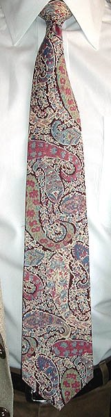
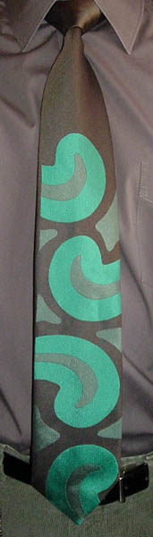
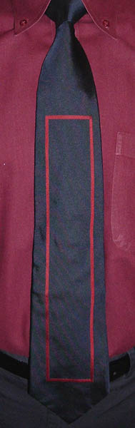
It is not the previous wearing of this tie that has romantic significance, but the design. The Mondrian-influenced graphic pattern is a perfect complement to our wedding rings, the "Mondrian" from Wedding Ring Originals:


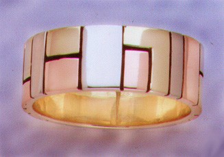
The panels are of red gold, white gold, and, um, gold gold fused onto a gold ring in a process called, fittingly, "marriage of metals." We think they're peachy.

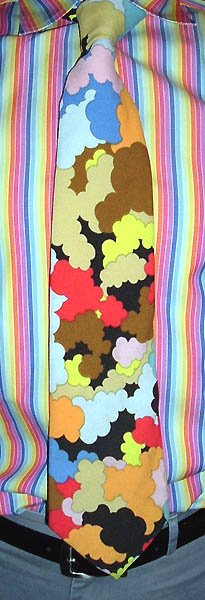
Mondrian's "de Stijl" paintings (like this tie, but with primary colors instead of grays) are some of the most recognizable of the 20th century. They're easy to copy, too, as I see Mondrian graphics everywhere: the Artcyclopedia icon, a garage door on Lakeside Drive in Greenbelt, stained glass windows in the Owen Brown Interfaith Center in Columbia, and so on. There are those who denigrate modern art in general and minimalism in particular ("my six-year-old could do that"), but I believe it took real genius to come up with such an enduring style of composition.

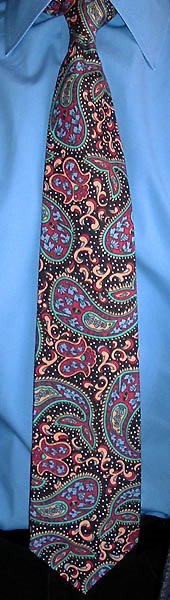
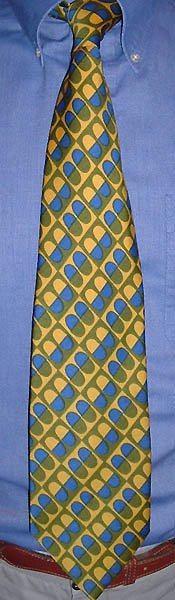
The tie is of rather heinous polyester from Index. Polyester doesn't have to be awful; two of my favorite tie lines are polyester (Christian Dior Monsieur ties with the "CD" logo on the front, and Oscar de la Renta Studio ties with the signature on the front). But one can't have everything.

Next week I will be coming to you from Orlando, Florida (assuming my mobile technology holds up), as I attend a conference on Sungard's administrative software for higher education. Woo-hoo!

Thursday, March 30, 2006

Romance

I was quite under the weather yesterday, and so stayed home from work, tieless. But I'm back today, and have decided to round out the week by re-wearing a couple more ties with romantic associations, or "ties that bind," as Mike S. slyly suggests. I wore this Liberty of London tie on my first date with Mrs. V. We had been friends for over ten years, but had just discovered that we liked liked each other. She had revealed that she just loved Liberty ties, and had sold quite a few of them during a stint in a Men's Furnishings department, so of course I had to wear one the next time I saw her. (Needless to say, it was the right choice.) Liberty's most celebrated ties are the florals made of their exclusive "Tana Lawn" cotton, which debuted in the 1920s. "Lawn" was first a linen fabric woven in Laon, France (hence the name); today it is a fine cotton fabric made of high-quality thread and weighing no more than 200 grams per square meter (as defined by the UN). "Tana" is from Lake Tana in Ethiopia, the source (more or less) of the Blue Nile and the area where the cotton for the fabric was originally grown. I have a pretty good selection of Tana Lawn ties, as I do not get rid of them. With the advent of warm weather you'll be seeing more of them.

Tuesday, March 28, 2006

Another wedding tie

I had to wear an Emilio Pucci tie today, for reasons I will reveal in due course. So I went into the vault and pulled out a tie for re-wearing (gasp!): the Pucci tie I wore to Mrs. Veneer's sister's wedding three years ago, in England. (Yes, her sister moved to England, and got married just two months after we did. And then later, both sisters had babies six days apart.) The wedding was in St. Mary's Church in Thorpe, Surrey; parts of it are 800 to 900 years old (or more), so that easily qualifies it as the oldest church in which I've ever attended a wedding. Happily, the English contingent is arriving for a visit tomorrow, and the two-year-old cousins will get to see each other again. For next year, we ("Team America," as the Englishman calls us) are planning a trip to their side of the pond. I feel so international. As for the tie, the knot was a bit wonky this morning (pictured), but it straightened itself out during the course of the day.

Monday, March 27, 2006

Bizarro World

Recognize this tie? It's the same as my wedding tie, but in a different color scheme, or "colorway" as they say in the fashion industry. While the wedding tie has an Albert Nipon label, this one has a Ketch label, so I can't really say who designed it. Probably a house designer at Wemco or Superba. This tie obviously comes from the Bizarro World, which is populated by imperfect copies of people and objects from our own world, most notably Superman's copy, Bizarro. And of course no reference to the Bizarro World would be complete without a further reference to the "Bizarro Jerry" episode of Seinfeld, in which Jerry and the gang encounter a group of friends remarkably similar to them (Kevin, Gene, and Feldman), yet different (i.e. they are thoughtful and respectful of each other). Episode transcript here!

Saturday, March 25, 2006

Before and after

This weekend edition features a very special tie from my permanent collection and its transformation into a work of fine art. My wife and I were married on February 1, 2003, a second marriage for each of us. We had a small ceremony at my parents' house on Greenbelt Lake, so we were not constrained to dress for church. Mrs. V. wore a gorgeous purple sari, and I wore this Asian-inspired art deco floral tie from Albert Nipon:


(I wore other clothes as well, but it's really only the tie that matters.) The best thing about the internet is the people you meet online. Catherine Gutsche of Ontario stopped by the blog a while back and left a comment which led me to her website of necktie art. Catherine puts a necktie on a canvas, then extrapolates the pattern in paint to cover the whole field. I was very impressed, and at that moment a plan began to form in my mind. Last month, I commissioned Catherine to create a painting from my wedding tie, and after much anticipation it arrived this week:


Wow!!! Isn't that wonderful?! Click on the picture to see a larger version, it's worth it. Make sure to find the tie in the painting (both the large end and the tail end are incorporated) and marvel at the masterful way Catherine has not merely replicated the existing patterns, but has really entered into the spirit of the tie and put the original motifs into new configurations, such as the wavy stalk at the bottom left. I'm especially pleased that she chose to cap off some of the decorative rods (bamboo?); having their cross-section in the painting gives them a solidity that is a nice counterpoint to the delicacy of the flowers and scrollwork. All I can say is, Bravo, Catherine! It easily follows that I wholeheartedly recommend the Catherine Gutsche treatment for any special tie you would like to have immortalized; her contact information is on her website at http://www.catherinegutsche.com/ (click the "Contact" link to initiate an email message).

Friday, March 24, 2006

Egg-cellent

I've got another Beau Brummell tie today, this one from the "Gentry" line. Nothing says "Gentry" like a fat polyester tie full of fried eggs! While I'm on the topic of eggs, this is a perfect time to revisit Glen Baxter:


There's another Glen Baxter egg cartoon here, and a whole gallery of his other delightful absurdities here. It would not be unreasonable to hypothesize that I bought this tie just so I could hang it in the bedroom and be reminded of Glen Baxter every morning and night. Now that I've worn it it goes into the closet, and I'll need to find another Baxter-related tie, maybe with a nice polenta design.

Thursday, March 23, 2006

The Outlaw Paisley Wales

(Josey's foppish brother.) The Dior tie below can rightfully be called a whale of a paisley tie; today's tie, from Kahala of Hawaii, is a tie of paisley whales. Yes, the big paisleys have the mouth, eyes, and flukes that unmistakably distinguish them as fanciful cetaceans. I was not familiar with Kahala before getting this tie, but they have been around since 1936. That's longer than Hilo Hattie, who I would have guessed was the oldest purveyor of Hawaiian clothing, but they've only been around since 1963. Kanaka is another Hawaiian brand whose ties turn up on the secondhand market fairly frequently, often made of cotton barkcloth. The name "Kanaka" is taken from "Kanaka Maoli," the indigenous people of Hawaii. In 1993, the US government formally apologized to the Kanaka Maoli for overthrowing their kingdom in 1893 (United States Public Law 103-150). The implicit postscript to the law is, "But we're still keeping it."

Wednesday, March 22, 2006

Gene Meyer does paisleys

Gene Meyer's take on paisleys is as perfect for its time (now-ish) as Christian Dior's was for its respective time (40 years ago). While I have linked to Gene Meyer's rugs and accessories before, I haven't highlighted his socks yet, so feast your eyes on these. They're pricey for socks, but still much cheaper than his ties. If anyone were to start a men's sock blog (to complement this women's sock blog), Gene Meyer socks would be a great feature.

Tuesday, March 21, 2006

Dior does paisleys

Here is what I consider the ultimate modern interpretation of paisleys (until Gene Meyer, coming up tomorrow), a super-wide Christian Dior tie of the finest woven polyester. I would date this tie at mid-to-late 1960s, the height of Carnaby Street mod and flower power fashions. Bless Mike Meyers for his revival of sartorial psychedelica in the Austin Powers movies. That series seems to have run its course, though, so I'm waiting for someone else to spark another revival. Well, not just waiting, I am still wearing the stuff, after all, and I urge you to do the same.

Monday, March 20, 2006

Alexander Shields

I wore a square-bottomed Rooster tie a few weeks ago, and in my posting mentioned a fabulous square-bottomed tie by Alexander Shields that I used to have. Well, I just found a picture of it, and here it is. It's a skillful synthesis of Mod and Hawaiian, and it's one of my all-time favorites; maybe I shouldn't have sold it. On the other hand, I just don't have room to keep every tie I like. That's one of the reasons I started this blog: as a kind of scrapbook in lieu of a physical collection. And it's a lot easier to look through than a closet full of ties. I now return to my mini spring break.

Saturday, March 18, 2006

The Wearing of the Pink

Here it is, St. Patrick's Day, without a green shirt left in the wardrobe, or even a white one. I'm down to blue, pink, and multicolored stripes. Fortunately I have a large inventory of ties, and found a green one with some pink in it to match the pink shirt. This extra-long tie was hand marbled by Galen Berry. I've linked to his definitive marbling website several times when I've worn marbled ties, and now finally I've gotten around to wearing and displaying one of his. Thanks to his 32 Examples of Marbling, I can confidently identify this pattern as "Moiré." I've never seen anyone else do this pattern.

One of the fringe benefits of working for a state university is I get a bit of a spring break; not a whole week like the students get, but two days, which is better than none. I'll post some old favorites from the archives during the break, and then resume real-time ties on Wednesday. Happy Spring!

The Collecting Gene

In searching for the right word to describe the predominant color of this unlabelled op art tie, I settled on "mustard." That could actually cover two of the three colors; I've never seen a blue mustard. And speaking of mustard--my father collects mustards. At one point he had over 700 different kinds, but after a refigerator failure (one of his two dedicated mustard fridges) he had to get rid of a lot, so now he's down in the 200-300 range. He is a true aficionado, and has donated many jars of exotic mustard to the Mount Horeb Mustard Museum (possibly the only collection larger than his, with over 4,300 different mustards). Once or twice a year my parents have a mustard party; all the mustards come out of the fridges and are placed on trays around the house by category: plain mustards, Dijon mustards, herb mustards, fruit mustards, horseradish mustards, garlic mustards, hot pepper mustards, alcoholic mustards, etc., to be sampled on little pieces of bread with various meats and cheeses. It's always a great time, and is much anticipated by family and friends. So that should put my tie collecting into context: I can't help it, I inherited the Collecting Gene.

Wednesday, March 15, 2006

Verdigris

The mottled browns and greens in this Atelier Italseta tie suggest the corrosion of metal, which, like many natural processes, can be harnessed and directed to produce works of art. While the general design can be controlled, the random elements of the reaction produce amazing textures. I probably should have saved this tie for St. Patrick's Day, but that's two days away, and I can't think that far ahead, so I'll have to find something else.

Clouds and rainbows

This tie (of Dacron Polyester, but otherwise unattributed) full of psychedelic clouds also bears some resemblance to Peter Max's "Cosmic '60s" art, and what better shirt to wear a cloud tie with than a rainbow shirt? I don't have any more to add about Peter Max since yesterday, but the clouds remind me of one of the more interesting conspiracy theories I've heard in recent years. Do you remember the US Postal Service's lovely Cloudscapes stamps? Pretty innocuous, huh? Not so! Some of the clouds look exactly like man-made "Chemtrails," and the stamps were put out to condition us into thinking they are normal, and not to worry about the Chemtrails. What are Chemtrails? Some kind of "stuff" that the Powers That Be have been spraying into the atmosphere since 1998. What is it? There are lots of theories, which you can read at the Chemtrails Hall of Shame website. Now me, I'm trying to condition people into thinking that multicolored clouds are natural, and once that's accomplished then...but that would be telling.

Monday, March 13, 2006

Ice Ice Baby

(Or "Ice Ice Timmy," as they say on South Park.) The label on this necktie reads simply "Ice;" good luck tracking that down on Google. I am always pleasantly surprised at the tie selections in off-brand menswear stores such as K&G (where I got my Vernor Panton tie) and Men's Wearhouse. Somewhere out there people are making ties that completely ignore current fasion trends, which is great if you don't want to look like everyone else. I bought this one on Ebay, but it has the feel of a K&G tie, and maybe it was. The floral pattern brings to mind Peter Max's classic silkscreen style ("Cosmic '60s", he calls it), as opposed to his later "NeoMax" comeback style, which is not as exciting. A common misconception is that Peter Max animated the Beatles' Yellow Submarine, when in fact the responsible artist was Heinz Edelmann. Edelmann himself addresses that "common knowledge" in a Baltimore radio interview in 1993: "Well, I've heard rumors. But, you know, if one goes by the books about official history, there have been hundreds of creators of Submarine. And at that time a lot of animators also claim to have taken part in the production who did not within a thousand miles of the studio." Cartoonist Bill Plympton got the staight dope from Milton Glaser (another apparent influence on Peter Max): "I asked him about the whole Peter Max vs. Heinz Edelmann debate, and his version goes something like this: he was contacted by Al Brodax, the producer of Yellow Submarine, to design the film. He felt he was too busy to spend a year in London, and he recommended Mr. Edelmann (although he never met Heinz until that night at SVA). At the same time, Peter Max was a student intern-type at the famous Pushpin Studios [Glaser's graphic design firm--BV.], and was soon to become a famous new-age painter. When the film opened, Peter claimed to have influenced the design of the movie, when in fact he was influenced by Glazer and Edelmann - he's great at self-promotion, and now the whole country thinks Peter Max created Yellow Submarine." And his name is the first to come to mind when confronted with a "Cosmic '60s" design.

In other news, Michael Segers of Knot a Blog has popped in to note that another tie blog has come online: check out Will's Vintage Ties at http://vintageties.blogspot.com/ for a nice selection of vintage beauties from the '40s. In fact, Michael and Will have sparked my own interest in ties of that era, and I now have a few cool ones to display right here in the upcoming weeks. Hooray for neckties!

Friday, March 10, 2006

Bad pun alert

This tie is suitable for work, for a nice dinner out, or relaxing at a bar; it is indeed an all-porpoise tie. Ba-dum! Don't say I didn't warn you. Ouch! Stop hitting me! (And if you think I only bought this tie so I could make that joke, you'd be pretty much correct.) The tie is by French designer Jean Charles de Castelbajac, who designed Farrah Fawcett's Charlie's Angels outfits way back when (when she was Farrah Fawcett-Majors). I'd never heard of JC de Castelbajac until I got this tie, but he seems to be quite popular in England. His designs stand out more for their audacity than for their aesthetic qualities; I submit this necktie as a case in point.

Giraffic Park

I present to you--the cameleopard! Yes, those abstract-looking splotches are really silhouettes of giraffes (Giraffa camelopardalis), in three shades of brown. Giraffes are the tallest animals on earth, adult males generally reaching 16-18 feet in height. The most famous giraffe has to be the cartoon Geoffrey Giraffe, mascot of Toys R Us. The character was created by Mike Edgett, who talks about it in this article. Among other things, I learned that the national chain originated in this very region; the Toys R Us store I visited as a child must have been one of the first ones (or one of the first fifty, at least). Today the building no longer houses Toys R Us, but a Value Village thrift shop (source of some of the ties displayed on this blog). Everything changes; even Geoffrey is no longer a cartoon, but a more realistic-looking animatronic giraffe.

The tie is by Givenchy, founded in 1952 by Hubert de Givenchy in Paris. Givenchy rose to fame by catering to Hollywood types, most notably Audrey Hepburn. Of course the real measure of a designer's achievement is his neckties, and Givenchy designed some pretty sweet ones. In the 1980s, Givenchy joined the ranks of many luxury fashion houses that have been gobbled up by the LVMH juggernaut; Givenchy himself retired from fashion design in 1995.

Wednesday, March 08, 2006

Magic carpet ride

I never thought I'd invoke Steppenwolf to describe a necktie, but the jumble of Persian rugs on this Rafaello tie pointed straight to it. Mrs. Veneer and I saw a fascinating exhibit on the history, construction, patterns, and traditions of Anatolian carpets at the Textile Museum (near Dupont Circle in Washington) a few years ago, which is catalogued in this book. Some of the carpets on display were hundreds of years old; the work and craftsmanship that went into them are truly amazing. The floral patterns on this tie are less stylized, but it's a nice kaleidoscope of colors and the variety and complexity of the patterns provide many avenues for the eye to wander through. My favorite contemporary designer of floral rugs is Kim Parker; her designs also grace other home furnishings too, but no ties yet, darn it.

Tuesday, March 07, 2006

Another impostor

Last week was heavy on the abstract geometrics, so this week I'm wearing some more representational ties, i.e. ties with pictures of something on them. So today: flowers! Any distinctive and popular design is bound to be copied sooner or later (see my recent Pucci and Leonard copies); imitation is the sincerest form of flattery, after all, but it also sells. Liberty of London florals are certainly some of the most distinctive ties of the last century, so there are also plenty of faux Libertys to choose from. This one is from J.T. Beckett, and is a pretty good approximation of a Liberty, though the color printing doesn't line up quite as well (click picture for a larger version and better detail). At 65 inches long it's the longest tie I've ever had. But even if you're not extra tall, don't be put off by an extra-long tie--you can make a long tie shorter, but you can't make a short tie longer. I brought this one to a reasonable wearing length by tying it in a loose Full Windsor knot. Or if you don't want to go to all that trouble, tying your preferred knot with an extra wraparound at the end should also do the trick. (In case you were wondering, I usually use the Pratt/Shelby knot; the knot "eats up" more length than the popular Four-In-Hand, and gives a more triangular knot.)

Sunday, March 05, 2006

Deeper Than Blue

The super-saturated blue in this shirt and Villa Bolgheri tie prompted the phrase "Deeper Than Blue" into my head; it's the title of a song on the Red Movies album by Play, released in 1983 by Survival Records. They had a great roster of artists who all worked in the synth-pop vein, such as Tik & Tok, Richard Bone, and Thirteen at Midnight. They all bear the unmistakable sound of the Roland TR-606 drum machine. Play's music sounds similar to Depeche Mode, combining the instrumentation of their first album with the melancholy tone of their second. Sadly, Red Movies is another album that never made it to CD.

The tie is a pattern that can only be described as "bold zigzags." Or maybe "ocean frequencies." Or "mountains of the sea." Feel free to add your own suggestions.

Thursday, March 02, 2006

Back to basics

It seems I've worn more Gene Meyer ties than any other brand since I began the blog in August; I must really like them! The Artcyclopedia defines Minimalism as "a form of art in which objects are stripped down to their elemental, geometric form, and presented in an impersonal manner." That holds true for most Gene Meyer ties (although some are very playful, and thus personal), including this one. I thought I had worn the most minimalist of Gene Meyer ties back in December, but today's is even moreso. The only thing that could be more minimal would be a solid-color tie, and those don't count! I think I only have two or three more Gene Meyer ties in the queue; I better start looking for more.

The Geometry of Style

You can't go wrong putting together right-angled shapes of different colors any which way you want. That's really all there is to this uncredited tie of 1970-ish vintage, though it is distinctive for being made of silk and not polyester. The next level of complexity would be for the shapes to overlap and have their colors blend; next would be introducting diagonals; and finally, curved shapes. If I had thought about it ahead of time I probably could have illustrated that progression in consecutive posts; but I didn't. But now that I've thought of it I can start putting a set together for a future theme week. (Anything that gives me an excuse to handle ties!)