Banana Republic returns to the blog with a cotton batik tie overprinted with bony black fish. (It was slated to be the fifth tie of Fish Week, which was shortened by a day due to illness; it's taken me almost eight months to get back around to it.) This tie must be several years old, from back when Banana Republic had an international travel theme. Their current tie offerings are as bland as white bread; so is the rest of the catalog, for that matter. Sloppier than Lands' End, but about twice the price. What's the point?
Tuesday, May 16, 2006
Fish batik
Banana Republic returns to the blog with a cotton batik tie overprinted with bony black fish. (It was slated to be the fifth tie of Fish Week, which was shortened by a day due to illness; it's taken me almost eight months to get back around to it.) This tie must be several years old, from back when Banana Republic had an international travel theme. Their current tie offerings are as bland as white bread; so is the rest of the catalog, for that matter. Sloppier than Lands' End, but about twice the price. What's the point?


Saturday, May 13, 2006
Vasarely
 My previous tie from J. Blades & Co. alluded to the mid-twentieth-century sculpture of Henry Moore and Barbara Hepworth; this tie points to the graphic art of Victor Vasarely. While Verner Panton popularized op art through his textile designs, Vasarely had blazed the way with his paintings and his theory of "multiples," art which could be efficiently (and affordably) reproduced through modern industrial techniques. Vasarely's later works were not paintings at all, but collages of vinyl. To quote Vasarely (as told to Jean-Louis Ferrier):
"Once I had discovered my alphabet, I hastened to put it into material form. I selected six basic colors: a chrome yellow, an emerald green, an ultramarine, a cobalt violet, a red, and a gray. From it I obtained six scales, each with 12 or 13 nuances, ranging from light to dark, and I added colored blacks--a blue black, a red black, a green black, and so on. Then I had tens of thousands of sheets printed by the serigraphic process, and had all the units of my alphabet punched out of them. Placed in cases, like type characters, they are so many form-colors which form the surest and fastest method of realizing my programmings executed on scale paper. By simple collage I obtain exactly what I want, that is, a combination which is both formal and colored, and which I call algorithm or permutation."That explains the sharpness of line and the uniformity of color within the tiles of his most famous works, such as the Vega series. This tie pales in comparison, but a pale imitation of Vasarely is better than none at all.
(Quote from Vasarely by Gaston Diehl, Crown Publishers, 1976, English edition; translated from the French by Eileen B. Hennesy from original Bonfini Press edition, 1973. See Bridget Riley for more pioneering op art works.)
Martin Wong
 In the world of neckties in the style generally known as "deco," Martin Wong is one of the top names, along with Modules, Format, Ziggurat, Zylos, J.T. Beckett, J. Blades & Co., and Ralph Lauren's Polo Hollywood Collection. (I have ascertained that the Martin Wong of Martin Wong Neckwear of Napa, California, is not the same Martin Wong as the artist who died in 1999, or the co-editor of Giant Robot.) Martin Wong's most swing-era-influenced line is the Screenplay collection, which was designed by Robert Taliver. Taliver was with the company for 14 years, and also designed the woven-patterned Insignia collection. (He left Martin Wong to start his own line of ties and a modeling agency, Thee Raspberry Company of St. Louis, Missouri; the company's domain registration has lapsed.) This tie is from neither collection, it's just a plain old "Martin Wong." It appeals to my taste for overlapping shapes, with its group of vertical sigmoids (f-holes?) crisscrossed by wavy horizontal lines. Like many deco ties, the borders are delineated with gold hairlines. Martin Wong Neckwear is "affiliated with" Ambiance Neckwear, Inc., but I can't determine the actual nature of the affiliation.
Wednesday, May 10, 2006
Return of the Pink Pantser
 Warm and sunny weather is firmly established, so that means that (a) unbearably steamy Washington summer weather is just around the corner, and (b) it's time to break out the pink pants again! (Wow, has it really been eight months?!) Today's tie (maker unknown) is, if not an actual Henri Matisse painting, based on Matisse's later (post-1930) style, and contains his recurring "goldfish in bowl" and sprightly wallpaper motifs. The Matisse goldfish bowl is also a popular art project for young children.
The Return of Wemlon
 No, Wembley's super-durable Wemlon polyester hasn't returned to the market since its discontinuation in 1979, but it has returned to the blog. There's a lot going on in this tie: the base is made up of very thin stripes of brown, gold, red, orange, and blue, and woven on top of that are the bold, wobbly gold circles, then there are smaller, lighter gold abstract shapes that catch the light at certain angles. In honor of Steve Zissou and The Mighty Boosh's Zooniverse, I have named this tie "Pinstriped Borneo Cheetah." Chika-chika!
Monday, May 08, 2006
Satellite of Love
 (Alluding to the mostly nonsensical Lou Reed song.) What are the tiny figures all over this tie? Mrs. Veneer's guess was "eggs and meat cleavers," but that's not it. They are communication satellites! Today I step into the world of the corporate tie, ties meant to be worn by a company's employees, as opposed to ties meant for regular folks to wear to promote a company (e.g. Tabasco, Absolut). If made by a collectible tie maker, corporate ties can be the most valuable of all due to their limited availability; I saw a paint company tie by Hermès fetch around $300 on ebay. No such luck with this one for Eutelsat, as the maker is anonymous, though the quality is top-notch. Eutelsat owns and operates a network of 24 satellites (with more planned), covering much of the world with television broadcasts, broadband internet, mobile phone service, and whatever else they can do with satellites.
Here's a closer look at the pattern:

I have enough corporate ties now to do a theme week, but I decided not to, because they're not good enough to wear for a whole week. So, back to "normal" tomorrow.
Saturday, May 06, 2006
Danger, Bill Robinson!
 That's what always pops into my head when I think of Bill Robinson (maker of this tie), though it's actually Will Robinson that the Lost In Space robot (whose name was, naturally, Robot) would always warn with that phrase. Will Robinson was played by Bill Mumy; whatever happened to him? Is he just a washed-up has-been like so many other former child stars (Dean Stockwell and Kurt Russell excepted)? No way! He's been an off-and-on member of the band America since the 70s, he was one half of novelty rock act Barnes and Barnes ("Fish Heads") in the 80s (and whenever they still get together, as when they were inducted into the Novelty Music Hall of Fame last year), he was on Babylon 5 for five years, he's done a shipload of voice-over work in cartoons and documentaries on most of the major cable channels, and he's made a whole bunch of albums, both solo and with his band The Jenerators, which he co-fronts with Miguel Ferrer (whose role as the snide but peace-loving Albert in Twin Peaks was the perfect foil for Kyle McLachlan's eccentric Dale Cooper). So in a nutshell, he's doing all right. But back to the tie: it's a basic four-color grid which is livened up by white lines placed at seemingly-random angles, with a nifty jacquard weave (you can just see it at the top) identical to the one on my previous Bill Robinson tie, thus from the same silk stock and most likely the same season.
Thursday, May 04, 2006
Fruit!
 That's what people kept yelling at me today. Think they meant my tie? It's from Beans McGee, a funny name which is the key signifier of a novelty tie company. While I generally don't wear novelty ties, I couldn't pass up this exuberant melange of fruit. I also couldn't keep the phrase, "Carmen Miranda's ghost is haunting Space Station Three" out of my head today. That's the title and premise of a 1990 science fiction anthology edited by Don Sakers. I've never read it, but I love the title. Delving deeper, the title actually comes from a 1985 filk song by Leslie Fish ("filk" being the sci-fi/fantasy/techie subgenre of folk music, based on a misspelling of "folk" in an essay by Lee Jacobs fifty-odd years ago), the lyrics of which are online here. Carmen Miranda (1909-1955) was born in Portugal but grew up in Brazil; while singing in nightclubs she developed her trademark fruit hat, based on the headdresses of Brazilian market fruit vendors. She quickly became a national superstar, and moved to the United States in 1939, where she captivated Broadway audiences, leading to starring roles in a series of films beginning in 1940. She died after suffering a heart attack during a performance on the Jimmy Durante Show, but left behind the legacy of the fruit hat, one of the most enduring pop icons of the twentieth century.
Psychedelic brocade
 Now here's a narrow tie from the first wave of them in the 1960s. I've seen several "rainbow brocade" ties from the 60s and 70s, so they must have been fairly popular. There was a wide variety of designs overlaid onto the background; this one has what look like plastinated smoke swirls (click through to the larger image for a better view of their texture) , or maybe piles of shaving cream. I just sold one on ebay that has aquatic dragons on it. Alas, as with so many ties of its era, the name of the maker got separated from this tie, so all I know about it is that it's made of 100% Rhodia acetate from Italy. The Rhodia company was founded in 1906 as the Société de la Viscose Suisse, making artificial silk out of viscose, and continues today as Rhodia Technical Fibers. Rhodia has diversified into several other fields (and countries, amassing over 30,000 employees worldwide), most prominently chemicals, food, and "eco services." I don't think they're making anything this dazzling anymore, though.
Tuesday, May 02, 2006
Missoni
 A thread of nobility and athletic prowess runs through many of the European fashion houses: Marchese Emilio Pucci was a world-class skier, Oleg Cassini was a French Count, and Ottavio Missoni was a world champion runner (Student World Champion, 400 meters, 1939) and the son of a Countess. Missoni got his start in the fashion world by designing (with his friend Giorgio Oberweger) the track suits for the 1948 Italian Olympic team, of which he was a member. He married Rosita Jelmeni, whose family owned a textile mill, in 1953, and later that year they founded the Missoni company together, specializing in knitwear. Their signature design is a zigzag pattern in boldly contrasting colors, but even the non-zigzag items have colorful designs and rich textures. Missoni is headquartered in Sumirago, Italy, and has a staff of 200, so obviously their success has been great and lasting, and they even have clothing items in several museum collections around the world. (For more about Missoni, there is an excellent article here, with extensive commentary from Mr. Missoni.) This Missoni necktie has a design that looks like pixelated roses, and like last week's Perry Ellis tie is just three inches wide and probably of 1980s vintage. At 60 inches long it's longer than most ties; I had to tie it in a Full Windsor knot to keep it from hanging down too far. The extra wraparounds and the thick lining make the knot pretty big, which looks kind of funny with a narrow tie, but so be it.
Impressionism
 The 60s-era impulse to print every color onto polyester resulted in a lot of what Mrs. V. has dubbed "crayon vomit" ties, which I think are great. But when moderated with some tasteful restraint the product could be a vaguely impressionistic design, as on this tie. The maker is Grenada, and the fabric is "100% imported polyester," presumably a nod to the ancient polyester-making traditions of other countries.
I recently addressed two objections to the wearing of neckties, but a third one has occurred to me, which is, "Ties are stupid, they don't serve any purpose." I will address that by saying that ties are no more stupid or purposeless than hats worn indoors, baseball caps worn backwards, belts on tight pants, body piercings, hemp necklaces, bracelets, earrings; any jewelry, for that matter. In fact they all serve the same purpose, which is bodily adornment and signification of belonging to a particular subculture or affinity group. My ties signify that I belong to the group of men who work 9-to-5 desk jobs; but I have also chosen to have some fun within that context, and present to the world ties that give some aesthetic pleasure to the viewer. Actually it's my own aesthetic pleasure that guides my selection of ties, and if people like looking at them, all the better. And if not, that's fine too, just don't call them stupid, thank you.
Saturday, April 29, 2006
Primo Polyester
 Following up yesterday's tie was a daunting task; even a great tie might seem dull in comparison. Clearly, my only available course of action was to go to the Permanent Collection and pull out a previously-worn but as-yet-unblogged All-Time Favorite. This is one of the CD-logo-embazoned polyester Christian Dior Monsieur ties I mentioned in passing last month. Every tie in that line that I've seen has a fantastic design, super-rich colors, and a complex jacquard weave providing a counterpoint to the print. Since I was raving about overlaps yesterday, this tie is a natural continuation of that theme: a melange of ovals, each with its own interior pattern, overlapping each other to create intricate new patterns in their intersections. Again, this tie provided a pick-me-up all day long, and is now tied with yesterday's tie for my favorite tie on the blog. I won't even try to match this level of exuberance on Monday; I'll use the weekend as a cooling-off period and start next week with a clean slate.
For some fun computer-generated geometric graphics, many of which are eminently suitable for neckties, here's a new link to Levitated.net (previously linked from my Verner Panton tie entry).
Thursday, April 27, 2006
Hawaiian Mod
 Wow! I really love when patterns are overlaid on each other and their colors allowed to blend to form an additional combinatorial pattern, so it's no surprise that I love this tie! There's a basic grid of eccentric square spirals (which is a cool enough design on its own), then on top of that float two more layers of rounded lozenges which change the color of the grid in different ways. The printing is very precise in that the different colors of the square spirals all line up, which is no small feat. The only label on the tie is the fabric label (100% acetate, definitely vintage), so once again I cannot credit a tie maker. I was excited about this tie all day, and I'm still excited writing about it. I think this is my favorite tie on the blog so far; it may sound like sacrilege, but I find it even more engaging than Puccis. This necktie will now advance to the Permanent Collection.
Wednesday, April 26, 2006
Perry Ellis
 This tie is a Perry Ellis "Handmade," most likely from the mid-1980s when the skinny ties of new wave fashion drove mainstream tie widths down to just 3 inches. Perry Ellis (1940-1986) was a fashion wunderkind, starting his own fashion house in 1978 and becoming the President of the Council of Fashion Designers of America in 1982 (and lauching the career of Isaac Mizrahi, currently bringing style to a Target near you). Tragically, Ellis died in 1986 of AIDS-related complications. He is commemorated by the CFDA's Swarovski's Perry Ellis Award for Best New Designer in menswear and womenswear. And of course the Perry Ellis company lives on, as a billion-dollar multinational corporation.
Tuesday, April 25, 2006
Sow the wind...
 Reap the whirlwind. (Or as Ultravox has it, "Reap the Wild Wind." I've been on a mild Ultravox kick. I prefer the proto-cyberpunk John Foxx version to the more techno-romantic Midge Ure version, but I like that too. I'm leery of the latter-day Foxx-less and Ure-less incarnation, and have stayed away so far.) But is it wind depicted in this tie (from Peachick, hand made in Korea from 100% polyester), or water? Viewer consensus says water, and the swirl-ending flourishes do resemble traditional Asian representations of waves, the best-known of which is undoubtedly Hokusai's "In the Hollow of a Wave off the Coast at Kanagawa" (ca. 1831), a.k.a. "The Great Wave," number one of his Thirty-six Views of Mt. Fuji (which actually contains 46 prints). I'm not suggesting this tie is in Hokusai's league, but it has an interesting design that far outclasses its base material.
Absolute Monarchy
 The colors in this tie are the same as those of the monarch butterfly (and its mimic, the viceroy), and they are arranged in roughly the same proportions, but the tie's pattern is more random than the geometric precision of the butterflies' wings. Since I first read about the viceroy in a Ripley's Believe It Or Not Sunday comic thirty-odd years ago, I went with the generally-accepted theory that the viceroy is tasty to predators, but achieved a degree of safety by mimicking the bad-tasting monarch. More recent studies, however, conclude that the viceroy tastes just as bad, so maybe it's just a fashion thing. Speaking of fashion, this necktie is a Stradivari by Park Lane, a label that usually promises a creative and original design.
Friday, April 21, 2006
Guggenheim
 Today's tie is from the Guggenheim Museum. I had hoped to identify the piece it's based on, but I've drawn a blank; it's not in their current (very limited) tie offerings, and I couldn't find it by browsing the online collection. If you know what it is, please post a comment!
Pat Argenti
 Pat Argenti's route to the fashion world was a strange one. His first career was as a stockbroker; then in 1980, he founded Argenti, Inc. as a wholesaler of primarily women's clothing. Argenti is not a designer; as he tells it:
“Artistic” skills, such as sketching and painting, are not necessary to accomplish design success. What is crucial is the ability to come up with the next great idea to move the business forward. An idea born from watching fashions while sitting in a Paris café turned into a $70 million dollar business.Argenti focused on finding innovative silk fabrics and patterns throughout Asia (and especially in China) , lowering his per-unit costs by keeping the factories busy year-round, and selling the end products at lower prices than competitors. Somewhere along the way he had some of the silk made into neckties, which show up on ebay occasionally (Argenti, Inc. folded in 1991). I have never seen a dull Pat Argenti tie. They consistently sport bright colors and bold designs, ranging from regular florals through more abstract batik-style designs (e.g. today's tie) to brilliant Pucci knock-offs (and I mean that in a good way).
Pat Argenti is now the Founder/CEO of Silver Miracle, Inc., a merchandising consulting firm. There's a short video of him on this page.
Wednesday, April 19, 2006
Shorty
 This vintage tie from Giofer of Italy is unusually short, at just 50" long (today's standard length is 57"). I think it may have been meant as a boys' tie, but I was able to tie it into an almost-reasonable length (though the tail end did not reach as far as the keeper, so I had to use a handy-dandy pants clip to keep it tucked in). This tie will never be mistaken for a Pucci, but it probably wouldn't have existed without the Marchese's trailblazing designs.
In the absence of anything constructive to say about this tie (I know, that never stopped me before), I would like to address the two most common objections to the wearing of neckties:
1. "They're uncomfortable." That's ridiculous, a tie just hangs on the outside of your shirt, how could that be uncomfortable? The uncomfortable part is not the tie, but the shirt collar when buttoned all the way up. If that is uncomfortable, then you're wearing the wrong size shirt. Get one with a bigger neck size. Unfortunately that usually means every other dimension of the shirt will be bigger; if you end up swimming in the shirt, try on some "fitted" or "trim" or "athletic" sizes. Or if you like being enveloped in voluminous swathes of fabric, that's cool too. A collar extender will also do the trick (it fastens to the top button, then has another button that goes through the top buttonhole), though some are more discreet than others.
2. "It feels too much like a uniform." Not all ties are the same! They don't have to be boring! (I hope I have demonstrated that on these pages.) There's enough variety in neckwear that surely something will appeal to you. Check out ebay, there are 13,000 ties up for auction and another 33,000 for immediate sale, most for much cheaper than retail! Besides, if you're in a "business casual" workplace I think you will agree that the polo shirt is even more of a uniform these days. (And Pretty Lady hates them, by the way.) Let your freak flag fly!
Tuesday, April 18, 2006
Spring!!! Is!!! Here!!!
 The nasty weather went away and left us with a beautiful cloudless sky and temperatures in the 60s, so I now deem it safe to break out the lightweight, bright clothing. To celebrate the advent of "actual" spring (as opposed to "calendar" spring) I wore an airy Gene Meyer tie that is full!!! of!!! exclamation!!! points!!!!! There's really nothing more I can say about it, but if you wish to peruse my previous Gene Meyer entries, please click here.
Rain delay
 I was all set for a week of bright spring colors and light fabrics, and then the weather turned rainy and chilly and completely dreary. There was nothing to do but dress darkly and warmly, with corduroy trousers, tweed jacket, and a Kandinsky-inspired Nino Cerruti tie. Nino Cerruti took over his family's fine-wool textile business in Biella, Italy in 1950, at the age of 20, upon his father's death. In 1957 he revolutionized the industry by making the company the first textile mill to launch its own clothing line, Hitman. In 1961 (or 1964, accounts vary) Cerruti hired a young Giorgio Armani to design menswear; Armani would remain with Cerruti until 1970. In 1967, Cerruti opened his own fashion house in Paris, Cerruti 1881 (after the founding year of the original company). Cerruti helmed the business (overseeing several offshoots) until 2001, when he sold it to Italian holding company Finpart, who subsequently licensed the Cerruti name to Rezidor SAS Hospitality (the European Radisson franchise holder) to create the Cerruti hotel brand. However, it appears that Finpart was declared bankrupt last year, dragged down under massive debt incurred by Cerruti France. These chains of holding companies, corporate licensing agreements, joint ventures, and other financial contrivances of modern business make my head spin. It shouldn't take that much to make a nice tie. It's when you want to make more than one that trouble looms.
Friday, April 14, 2006
D.I.Y.
 If the eyes are the windows of the soul, then surely neckties are its curtains. (I have anticipated the arguments against this thesis: the eyelids are the blinds, and sunglasses are the shutters.) Even moreso if the necktie was homemade out of curtain material, as I suspect this one was (if not upholstery fabric). The fabric probably dates from the 1930s; at least that's what my father estimates, and I'll take his word for it since he lived through part of that decade himself (the latter part). Since silk is so sheer, the construction of a tie from it requires the silk to be wrapped around a lining or interfacing of a heavier fabric to give the tie its shape (unless using the luxurious and difficult seven-fold method). But with a heavy fabric with some stiffness to it, such as curtain fabric, the interfacing can be dispensed with, making for easier construction, as in today's necktie. I also like the color palette, which you don't see much on ties. I wish I could have pulled more of the magenta flowers through the knot, but I was already pushing the appropriate limit of tie length. At least there was enough for a nice accent.
Addendum: the Tie Yourself In Knots website has a page of instructions for making your own necktie here.
Thursday, April 13, 2006
Peek-a-boo
 From Bullock and Jones of San Francisco comes this heavy tie with a woven pattern of multicolored circles peeking through a red "surface" in vaguely amoebic swathes. Bullock and Jones was founded in 1853 by Frank Bullock and John Luther Jones, and survived until 2000 (after being bought by Saks) on its reputation for luxury menswear and its latter-day strong catalog sales. But this tale of corporate takeover and closure has a happy ending: the firm was bought back from Saks by the son of its former owner, and reopened in a new location. Hurrah for independent businesses!
Now it can be told
Why did I "have to" wear a Pucci tie a couple weeks ago? Because that's the day that the Greenbelt Gazette sent a photographer to my house to take a picture of me to accompany this article on Greenbelt blogs (or blogging Greenbelters). I wanted to wear a tie that would establish my credibility as a necktie connoisseur, and while there are wide differences of opinion about various collectible brands, I think everyone agrees on Puccis. The article is quite nice, not the "Local Weirdo Collects Obscure Junk" piece that I somewhat feared, so thanks to Sara Schwartz for a great story!
And speaking of connoisseurs, Mark Valentine's tales of "The Connoisseur" (collected in In Violet Veils and Masques and Citadels from Tartarus Press) are the most exquisite weird fiction of the last decade. The Connoisseur is concerned not with luxury consumer goods, but with esoteric arts and philosophies and historical anomalies, usually with a supernatural aspect. Seek out the books (both out of print) and enjoy them with a fine ale, such as my favorite, Weyerbacher Quad, for the ultimate in reading pleasure.
Wednesday, April 12, 2006
The Brown Whisper
 The amazing period neckwear of the dapper gentlemen at Knot a Blog and Will's Vintage Ties piqued my interest in real vintage ties, i.e. from the "swing era" of the 40s and 50s when pants were high-waisted and ties were short, and men called women "dames" and "broads" and "tomatoes" and ogled their "gams." I was lucky to find this rayon tie on ebay; it's "The Brown Whisper" from Wembley, 1950. I know that because it was in unused, mint condition, with its cardboard sleeve-label still intact! I'm sure I've just torpedoed its resale value by wearing it (after 56 years of careful storage), but that's how committed I am to my calling. A popular catch-all key phrase on ebay for anything moderately funky from that period is "Eames era," riding the coattails of Charles and Ray Eames, who popularized the "playful-industrial" look. It's an overused phrase, yet I wouldn't hesitate to use it to describe this tie. "Atomic" works too. Now please excuse me while I go toss back a few with the guys at the Frolic Room.
Update: Here's the label from the tie, which includes such quaint phrases as "For the man in her life," and "Correct color for fall:"

Tuesday, April 11, 2006
Italy -> France -> Japan
 Emanuel Ungaro started his own fashion house in Paris in 1965, after working for the legendary designer Cristobal Balenciaga for six years. This tie's large label proclaims, "Emanuel Ungaro - Modèle Déposé," which means "registered pattern" according to this dictionary. There is a smaller label on the tail end indicating that the tie was made in Italy of 100% silk. Then there is one more label sewn into the opening of the tail end that says "100% silk, Mitsukoshi," which I take to mean that it was originally sold through a Mitsukoshi department store in Japan, probably in the 80s judging by its 3-inch width and modern print style. The Mitsukoshi chain traces its roots back to a single kimono shop that opened in Edo (now Tokyo) in 1673. How's that for provenance?
I'm back!
 I took a few days off to entertain our guests from England (including a trip to Philadelphia for a great Josh Rouse concert), which was quite delightful, but now I'm back with more ties. It looks like an airbrushed geometric pattern was used as the basis of this tie pattern. I've always thought the airbrush is best suited for specific genres, such as monsters on van murals (now that "custom choppers" are all the rage, I'm eagerly anticipating a van mural comeback), or rippling muscles and bodice-straining bosoms on fantasy novel covers. But there's always an exception, and this airbrushed rendition of a jumble of overlapping shapes fits right in with the Burl Veneer aesthetic. This is a Modaitalia tie of Italian origin but unknown maker; it has an unusually stiff lining, but makes a beautiful triangular knot. Which leads me to address the issue of dimpling. To dimple or not to dimple? In my mind there are three reasons to dimple your necktie:
- The tie is insufficiently tapered to prevent bunching up as it emerges from the knot. In this case dimpling keeps the symmetry of the tie, instead of having unsightly bunches at one or both edges at the blade/knot intersection.
- To show off a particularly rich and lustrous fabric. Ties don't drape, they just fall flat, so you don't get the play of light and shadow (a.k.a. chiaroscuro) that shows off a really fine fabric. The dimple provides a little bit of that.
- You like wearing a dimple. That's a matter of taste. I try to avoid a dimple whenever possible, but I was unable to with the last tie.
(In case you're wondering what I wore to the Josh Rouse show, it was this Pucci-inspired Kenneth Cole shirt:)

Thursday, April 06, 2006
Homeward Bound
 For my final day in Florida I brought along a tie that, while not actually from Florida, seems to fit in with the "Florida style" as defined by the three previous ties. You'll never guess where this tie came from, so I'll just come right out and tell you: The Men's Store at Sears! It's nothing recent, though, probably another one from the Apollo era. After a long day including early conferences, several bus rides, and a delayed flight, I am finally home. I won't have to be separated from my family again until next year's conference in Vegas. Totally worn out from my trip, I'm taking the rest of the week off, so no new ties until Monday (but perhaps one or two archival entries in the interim).
Tuesday, April 04, 2006
Welcome to Space Station Five
 This futuristic masterpiece is from "Pav's Resort Fashions, Palm Beach, Boca Raton." Wow, was there really a time when men wore neckties at resorts? Take me back there! The tie must be from the Apollo era (1963-1972), with Stanley Kubrick's 2001: A Space Odyssey and its Space Station Five (where this tie would be right at home) coming on the scene right in the middle of it (1968). Check out the mod jacquard weave, too!
It's day three of the conference, I'm starting to wear down, and I miss Mrs. Veneer and the kids terribly. One more day until we are reunited, and I can't wait.
Men's Stuff
 Here is the quintessential Florida necktie brand: Men's Stuff by Lilly Pulitzer of Palm Beach. Is it kitsch or high fashion? It's both, and no one does it like Lilly Pulitzer. Her colors and patterns are completely distinctive. Don't know about these pants, though. I only regret that I don't have the white shoes and belt that would really bring this ensemble to life. (And yes, she is one of those Pulitzers: she married the grandson of publisher Joseph Pulitzer, of the prize.) I'm halfway through the conference; two more ties to go.
Monday, April 03, 2006
A tie on a Sunday?
 My conference in Florida began on a Sunday, so I figured I might as well put on a tie in the morning for the flight down and save myself the trouble of putting one on in the middle of the day. While the conference dress code is "business casual," I can't conceive of working without a tie; so I've chosen casual ties for the four days of the conference. Casual Florida ties, at that (and never mind that they don't look anything like the ties of bona fide Floridian Mike Segers; I'm more after the "concept of Florida," if you will). This is a hand-printed tie (silkscreen on cotton, I believe) from Key West Fashions. I knew I picked the right tie when I went to the check-in counter at the airport: I got my boarding pass, checked my bag, and the clerk said, "Welcome back to Orlando." Back? Now if that's not just a stock phrase that the clerks have to tell everybody (and I refuse to believe it is), then I can only assume she mistook me for a Floridian. Yes! Then one of the security screeners told me he liked my tie. Then, when I got off the plane in Orlando, who was sitting on the very first seat next to the door but... John Waters! He didn't say anything about my tie, though; he must have wanted to respect my privacy, so I returned the favor. Several more people complimented me on my tie throughout the day, so my trip is off to a good start. Oh yeah, I also learned stuff, too, and saw a motivational speech from Boston Philharmonic conductor Ben Zander, which was nice.
Friday, March 31, 2006
Piet Mondrian
 It is not the previous wearing of this tie that has romantic significance, but the design. The Mondrian-influenced graphic pattern is a perfect complement to our wedding rings, the "Mondrian" from Wedding Ring Originals:
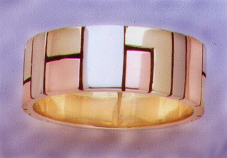
The panels are of red gold, white gold, and, um, gold gold fused onto a gold ring in a process called, fittingly, "marriage of metals." We think they're peachy.
Mondrian's "de Stijl" paintings (like this tie, but with primary colors instead of grays) are some of the most recognizable of the 20th century. They're easy to copy, too, as I see Mondrian graphics everywhere: the Artcyclopedia icon, a garage door on Lakeside Drive in Greenbelt, stained glass windows in the Owen Brown Interfaith Center in Columbia, and so on. There are those who denigrate modern art in general and minimalism in particular ("my six-year-old could do that"), but I believe it took real genius to come up with such an enduring style of composition.
The tie is of rather heinous polyester from Index. Polyester doesn't have to be awful; two of my favorite tie lines are polyester (Christian Dior Monsieur ties with the "CD" logo on the front, and Oscar de la Renta Studio ties with the signature on the front). But one can't have everything.
Next week I will be coming to you from Orlando, Florida (assuming my mobile technology holds up), as I attend a conference on Sungard's administrative software for higher education. Woo-hoo!
Thursday, March 30, 2006
Romance
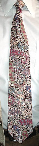 I was quite under the weather yesterday, and so stayed home from work, tieless. But I'm back today, and have decided to round out the week by re-wearing a couple more ties with romantic associations, or "ties that bind," as Mike S. slyly suggests. I wore this Liberty of London tie on my first date with Mrs. V. We had been friends for over ten years, but had just discovered that we liked liked each other. She had revealed that she just loved Liberty ties, and had sold quite a few of them during a stint in a Men's Furnishings department, so of course I had to wear one the next time I saw her. (Needless to say, it was the right choice.) Liberty's most celebrated ties are the florals made of their exclusive "Tana Lawn" cotton, which debuted in the 1920s. "Lawn" was first a linen fabric woven in Laon, France (hence the name); today it is a fine cotton fabric made of high-quality thread and weighing no more than 200 grams per square meter (as defined by the UN). "Tana" is from Lake Tana in Ethiopia, the source (more or less) of the Blue Nile and the area where the cotton for the fabric was originally grown. I have a pretty good selection of Tana Lawn ties, as I do not get rid of them. With the advent of warm weather you'll be seeing more of them.
Tuesday, March 28, 2006
Another wedding tie
 I had to wear an Emilio Pucci tie today, for reasons I will reveal in due course. So I went into the vault and pulled out a tie for re-wearing (gasp!): the Pucci tie I wore to Mrs. Veneer's sister's wedding three years ago, in England. (Yes, her sister moved to England, and got married just two months after we did. And then later, both sisters had babies six days apart.) The wedding was in St. Mary's Church in Thorpe, Surrey; parts of it are 800 to 900 years old (or more), so that easily qualifies it as the oldest church in which I've ever attended a wedding. Happily, the English contingent is arriving for a visit tomorrow, and the two-year-old cousins will get to see each other again. For next year, we ("Team America," as the Englishman calls us) are planning a trip to their side of the pond. I feel so international. As for the tie, the knot was a bit wonky this morning (pictured), but it straightened itself out during the course of the day.
Monday, March 27, 2006
Bizarro World
 Recognize this tie? It's the same as my wedding tie, but in a different color scheme, or "colorway" as they say in the fashion industry. While the wedding tie has an Albert Nipon label, this one has a Ketch label, so I can't really say who designed it. Probably a house designer at Wemco or Superba. This tie obviously comes from the Bizarro World, which is populated by imperfect copies of people and objects from our own world, most notably Superman's copy, Bizarro. And of course no reference to the Bizarro World would be complete without a further reference to the "Bizarro Jerry" episode of Seinfeld, in which Jerry and the gang encounter a group of friends remarkably similar to them (Kevin, Gene, and Feldman), yet different (i.e. they are thoughtful and respectful of each other). Episode transcript here!
Saturday, March 25, 2006
Before and after
This weekend edition features a very special tie from my permanent collection and its transformation into a work of fine art. My wife and I were married on February 1, 2003, a second marriage for each of us. We had a small ceremony at my parents' house on Greenbelt Lake, so we were not constrained to dress for church. Mrs. V. wore a gorgeous purple sari, and I wore this Asian-inspired art deco floral tie from Albert Nipon:
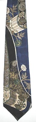
(I wore other clothes as well, but it's really only the tie that matters.) The best thing about the internet is the people you meet online. Catherine Gutsche of Ontario stopped by the blog a while back and left a comment which led me to her website of necktie art. Catherine puts a necktie on a canvas, then extrapolates the pattern in paint to cover the whole field. I was very impressed, and at that moment a plan began to form in my mind. Last month, I commissioned Catherine to create a painting from my wedding tie, and after much anticipation it arrived this week:
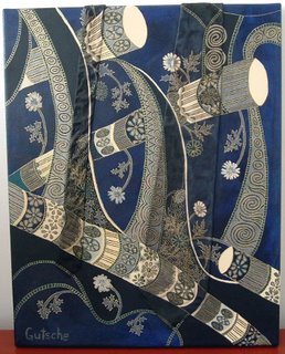
Wow!!! Isn't that wonderful?! Click on the picture to see a larger version, it's worth it. Make sure to find the tie in the painting (both the large end and the tail end are incorporated) and marvel at the masterful way Catherine has not merely replicated the existing patterns, but has really entered into the spirit of the tie and put the original motifs into new configurations, such as the wavy stalk at the bottom left. I'm especially pleased that she chose to cap off some of the decorative rods (bamboo?); having their cross-section in the painting gives them a solidity that is a nice counterpoint to the delicacy of the flowers and scrollwork. All I can say is, Bravo, Catherine! It easily follows that I wholeheartedly recommend the Catherine Gutsche treatment for any special tie you would like to have immortalized; her contact information is on her website at http://www.catherinegutsche.com/ (click the "Contact" link to initiate an email message).

(I wore other clothes as well, but it's really only the tie that matters.) The best thing about the internet is the people you meet online. Catherine Gutsche of Ontario stopped by the blog a while back and left a comment which led me to her website of necktie art. Catherine puts a necktie on a canvas, then extrapolates the pattern in paint to cover the whole field. I was very impressed, and at that moment a plan began to form in my mind. Last month, I commissioned Catherine to create a painting from my wedding tie, and after much anticipation it arrived this week:
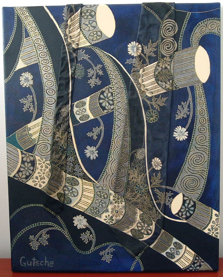
Wow!!! Isn't that wonderful?! Click on the picture to see a larger version, it's worth it. Make sure to find the tie in the painting (both the large end and the tail end are incorporated) and marvel at the masterful way Catherine has not merely replicated the existing patterns, but has really entered into the spirit of the tie and put the original motifs into new configurations, such as the wavy stalk at the bottom left. I'm especially pleased that she chose to cap off some of the decorative rods (bamboo?); having their cross-section in the painting gives them a solidity that is a nice counterpoint to the delicacy of the flowers and scrollwork. All I can say is, Bravo, Catherine! It easily follows that I wholeheartedly recommend the Catherine Gutsche treatment for any special tie you would like to have immortalized; her contact information is on her website at http://www.catherinegutsche.com/ (click the "Contact" link to initiate an email message).
Friday, March 24, 2006
Egg-cellent
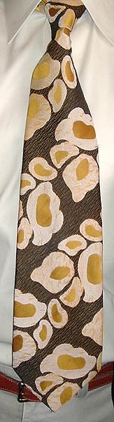 I've got another Beau Brummell tie today, this one from the "Gentry" line. Nothing says "Gentry" like a fat polyester tie full of fried eggs! While I'm on the topic of eggs, this is a perfect time to revisit Glen Baxter:

There's another Glen Baxter egg cartoon here, and a whole gallery of his other delightful absurdities here. It would not be unreasonable to hypothesize that I bought this tie just so I could hang it in the bedroom and be reminded of Glen Baxter every morning and night. Now that I've worn it it goes into the closet, and I'll need to find another Baxter-related tie, maybe with a nice polenta design.
Thursday, March 23, 2006
The Outlaw Paisley Wales
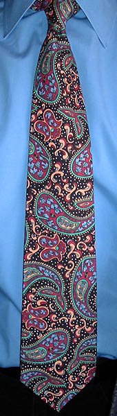 (Josey's foppish brother.) The Dior tie below can rightfully be called a whale of a paisley tie; today's tie, from Kahala of Hawaii, is a tie of paisley whales. Yes, the big paisleys have the mouth, eyes, and flukes that unmistakably distinguish them as fanciful cetaceans. I was not familiar with Kahala before getting this tie, but they have been around since 1936. That's longer than Hilo Hattie, who I would have guessed was the oldest purveyor of Hawaiian clothing, but they've only been around since 1963. Kanaka is another Hawaiian brand whose ties turn up on the secondhand market fairly frequently, often made of cotton barkcloth. The name "Kanaka" is taken from "Kanaka Maoli," the indigenous people of Hawaii. In 1993, the US government formally apologized to the Kanaka Maoli for overthrowing their kingdom in 1893 (United States Public Law 103-150). The implicit postscript to the law is, "But we're still keeping it."
Wednesday, March 22, 2006
Gene Meyer does paisleys
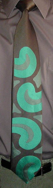 Gene Meyer's take on paisleys is as perfect for its time (now-ish) as Christian Dior's was for its respective time (40 years ago). While I have linked to Gene Meyer's rugs and accessories before, I haven't highlighted his socks yet, so feast your eyes on these. They're pricey for socks, but still much cheaper than his ties. If anyone were to start a men's sock blog (to complement this women's sock blog), Gene Meyer socks would be a great feature.
Tuesday, March 21, 2006
Dior does paisleys
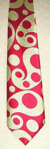 Here is what I consider the ultimate modern interpretation of paisleys (until Gene Meyer, coming up tomorrow), a super-wide Christian Dior tie of the finest woven polyester. I would date this tie at mid-to-late 1960s, the height of Carnaby Street mod and flower power fashions. Bless Mike Meyers for his revival of sartorial psychedelica in the Austin Powers movies. That series seems to have run its course, though, so I'm waiting for someone else to spark another revival. Well, not just waiting, I am still wearing the stuff, after all, and I urge you to do the same.
Monday, March 20, 2006
Alexander Shields
 I wore a square-bottomed Rooster tie a few weeks ago, and in my posting mentioned a fabulous square-bottomed tie by Alexander Shields that I used to have. Well, I just found a picture of it, and here it is. It's a skillful synthesis of Mod and Hawaiian, and it's one of my all-time favorites; maybe I shouldn't have sold it. On the other hand, I just don't have room to keep every tie I like. That's one of the reasons I started this blog: as a kind of scrapbook in lieu of a physical collection. And it's a lot easier to look through than a closet full of ties. I now return to my mini spring break.
Saturday, March 18, 2006
The Wearing of the Pink
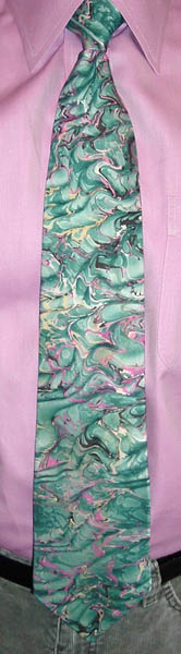 Here it is, St. Patrick's Day, without a green shirt left in the wardrobe, or even a white one. I'm down to blue, pink, and multicolored stripes. Fortunately I have a large inventory of ties, and found a green one with some pink in it to match the pink shirt. This extra-long tie was hand marbled by Galen Berry. I've linked to his definitive marbling website several times when I've worn marbled ties, and now finally I've gotten around to wearing and displaying one of his. Thanks to his 32 Examples of Marbling, I can confidently identify this pattern as "Moiré." I've never seen anyone else do this pattern.
One of the fringe benefits of working for a state university is I get a bit of a spring break; not a whole week like the students get, but two days, which is better than none. I'll post some old favorites from the archives during the break, and then resume real-time ties on Wednesday. Happy Spring!
The Collecting Gene
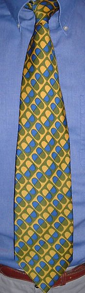 In searching for the right word to describe the predominant color of this unlabelled op art tie, I settled on "mustard." That could actually cover two of the three colors; I've never seen a blue mustard. And speaking of mustard--my father collects mustards. At one point he had over 700 different kinds, but after a refigerator failure (one of his two dedicated mustard fridges) he had to get rid of a lot, so now he's down in the 200-300 range. He is a true aficionado, and has donated many jars of exotic mustard to the Mount Horeb Mustard Museum (possibly the only collection larger than his, with over 4,300 different mustards). Once or twice a year my parents have a mustard party; all the mustards come out of the fridges and are placed on trays around the house by category: plain mustards, Dijon mustards, herb mustards, fruit mustards, horseradish mustards, garlic mustards, hot pepper mustards, alcoholic mustards, etc., to be sampled on little pieces of bread with various meats and cheeses. It's always a great time, and is much anticipated by family and friends. So that should put my tie collecting into context: I can't help it, I inherited the Collecting Gene.
Wednesday, March 15, 2006
Verdigris
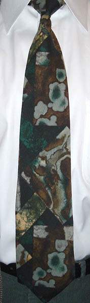 The mottled browns and greens in this Atelier Italseta tie suggest the corrosion of metal, which, like many natural processes, can be harnessed and directed to produce works of art. While the general design can be controlled, the random elements of the reaction produce amazing textures. I probably should have saved this tie for St. Patrick's Day, but that's two days away, and I can't think that far ahead, so I'll have to find something else.
Clouds and rainbows
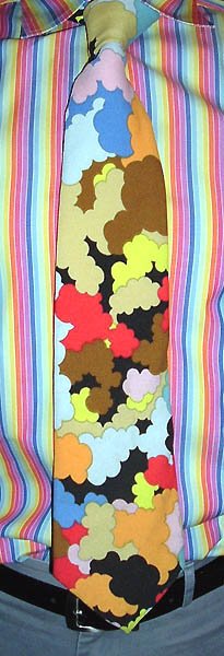 This tie (of Dacron Polyester, but otherwise unattributed) full of psychedelic clouds also bears some resemblance to Peter Max's "Cosmic '60s" art, and what better shirt to wear a cloud tie with than a rainbow shirt? I don't have any more to add about Peter Max since yesterday, but the clouds remind me of one of the more interesting conspiracy theories I've heard in recent years. Do you remember the US Postal Service's lovely Cloudscapes stamps? Pretty innocuous, huh? Not so! Some of the clouds look exactly like man-made "Chemtrails," and the stamps were put out to condition us into thinking they are normal, and not to worry about the Chemtrails. What are Chemtrails? Some kind of "stuff" that the Powers That Be have been spraying into the atmosphere since 1998. What is it? There are lots of theories, which you can read at the Chemtrails Hall of Shame website. Now me, I'm trying to condition people into thinking that multicolored clouds are natural, and once that's accomplished then...but that would be telling.
Subscribe to:
Posts (Atom)