Yes, that is silver foil on glossy black! "Cosmo's, for men who are." I am, I cried! I bet they carried Sex Panther!
 Nothing says "mod" like eccentric circles. This vintage polyester tie was custom made by the William M. Frazin Company, Custom Neckwear Makers, Chicago and Los Angeles. I wore it on May 14, and I haven't worn a tie since. Perhaps when the students return to campus in late August and we go back into "business mode" I'll tie one on again, but during the summer I'm just wearing open-necked shirts. I have some pretty wild ones, so I don't feel completely bereft of adornment.

 It's hard to pin down a time period for this tie; the fabric is acetate, which was widely used for ties in the 40s and 50s, but the pattern is more late 60s/early 70s. It is safe to say, however, that it is not recent.
 Look into my tie, look into my tie, the tie, the tie, not around the tie, don't look around my tie, look into my tie, you're under. You will marvel at this black-and-white op-art vintage polyester necktie from Pauline Trigere and admire its wearer for his keen fashion sense. Three, two, one... You're back in the room. (Or, as our three-year-old says, "What you want... you're back in the room.")
 Catching up here, the tie for Wednesday, April 25 was this paisley-like floral print from Enrico Coveri. Coveri was born in Prato, Italy, in 1952, and established his own fashion company in 1978. His clothing was known for a more youthful orientation than most fashion houses, and his extensive use of vibrant prints. Coveri died young, of a stroke, in 1990. His sister hired new designers and took charge of the company, which is still a going concern. Coveri's use of color is sometimes likened to Pucci's, but I have yet to see any similarities in their neckties.
 Tuesday's tie is another one from stockbroker-turned-fashion-mogul (now turned consultant) Pat Argenti; it features a baroque-style floral pattern in all eight colors of the rainbow: red, orange, yellow, green, blue, indigo, violet, and... taupe (over the yellow). I have never seen a dull Argenti tie; I've seen some ugly ones, but they weren't boring.
 Thursday's tie, made in the US and sold under the British Allen Lolly label, seems to be an attempt at an Australian Aboriginal-style design like those produced by Jimmy Pike and Doris Gingingarra for Desert Designs. Or it could be a psychedelic pattern rendered in boardroom-friendly colors. Either way, I'd buy more if I found them.
 There we were, thinking spring had finally arrived (again), then we get another foot of snow. Ai-yi-yi, an Ithaca winter has more false endings than a Starcastle album. So I started the week reverting to the purely functional, but spring had returned by Wednesday and I wore this tie by Principe. It has lots of the geometric design elements I love, but in the process of being chopped up, repositioned, and given a rather lackluster color scheme, they've lost a little something. Good enough to wear once, though!
 Klimt patterns are available not only on fine silk ties, but on durable polyester ties as well, such as this one from the Cabralli Collection. The pattern contains elements from Klimt's best-known painting, The Kiss (1908); in fact, it contains just about every element except the kiss itself. And the gold. All this Klimt lately has reminded me of the only Klimt joke I've ever heard, from Rodney Dangerfield's 1986 movie Back to School:
Trendy Man: Mr. Melon [Dangerfield], your wife was just showing us her Klimt.Heh-heh. (Exchange lifted from imdb.com.) Unfortunately the joke doesn't really refer to Klimt's art at all, it just uses his name for funny effect, and as such could work for any number of artists (an exercise I will leave to the reader). So maybe it's really more of a "gag" than a proper joke. If you've heard a proper Klimt joke, by all means please post it in a comment.
Thornton Melon: You too, huh? She's shown it to everybody.
Trendy Man: Well, she's very proud of it.
Thornton Melon: I'm proud of mine too. I don't go waving it around at parties, though.
Trendy Man: It's an exceptional painting.
Thornton Melon: Oh, the painting.
 Wednesday's tie comes from stockbroker-turned-clothier Pat Argenti and answers the question: what if, instead of gold, Gustav Klimt's favorite colors were dark magenta, chartreuse, and aqua? Maybe he would have come up with something like this for a background pattern on one of his paintings. (Or the more likely scenario: what if a modern fabric designer wanted to create a Klimt-like pattern in dark magenta, chartreuse, and aqua?) The tie fabric is sanded silk, which I think is the most tactilely sumptuous fabric of all: the silk is put through a chemical process that leaves it with the texture of the finest suede imaginable. Another sanded-silk Argenti tie I own has fingerprint stains on it, and no wonder, it's just so delightfully touchable!
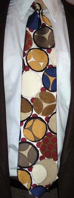
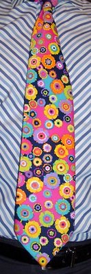
 The King of All Cosmos, that is. It's wonderful when my passion for neckties and my passion for Katamari Damacy come together in a tie like this one. It's a vintage cotton tie that I got on eBay, where the seller described it as "ugly" and even claimed to have won an Ugly Tie Contest with it. Obviously, some people just don't appreciate retro patterns in exuberant colors (that man's workmates, and mine too for that matter), but I declare this tie fantastic! It has all the hallmarks of a homemade tie, i.e. unorthodox construction and a lack of labels. What sets it apart from most homemade ties is the masterful approach to the problem of making a tie from a large pattern, which is finding just the right section to appear on the front of the tie. The maker managed to include the entire height of one psychedelic white flower as the central motif while still allowing a bit of a navy flower at the bottom and leaving just enough room for a piece of red flower to peek through under the knot at the top, and (this is the hard part) keeping it all in place while being sewn. That couldn't have been easy.
 |  |  |
 Tuesday's tie is the first knit tie on the blog, the second Coogi tie, and the third flat-bottomed tie. It is also the only knit tie I have ever owned; knit ties are usually just a single color, and I have made my feelings about single-color ties clear already. (But I will repeat: I don't like them! They're a waste of prime display space.) Most Coogi ties that turn up are either silk ties with an approximation of a Coogi sweater pattern printed on them, some have intricately-sculpted patterns woven into the silk, but this one is the closest thing to a Coogi sweater you can get in a necktie. If that's what you're after (and today I was).
 It occurred to me after Friday's post that instead of directing readers to another site to compare the Modules tie with genuine vintage swing ties, I could wear one myself and post it right here. I do have a few, after all. So today's tie is a mid-50s Towncraft, worn for the very first time--I actually got it new in a box on eBay, along with "The Brown Whisper" by Wembley. Towncraft has been a J.C. Penney house brand since 1927, and continues today, though as with so many other long-established clothing brands there are no longer any neckties in the line. Tie duty has shifted to Penney's Stafford line, but you won't find anything as daring as this anymore.
 I was surprised to find that of all the Modules ties I have amassed, I have only blogged one of them before today. Modules of Japan created some of the best "swing revival" ties of the late 80s/early 90s (and for more on that, see my previous Modules post), and today's tie is a prime example: it stays true to the spirit of the swing years without a slavish imitation of its motifs. For comparison, see the bona fide swing ties on display at Will's Vintage Ties.
 This addition to my collection of Beau Brummell ties is my favorite so far. An acetate tie with woven pattern, it just oozes that swinging mod vibe that is being kept alive today by the likes of Shag, Tim Biskup, and Mary-Kate and Ashley Olsen, believe it or not--check out their line of rugs!
 We had another springlike (albeit rainy) day on Wednesday, a perfect day (except for the rain) for a tie and sportcoat. The tie is from Seidenweber of Germany, which translates into the very descriptive "silk weavers."
  Hola, amigos. I know it's been a long time since I rapped at ya. Today was the first day in weeks that the temperature started out above freezing, so I decided to emerge from my winter cocoon (long-sleeved undershirt, turtleneck, flannel shirt, wool sweater, sometimes a second wool sweater, and a down coat) and get my tie on. This one is from the Museum of Fine Arts, Boston, though I don't know what work it's based on as it's no longer on the store website. (They do have a very cool David Hockney tie, though.)
 (2/2:) Ain't it funny how time slips away? Here's my tie from last Monday (Jan. 22), a homemade item from 1970 or so. What wonderful fabrics abounded in those days! I wore this tie in anticipation of Ithaca's Light In Winter festival, which was held over the past weekend. I got to fulfill a wish that had been simmering on my mind's back burner for about 25 years, which was to see Pilobolus Dance Theater. I don't know a thing about dance, but the manner in which the Pilobolus dancers cantilever, roll, leap, hang, and interact in a myriad of other ways is fascinating. It was a glorious night out with the kids at the fabulous State Theatre, I just hope Pilobolus comes back again: I want to see them perform their piece Megawatt, which features music by Squarepusher!
 Here we are halfway through January, and I've just now worn my second tie of the year; at this rate I'll never get through them! I'd better pick up the pace again (though it looks like turtleneck-and-wool-sweater weather for the next week). Beau Brummell returns to the tie blog today, with a 1950-ish ink-and-watercolor-style floral pattern. The upper part of the tie is a dark wine color, appropriately enough as bunches of grapes form its bottom border. Between each bunch of grapes is a curious little symbol (click the pic for a better look) that looks like it could be zodiacal, but I can't find a match; it's closest to the symbol for Uranus, but modified to look more like... well, I won't go there, I'll just say it could qualify for one of these naughty awards.
 I start off the new year with...another tie from the top of the box! This is a corporate tie by German corporate clothier Art di Como. The activities of a company presumably called AMF/APF (both are on the tie) are depicted with a decidedly European cartoon whimsicality. Strangely, though, none of the companies on the client list are called AMF or APF, so I really don't know anything about the company for which this tie was designed, except that they apparently bottle beverages, or make bottling equipment, or distribute or serve bottled beverages; they use or make PCs; they conduct their business in quaint-looking European buildings; they may also make or use CDs and/or vinyl LPs; and I don't even know what to make of the things that look like bongs, maybe they make beakers or something. Regardless of its incomprehensibility, this is one lively corporate tie.
 Today was the office holiday party, which means it was time for my annual wearing of the red Levi's cords. I didn't have another Christmas-themed tie, so I chose one with red in it, and what's more festive than a retro mod/tiki pattern? (Tie made in Italy by an unknown maker.) This year's party, at my new job, differs from last year's at my old job in two major ways: 1) it wasn't cancelled at the last minute, and 2) we all got to go home early. Now that's living!
 People have been warning us about the harshness of Ithaca winters for the past six months, but it is still unseasonably warm and looks to stay that way through the next week and possibly beyond. So today I wore a tie that is unseasonably bright. It's a heavy (and wide) vintage tie of cotton by Liebert, a brand that has more hits than misses in my experience.
 At first I thought this tie was a cityscape with two giant cats; then I saw that what I thought was a house was really a rooftop fan housing, alongside a TV aerial, some chimney pots, and two normal-sized cats. There are some pink clouds directly behind the fan housing, a sligthly sinister-looking anthropomorphized moon, and a tiny white cloud farther to the left. The detail of the woven pattern doesn't show up so well in the small picture to the left, but you can click through to a larger version. This tie is unlike any other I've ever seen; it's a wide polyester number from 1970 or so. The brand is "Pedigree by Michel;" with a name like Pedigree, I wonder if it was an entire line of animal-themed ties. I can only hope I'll run across another one some day.
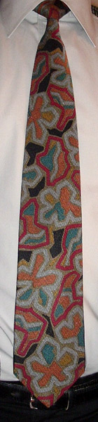 Owing to my extended schedule of unpacking in our new house, I was unable to join the other tie guys (Mike and Will) in celebrating Fall with autumn leaves ties; I have some, I just couldn't find them. Here, then, is my belated entry in that category. I know that this is actually a floral tie, but the flowers are stylized enough that they could be interpreted as leaves if you really want to (and I do). (Oh, the many and varied practical uses of abstraction!) The tie is by GianMarco Venturi, and is yet another purchase from the Modaitalia eBay store.
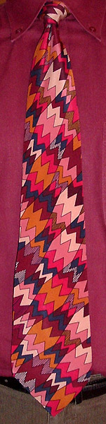 The past week was very cold; I wore mostly turtlenecks and wool sweaters, except for Wednesday when I wore this eye-grabbing Missoni tie. If a network were to broadcast The Point, and there was static interference with the broadcast, then I think this is what the static would look like.
 "Today's" tie (and by "today" I mean November 30) is the companion to my October 21 tie, in that it has the same label (Garber's), the same construction (woven, as opposed to printed, silk), and I got it in the same lot of vintage ties on eBay. Click on the picture to see a larger version for a better appreciation of the intricacy of the pattern.
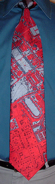 Since I wore a Cornell tie to the University of Maryland before I left, it's only fair that I wear a University of Maryland tie to Cornell. This tie was presented to me by the Big Boss himself at my farewell party. It depicts the University of Maryland at College Park Master Plan (2001-2020), and the slice of campus on the front contains both buildings in which I worked: the Pocomoke Building (Building 007) and the Samuel Riggs IV Alumni Center (which, unfortunately, is located a little too high on the tie and got covered up by the knot). The tie was made by Civitas, a company which specializes in city plan ties (there had to be one); this is their first campus tie. Sales of the tie fund scholarships for the School of Architecture, Planning, and Preservation, and internships for campus planning, development, and preservation. Cornell's unique campus geography would also look great on a tie...
 Monday's tie was a Liberty of London Archival Design (and a Burl Veneer archival tie), one of their lovely classic floral patterns. There's a bird in the design, but unfortunately only its legs and tail show on the front of the tie (to the lower right of the large, gold-purple flower), so you can't really tell it's a bird at all. A wider expanse would benefit this fabric by displaying the full pattern, and I think it would indeed work as curtain or upholstery material.
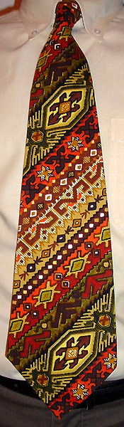 For the last work day before Thanksgiving I chose a tie that resembles a Thanksgiving tablecloth, both in pattern and dimension (it's huge!). It appears to be homemade, and thus may even have been a tablecloth at one time. This Thanksgiving finds me once again with so many things to be thankful for; new this year are my lovely new home, new job, a walking commute, and a wonderful new home town. May your Thanksgiving be a happy one, and may you find occasion throughout the year to give thanks to the Being or non-being of your choice!
 I've had the frenetic and irresistible techno-acoustic music of Squarepusher (a.k.a. Tom Jenkinson) on the headphones for the past two days, so I wore this tie in his honor. Like my last tie (nearly two weeks ago!), this is an Italian-made silk tie with no maker identification. This picture marks my stepson's first gig as Tie Blog Photographer; taking the picture was like second nature to him. Way to go!
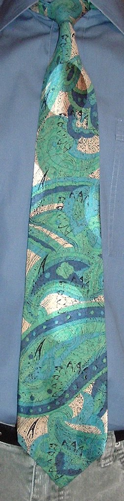 I was reminded by a reader today (my dad) that I have fallen behind in my tie blogging; quite so! Here it is November 18 and I'm just getting around to posting my tie from November 8. (However, it's the last tie I've worn; a week of rainy days made the thought of commuting on foot in a tie unappealing, so I went a whole work week without wearing a tie. I confess it felt weird.) This tie is another one of unknown lineage from the Modaitalia Store. It features a large paisley pattern in blue and green superimposed on a smaller black-and-white paisley pattern for double your paisley pleasure! The most remarkable aspect of this tie, though, is the jacquard weave of giant polka dots, which actually came through in the picture: see the one at the top near the knot.
 From my "I Voted" sticker (my first time voting in my new home state!) you have probably deduced that this is Tuesday's tie. What are those blotches crawling across the sharp geometric background in Depression-era kitchen tones? Crabs? Lionfish? No, they're flowers, but they have evolved some pretty good camouflage. Victor Vasarely did some interesting experiments in merging foreground and background patterns. I'm not sure what the designer was going for in this tie by Firenze, but it's definitely not something you'll see very often.
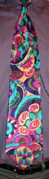 At first glance this tie from Format, back when they were made in Japan, looks pretty psychedelic because of its high-contrast palette and curvilinear graphics. But the shapes don't quite have the Dionysian abandon of true psychedelia; they are more staid, and in some places recall the old-world stylizations of Pennsylvania Dutch hex signs. Still, it's a fine attempt at a different genre from a tie maker best known for its excellent swing/art deco ties.
 Thursday's tie was this brash mod/op-art number from Givenchy. It has an unusual shape that I've only seen in a few other ties, which I will call "entasis" after the ancient Greek architectural practice of making columns bulge slightly in the middle to enhance their aesthetic appeal. This tie, instead of flaring out steadily to it maximum width at the bottom triangle, actually reaches its maximum width about halfway down, then tapers back a little bit before the bottom. So you get the broad expanse of fabric of a fat tie, but without the really fat part that can push a gaudy tie over the edge.
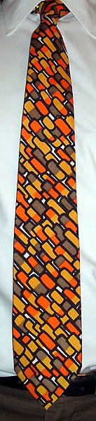 Some of my ties have to months, even years before I wear them for the first time. But this Emilio Pucci tie, which I got mere weeks ago, was so suited to Halloween that it was the obvious choice for today. The "capsules" are, of course, astronaut candy corn.
This tie came from an exclusive dept. store in downtown Cincinnati many years ago. The name of the store was Pogue's, which was known for selling exclusive designer clothing from as far back as the 40's. It came from an estate where most of the items were from the 40's, 50's, and early 60's, it was packed away with some other gifts given to the gentleman of the house....And enclosed with the tie was a typewritten gift card:
DEAR WILLIE:So once upon a time one could get Pucci ties in Cincinnati (and thus, by extension, anywhere), though apparently few actually did. Willie very sensibly kept the tie, as will this William.
IF YOU WISH TO EXCHANGE THO THIS IS A REAL BEAUTY ASK FOR MR MAFFA AT POGUE. HE SHOULD RECALL ME. THEY HAVE NOT TOO MANY CUSTOMERS FOR EMILIO PUCCI TIES.
REX
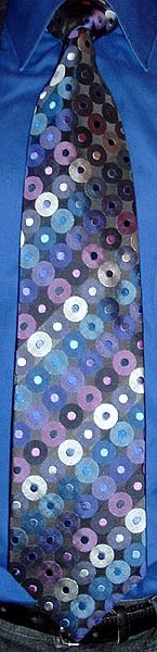 The Great Shiny Woven Tie Explosion of 2004 (referenced in my October 8 entry) trickled down to the discount stores in 2005. Burlington Coat Factory had (and probably still has) a wide selection of these cheaply luxurious ties, and was the source for this Adolfo Gold grid of circles in black, blue, purple, and silver.
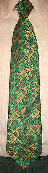 It's taken me nearly a week to get last Friday's tie up because I couldn't come up with the larger connection for it, but it finally hit me on the way to work. This tie from "Garber's" (presumably a menswear store) has the colors and abstract patterns of a Hundertwasser painting. Friedensreich Hundertwasser (1928-2000) was an Austrian painter, sculptor, and architect, a genius, and a true original. His passion for the environment informed all his work, which included many posters promoting conservation and awareness of environmental issues (e.g. Save the Seas, Conservation Week, Save the Whales, Save the Rain, etc.). His buildings incorporated organic forms (and organic matter) and his paintings freely mingled the living with the built, all highly stylized in vibrant, multicolored palettes. This tie (from the polyester era but surprisingly made of silk) is a mere echo of Hundertwasser's creativity, but even an echo of Hundertwasser is something special.
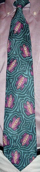 These frogs would have had a field day at last Saturday's Insectapalooza at the Cornell University Department of Entomology. Our whole family went; after the cockroach races right at the entrance, we went upstairs to the exotic insect zoo to see live tarantulas, scorpions, whip spiders (perhaps the nastiest-looking creatures on earth), black widows, praying mantises, grasshoppers, millipedes, beetles, and many more assorted creepy-crawlies. Come to think of it, some of those creatures could probably turn the tables on a frog. We skipped the bug and worm cuisine room...
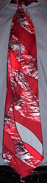 I didn't want to go another full week without wearing a tie, so here's one six days after the last one. This tie is by Guy Laroche of Paris. Laroche was born in La Rochelle, France, in 1921, and opened his own couture house in Paris in 1957. Perhaps his most prominent achievement was producing the ubiquitous smell of the 1980s, Drakkar Noir for men, in 1982. (Or maybe I just think it was ubiquitous because one of my college housemates doused himself in it all the time.) Laroche died in 1989; the design house continues as a subsidiary of YGM Trading Ltd. of Hong Kong. (They seem to be between head designers, Herve Leroux having just left to start his own house.) This tie touches on two of my favorite themes, stained glass and "heavy scribbles." I'm not so crazy about the colors, but you can't always have everything in a tie.
 I only managed to wear one tie last week, on Wednesday. This tie is from my favorite line of polyester ties, the Christian Dior Monsieur line with the oval CD logo on the front. I have previously presented one other tie from this series, and I have one or two more to bring out eventually.
I was stakin’ out a gin joint in a rented Cadillac, when I heard a roscoe coughin’ and everything went to black. Next thing I know, Saint Peter was lookin’ me in the eye. He said, “Sorry, I can’t let you in, but where’d you get that tie?”
 (Wednesday, October 4) Seems like I just had a birthday last year, and now another one arrives. I didn't have another birthday-themed tie like last year's, so I picked out this wild silk patchwork Robert Talbott Best of Class tie more or less at random. And what a lovely birthday it was: a surprise party in the office with a luscious Wegman's chocolate cake. My boss even made orange chocolate ice cream! My favorite combination of sweet flavors! Mmmmm....
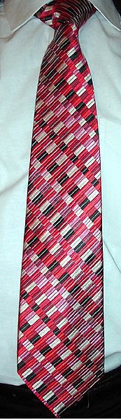 One day in 2004 Mrs. Veneer and I took a trip out to Annapolis Mall so I could ogle the Duchamp ties at Nordstrom. The big surprise was when we went to Hecht's and found hundreds of Duchamp/Ted Baker/City of London-style ties being offered by nearly every tie label there. So I picked up a couple by Geoffrey Beene, and this is one of them. (We were even more surprised to find similar offerings at JCPenney.) These woven-patterned ties of brilliant silk thankfully found their way into the mainstream, were they remain today. Hooray!
 I had a busy week and fell behind on the blog, but here I am again. The tie for Monday, October 2, is another Exotic Silks tie from Pamper Him of Chicago. The silk satin is a real joy to handle, the shape is perfect, the knot effortless. I think there are six Pamper Him ties in my permanent collection, which I am now getting a chance to rewear, as they have not been blogged yet, and they are new to my new workplace.
 Today's tie is from the Gallery Collection by Christina Desiree, and is based on Paul Klee's 1918 painting (and poem) Once Emerged from the Gray of Night. The painting itself has a gray band in the middle, which I take to represent the gray of night, and which was dropped from the necktie design. I think I would have kept it, but the tie is still special. In this one piece Klee has created not only beautiful pattern of letters and colors, but a work which ties in the sounds of the words and the meaning of the poem they assemble. Translated into English, the poem reads:
Once emerged from the gray of night,
Then heavy and precious and strong from the fire--
In the evening filled with God and bowed...
[gray band]
Ethereally now rained round with blue,
floating off over mountains' snowcaps to wise
constellations.