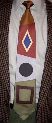
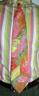
Paul Klee is probably my favorite artist of the twentieth century, so I was excited to learn about the opening this year of the Zentrum Paul Klee in Bern, Switzerland, near Klee's home town of Münchenbuchsee. It has logged over 100,000 visitors in its first three months of operation! Now I know where to plan my dream vacation. Klee was a member of his friend Wassily Kandinsky's Der Blaue Reiter artists' collective in Munich before World War I; after the war he taught at the renowned Bauhaus school of art and architecture. I greatly admire Kandinsky's art as well, and both Kandinsky and Klee sometimes exhibit similar whimsicality and optimism. But Klee's work has a more organic feel than Kandinsky's largely mechanistic designs, and some of his paintings (especially his later works, after being denounced by the Nazis as "degenerate") explore darker themes. The Artcyclopedia has a page of links to Klee works in museums around the world, and the Zentrum has an online database of over 300 of Klee's works. This tie is from the Gallery Collection by Christina Desiree, and is based on Klee's work "Aeolian," which I have not been able to find a picture of, unfortunately. This is one of several Paul Klee ties I have in my permanent collection.
Speaking of Bauhaus, the band of the same name, the godfathers of Goth, has regrouped for a "The Resurrection Tour," and Mrs. Veneer and I are going to see them at the Strathmore Music Center in Kensington, Maryland, on the 22nd! We were fortunate enough to see singer Peter Murphy with his new band earlier this year, and now this! Bauhaus comes to the suburbs! WOW!
Saturday, October 29, 2005
Thursday, October 27, 2005
Dippy birds
Do you remember "dippy birds" from the 1970s? They were a popular desk toy to rival the Newton's Cradle bouncing balls. They would rock back and forth, going lower and lower, until the beak dipped into a glass of water, then they would spring upright, gradually start rocking again, and repeat the process over and over. Don't the white birds in the rust-colored bands look like those? As for the other creatures on this tie, your guess is as good as mine. Dinosaurs? Lizards? Sometime in the early 1970s, something tragic happened to neckties. Designers started taking the garish colors of mod design and applying them to more traditional and antique patterns. The result was a multitude of weird brocade ties: classical and baroque motifs in diagonal bands of downright ugly color combinations of woven polyester. (Ted) Sturgeon's Law states that "ninety percent of everything is crap" (though he actually said "crud"); but on the other hand, ten percent isn't. Even among the ugly brocade ties there are some gems, and I consider this to be one, truly inspired in its whimsicality if not its hues.
Tuesday, October 25, 2005
And the Oscar goes to...
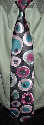
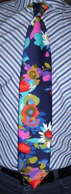
Me! Oscar de la Renta was born in the Dominican Republic in 1932; he went to Spain to study painting at the age of 18, but soon began working for the legendary designer Cristobal Balenciaga. He went on to work for Lanvin in Paris, then Elizabeth Arden in New York, before launching his own clothing line in 1965. And he is still at it, counting among his private clients Laura Bush and her twin daughters. (I don't hold that against him, though, a man's go to eat. ;-) Moreover, he still retains financial control of his company while so many other designers have sold out to corporations. This tie is from the Oscar de la Renta Studio collection, probably from the late 1970s, and is characterized by the signature on the front of the tie, a big, leafy jacquard weave, and a fabric composition of 97% polyester and 3% silk (one of the more perplexing fabrics I've encountered). The designs and colors on the Studio ties are mostly bold and wonderful, this one being my favorite. The shapes remind me of ceramic flowers.
Heeeeere's Johnny!
Johnny Carson was not only the quintessential late-night talk show host, he was also a clothing designer. Well, sort of--he had his own line of clothing, but he didn't actually design it. The Johnny Carson line was known for its sportiness, and the turtlenecks were especially popular. There were scads of neckties as well, with no discernible unifying style, except that Johnny liked them. The Elkhorn Valley Museum and Research Center in Johnny's home town of Norfolk, Nebraska, houses a Johnny Carson exhibit, and the gift shop has several neckties personally donated by Johnny for sale (at the bottom of this page). My favorites are #2 and #13. At $100 apiece they are quite pricey, but the proceeds benefit the museum. Of course, you can find Johnny Carson ties much cheaper on ebay. This particular tie has pleasant rust and cream colored flowers with like-colored "stems" (in quotes because they're not actually connected to the flowers) on a rich blue background, which is covered with black "crackling" somewhere in between batik and mosaic in appearance. (This is another detail that you'll have to click on the picture to see, in the larger version.) Celebrity neckties are a mixed bag, but there were some winners in Johnny's line.
Friday, October 21, 2005
Not what it looks like
Update 6/29/06: Chris Coleman never worked for Gene Meyer. This is according to Gene Meyer himself (see comment #2 attached to this post). Chris Coleman ties are nothing more than Gene Meyer knock-offs. My original post follows.
You will be excused for thinking this is a Gene Meyer tie. It's not, but the designer, Chris Coleman, used to work for Gene Meyer, and obviously absorbed some of his design sensibilities (even down to the polka-dotted tipping). Coleman's line of ties was produced by the Harmony Ball Company, whose primary business is cutesy figurines and home decor. They had a good thing going with these ties, though, too bad they stopped making them. Their Shakatiki vessels are pretty cool, at least.
Thursday, October 20, 2005
Plain or subtle
My boss saw this tie this morning and said, "You look plain today." I was going for "subtle." What's that? I said, "subtle." Subtle. Yes, subtle, as in HEY EVERYBODY, LOOK HOW SUBTLE I'M BEING!
This tie is branded I. Magnin, and thus must be over 10 years old, as that chain fell victim to the Great Department Store Consolidation of the late 20th century (still ongoing). I. Magnin began in San Francisco in 1876 and expanded throughout the west coast. During the Golden Age of Hollywood, I. Magnin catered to the top stars, and wowed everyone with their opulent art-deco stores. They eventually went nationwide; in the Washington area, there was an I. Magnin store at the high-end White Flint mall in Kensington, Maryland. When the chain was bought by Macy's in 1986, most locations continued under the I. Magnin name; but when Macy's merged with Federated Department Stores in 1994, the Magnin name was scrapped. And now that Federated has bought out May Department Stores, they're scrapping my beloved Hecht's as well. Boo, hiss!
But about this tie: in its red field, light black vertical lines, and even lighter ovals, I see trees, viewed through a mist, on Mars.
And now for something completely different: a good slogan for Google would be, "No, you didn't just make that up." Because if you ever come up with a clever phrase or idea, just Google it, and you will learn that no, you didn't just make that up, about fifty people before you already thought of it and put it on the internet somewhere. But--when I began this tie blog, I found no such history, and so believed this to be the first. However, I have just discovered that over at flickr, bjohnson has been posting photos of his daily neckties since May, 2004. D'oh! No commentary, though. And I don't want to sound catty, but I think my ties are better. ;-)
Pucci Alert-- Check out all the sweet vintage Emilio Pucci ties on ebay right now, somebody has a real treasure trove! (The link should last forever, but the auctions I'm talking about here end on October 25.) With starting bids of $99.99, these pictures are as close as I'll be able to get to them! (I will accept donations if anyone is so inclined.)
Wednesday, October 19, 2005
Guitar man
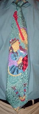
This tie by Daniel of Milano (Hubert's brother?) features a Viola da Gamba (precursor of the whole violin/cello family) and a tricked-out guitar that owes something to the Cubists. Note the busy, leafy jacquard weave, and the rococo "V" at the bottom. What is the V for? I don't know! An "R" and a "D" appear, one on top of the other, way up in the under-the-collar region, but I don't know if either one belongs with the "V"; it's all so frustratingly mysterious. If only I could decipher the Cubist Guitar Code...
My hometown of Greenbelt, Maryland, is also the home of the resurrected Hallmark Guitars brand of electric guitars. They must be pretty good (they sure look good), because look at all these people who play them. Blue Oyster Cult--score! More cowbell! If you want to look at some more beautiful electric guitars, check out the Girl Brand Guitars website. Or if you want to see more Viola da Gambas (Violas da Gamba?), then here's a bunch.
Tuesday, October 18, 2005
Spot the difference
There's something different about this tie, can you tell what it is? Probably not, the picture does not convey the supremely tactile surface that can only be found on--suede! That's right, it's leather! When you hear "leather tie," you probably think of one of those skinny monstrosities that were all the rage during the New Wave years. This tie by Tinder, on the other hand, is crafted to the same dimensions as a "normal" tie, and decorated with geometric motifs reminiscent of those of Gustav Klimt (more about him at a later date). The tie is not actually tied: the "knot" and blade are permanently attached. The tie tightens around the neck by means of an ingenious zipper loop, sometimes seen on boys' ties.
Some other non-standard materials from which ties have been made are:
Given my "name," I should probably get one of these Burl Wooden Neckties.
Some other non-standard materials from which ties have been made are:
Given my "name," I should probably get one of these Burl Wooden Neckties.
Monday, October 17, 2005
Modules!
Japanese tie maker Modules produced some of the finest neo-swing ties ever. The designs were elegant interpretations of 40's styles without being slavish imitations. The construction of these ties is very delicate, with a wispy thin lining and narrow tail, resulting in a tiny knot. Many Modules ties also have an inspired jacquard weave; my favorite one looks like tumbling donuts. This is relatively sedate for a Modules tie, from the simple Eames-like pattern of rectangular panels to the leafy jacquard pattern. The Modules label disappeared in the early 90's, to be reborn as Format. Early Format ties are almost indistinguishable from Modules, but in later years production was moved to Korea and the designs became more ordinary. (Korean ties are OK if price is your only consideration. If you are interested in buying in bulk, there is a lot of 400,000 ties from Korea for sale here. I'll bet you can get a great price!) Format ties can still be found in department stores (and the leftovers in discount stores, like Value City), and some of them are pretty nice, but the elegant swing revival ties are long gone. The swing dance craze still seems to have a dedicated following in Japan, though, and American swingsters Big Bad Voodoo Daddy are still at it!
Saturday, October 15, 2005
Hydrangeas or lotus seed pods?
Here's a Robert Daskal tie, hand painted by Karina Alicio. I can't decide if those are hydrangeas or lotus seed pods; the color would indicate the former, but the sculpted quality is more similar to the latter. In the Hindu religion, the blossoming of the lotus flower symbolizes the opening up of the soul; there is a sequence of pictures of the lotus in successive stages of bloom on this page. Way back in the 80's, Lotus was also synonymous with "spreadsheet"; apparently 1-2-3 lives on as part of the Lotus SmartSuite, owned by IBM. I've never met anyone who uses that, though.
I wasn't able to find any greater significance for hydrangeas, though they could symbolize either instability or friendship, depending on whom you believe. But fans of the Spong Monkeys will recognize them from the backdrop of the "We Like the Moon" video (2003). That's a silly song; but the most beautiful (and little-known) moon song ever is "We Love the Moon" by Royal Family and the Poor, from the album of the same name. An even better version, extended and more fully orchestrated, appeared on the Four from the Madding Crowd compilation album from Third Mind records. I don't think that's been reissued on CD, but all of the Royal Family and the Poor albums have, and they are all worth having.
Thursday, October 13, 2005
Turn it down!
It's way too loud! In for a penny, in for a pound--the shirt's already way out there, so there's nothing to lose by tying an equally (more?) eyeball-assaulting tie around it. This "crayon vomit" tie is store-bought rather than homemade, as it has a label attributing it it Pietro di Roma.
My striped shirt and wild tie combinations invariably draw comparisons to Austin Powers. I commend Mike Myers for reminding the public that psychedelic dandyism was once widespread, and now that the meme is loose perhaps the way is paved for a new flourishing of fashion beyond the recent bounds of color (and taste). But then it's been three years since the last Austin Powers movie, so maybe it's run out of steam. Meme or not, wild fashions for men are out there, they just need more buying and wearing. So get to it!
Thai tie
This tie from Thailand is made of hand-woven Thai silk, which has a "flat" appearance when lit from the front, but has a marvelous shifting sheen when light strikes it at an angle. The sheen is a quality of the silk itself, while the shifting is accomplished by weaving threads of different colors together. The World of Thai Silk website has a very informative page all about homespun Thai silk, and many other informative pages as well. How Thai is Thai silk? "Thai silk is produced by Thai caterpillars raised on Thai mulberry leaves by Thai weavers in Thailand, primarily on the Korat Plateau in the country's northeast region." You can't get any more Thai than that! The pattern on this tie is printed, but in the "mudmee" method of weaving (also known as "ikat"), the pattern is created by using different colored threads in the weaving process, making the pattern an integral part of the fabric itself. World of Thai Silk has a gallery of mudmee silks starting here; use the"Next" arrow to cycle through the whole collection and be amazed. I don't have any mudmee ties, but I'm looking.
Tuesday, October 11, 2005
Swiss Army Tie
Not content with a single pattern, this tie by Anne Surkamp-Kramer of Germany has six or eight different patterns displayed in "windows" of various sizes. And instead of abutting each other in the usual patchwork style of multipattern prints, they are all set into a gray and white background pattern that resembles granite, or an animal print. All in all a fascinating tie that held my interest when a committee meeting could not. Anne Surkamp-Kramer is the head designer of Krawatten-Experte.de, and also designs custom ties, if I understand correctly with my rudimentary German and Google's automatic translation. She also appears to run a business that sells flip-flops, wicker furniture, and Buddha statues. Naturally.
Monday, October 10, 2005
Plum crazy
This plum-colored shirt from Jos. A Bank (Maryland-based, just like me) has always been difficult to match; with ties, with pants, with anything. A female acquaintance of mine once put together a stunning ensemble around it for me, featuring blue pants and a blue tie with plum accents by... hmmm... Ungaro, I think it was. That woman is now known the world over as... Mrs. Burl Veneer! But I digress. This tie is from Christian Dior, whose website has too many popups to merit a link here. According to the indispensible Wikipedia, Dior headed his fashion house for only ten years, from its inception in 1947 until his untimely death in 1957. This tie doesn't go back that far, but the shapes on it look like art deco buttons or brooches that may have been around back then. As for the background, I'm not too crazy about the airbrushed look; that's fine for motorcycle gas tanks, van murals, and album covers, but not ties. But variety is the spice of life, so here is my airbrushed-background tie with colorful square art deco buttons on it that more or less matches a plum-colored shirt. Do you have one? (Do you want this one?)
Christian Dior Perfumes is now owned by LVMH Moet Hennessy - Louis Vuitton, a holding company that also owns just about every other luxury couturier, odorier, and liquorier you can think of. But at least someone is keeping the fantastic Emilio Pucci brand alive!
Friday, October 07, 2005
Give me Liberty...
Or give me a totally wacked-out floral tie that makes Liberty look like Laura Ashley. Near the bottom of this tie, the design bears a passing resemblance to Claude Monet's Water Lilies paintings. Monet suffered from cataracts, and the increasingly abstract style and muted colors of his later works reflect his declining vision. This tie shows what he might have painted if he had had clear vision, and a strong dose of peyote. Some probably think that peyote influenced my pairing of this shirt (by Linea, from House of Fraser in London) and this tie of unknown origin. No way man, I'm high on life!
Thursday, October 06, 2005
Under the microscope
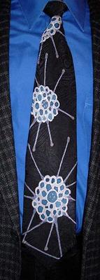
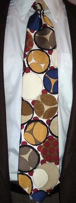
This tie by Hubert of Milano looks like something you would see under a microscope, like blood cells, or liver cells, or elastic cartilage cells, or muscle myofibers in cross-section, or maybe pollen, but cooler-looking. If there is any evidence for Intelligent Design, this tie is it. The enigmatic Hubert is responsible for some incredibly imaginative ties, some of which will be displayed in the tie blog eventually. Don't miss them!
(The brown orbs with the red bumps on them look like a Katamari, which reminds me--We ♥ Katamari for PS2, the sequel to Katamari Damacy, is out! It's even more fun and goofy! It gives a whole new meaning to "Let's roll!")
Wednesday, October 05, 2005
I dream of Gene
There's no mistaking a Gene Meyer tie. I read somewhere (an ebay auction listing, to be exact) that very few of this particular design were produced, because it was too difficult to position the screens to get the crosses so precisely aligned. That's too bad, there should be lots of these ties out there brightening up the world. Not much else to report this time; see this post for more Gene Meyer links. And I'm selling two more Gene Meyer ties on ebay this week. They can't brighten up the world from my closet, you know!
Tuesday, October 04, 2005
My birthday suit
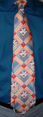
Happy birthday to me! Yes, today was my birthday, so whatever I wore today can truthfully be called my birthday suit, and here it is. This sublimely ridiculous tie featuring wedges of blue and pink cake (blue cake, mmmmmm) is called "Sweeter Days, " by Chereskin. After seeing this tie I was not surprised to learn that Ron Chereskin began his career as a magazine illustrator, since the design looks very magazine illustrationish. Not to mention dated--when was the last time someone could get away with a tie design like this? 1978, maybe? Still, it's not as old as I am, and I'm not telling that (but in Roman numerals it's XL). I've still got many tie-wearing years ahead of me; I estimate I should be able to display at least 5,000 more fanciful ties here, so check back often!
(The shirt is from Express by way of Rugged Wearhouse, who once in a while let some grown-up clothes slip onto the racks.)
Monday, October 03, 2005
Monodelica
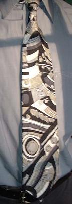
Or, monochromatic psychedelica. (Almost monochromatic--there is a gold tinge to one of the grays that really sets off the pattern.) The design influences for this tie come from nature: geological strata for the background, and enoki mushrooms (Flammulina velutipes) on top. The tie is by Monterey County-by-the Sea for Men's Wearhouse, which has been in business since 1973, so it might be vintage, or it might not (and my guess would be the latter). Sure looks 70s-ish! I would like to think that imaginative ties like this are still being made, but I haven't seen any others like this "in the wild." On the other hand, similar fabrics still turn up frequently in women's blouses. Hey clothing makers, how about sewing more of that into neckties for us fellas?
Subscribe to:
Posts (Atom)