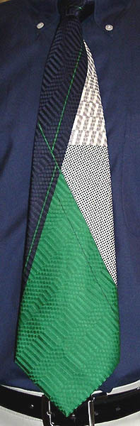
 This Pierre Cardin "Modèle Déposé" (registered pattern) necktie exemplifies the European Deco style of the 1970s, and also provides a marked contrast to the luxury ties of today. Today's luxury ties (Charvet, Ike Behar, Duchamp) are luxurious by virtue of the lustrous silk they're made of, but they are usually woven in very plain patterns and rely on a color contrast between the warp and weft threads to create a shimmer. (Duchamp is a notable exception, with many interesting weave patterns and exciting color combinations, and seems to be influencing other tie makers lately.) This vintage tie is woven in an imaginative jacquard weave, and a pattern is then printed onto the fabric; the fine detail indicates screen printing rather than block printing. I think it would go best with a double-breasted suit, on a yacht, in the Mediterranean.
Showing posts sorted by relevance for query cardin. Sort by date Show all posts
Showing posts sorted by relevance for query cardin. Sort by date Show all posts
Wednesday, July 12, 2006
Pierre Cardin
This Pierre Cardin "Modèle Déposé" (registered pattern) necktie exemplifies the European Deco style of the 1970s, and also provides a marked contrast to the luxury ties of today. Today's luxury ties (Charvet, Ike Behar, Duchamp) are luxurious by virtue of the lustrous silk they're made of, but they are usually woven in very plain patterns and rely on a color contrast between the warp and weft threads to create a shimmer. (Duchamp is a notable exception, with many interesting weave patterns and exciting color combinations, and seems to be influencing other tie makers lately.) This vintage tie is woven in an imaginative jacquard weave, and a pattern is then printed onto the fabric; the fine detail indicates screen printing rather than block printing. I think it would go best with a double-breasted suit, on a yacht, in the Mediterranean.


Tuesday, April 12, 2011
Klimtish
 This Gustav-Klimt-by-way-of-Heinz-Edelmann-looking print is brought to you by Pierre Cardin.
Saturday, June 04, 2011
Earthtones
 Does this tie just shout out "Burl Veneer!", or what? The wavy jacquard weave is almost a woodgrain, even. I can't say a Pierre Cardin tie has ever turned my head in a retail store, but the handful of vintage Cardins I own, of which this is one, are among my favorites. This tie would be perfect to wear in a room that has a photomural of a woodland scene.
Saturday, July 03, 2010
Disco Constructivist Houndstooth
 The 70s was a great decade for updating historic styles into something cheap and glossy (could that be the etymology of "cheesy"?); for example, the appropriation of Art Deco for the Studio 54 logo. Thus I like to refer to this navy and gold Pierre Cardin tie as "Disco Constructivist Houndstooth." Mrs. Veneer, on the other hand, thinks it is more evocative of a 1970s airport terminal. What does it remind you of?
Wednesday, April 01, 2009
MCM (and I don't mean 1900)
 I had so much fun wearing a tie last week, I decided to do it again this week. What this narrow Pierre Cardin tie lacks in color it makes up for in discipline: its grid of eccentrically-nested hexagons in dark gray on light gray (with some blue ones thrown in for an austere kind of flair) is decidedly Mid-Century Modern. The pattern would be perfect for a brushed-aluminum screen between my dining room and sunken living room. If Dwell magazine ever does a feature on my house, I will have to wear this tie for the photo shoot. And maybe clean up a little.
Saturday, June 04, 2011
Return of The Other Pierre
 Hot on the heels of the Pierre Cardin tie from three entries back, here is an old favorite from the other Pierre, Pierre Balmain. The pattern is obviously part of a large-scale floral print, but the "flowers" featured on it also bear an unsettling resemblance to crustaceans or crinoids.
Friday, September 15, 2006
Another first day
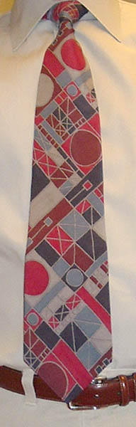 Not only did my daughter take my tie picture today, she also had her first day at her new school, which went marvelously. (Good thing, too, as schools were a primary consideration for our move.) This Pierre Cardin tie has a geometric pattern that reminds me of stained glass, a craft I've been toying with taking up since getting the book New Glass by Otto Rigan (1976) a couple years ago. The artists featured in the book completely surpass conventional notions of stained glass art, and the glass pieces transform interior spaces in a way that no other medium can. Tom Krepcio has written a useful "where are they now?" entry on the New Glass artists on his Vitreosity blog, which, now that I've found it, is set to consume a great deal of my net-surfing time.
Tuesday, July 25, 2006
Brooching the subject of neckties...
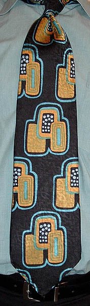 The repeated figure on this Pierre Cardin Boutique tie looks like an art deco enamel brooch.
Thursday, January 19, 2006
Dad's Ties Week, Day 3: Random House
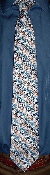 Dad calls this Pierre Cardin tie his "Random House" tie, because of the resemblance of its repeating buildings (woven, not printed) to the Random House logo:
 (This is a modernization of the original logo, designed by artist Rockwell Kent in 1927.) We had near-constant exposure to that logo, as it graced the cover of the massive dictionary that was the standard reference book in our house. Later on, I lived for a couple years within view of the gargantuan Random House distribution center on Bennett Cerf Drive in Westminster, Maryland.
A few years ago my parents were off on one of their world trips, and I got the notion to wear this tie to work one day. So I looked through Dad's tie rack for quite some time (believe it or not, he has a lot of ties), but I couldn't find it. It turned out that it was the one tie Dad took with him on the trip! Great minds think alike.
Thursday, November 03, 2005
Mongolian harlequin leopard
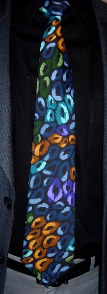 I'm a big fan of the movies of writer/director Wes Anderson. While the individual scenes are rarely laugh-out-loud hilarious, they are usually funny (and often touching) on some level, and the cumulative effect of a whole film of gently comic scenes among a large cast of intertwined characters is one of great enjoyment. In his most recent film, The Life Aquatic with Steve Zissou, Bill Murray stars as Zissou, a Jacques Cousteau-like marine biologist, adventurer, and filmmaker. He seems to focus more on the adventuring and filmmaking, though, and displays highly questionable scientific skills. His identification of marine species is especially suspect; it's never clear whether he just makes them up on the fly, or if they really do exist in Anderson's alternate film world. The movie centers on Zissou's quest for the "jaguar shark" that ate his partner. In honor of Wes Anderson and Bill Murray, I have christeneed the pattern of this tie with the Zissouvial moniker, "Mongolian harlequin leopard." It's by Pierre Cardin (maybe; when all you have to go on is the keeper, it's not a certainty), and its 3-inch width indicates a 1980s vintage.
I've just noticed that I'm about three months into the tie blog, and I haven't worn a paisley tie yet. It's not that I don't like them, it's just that I don't like most of them. Paisley fans take heart, I'll get to one eventually; watch this space!
Thursday, September 15, 2005
The Other Pierre
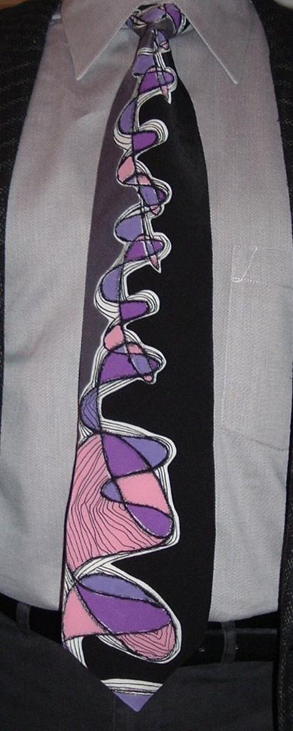
Who do you think of first when you think of a designer named Pierre? Pierre Cardin, right? Well this tie is by the other (and earlier) Pierre of French fashion, Pierre Balmain. Except this likely came out after Balmain's death in 1982, maybe under Oscar de la Renta's watch (1993-2002). It takes the free-spirited, hand-painted style of 1940s swing ties and updates the colors and dimensions (and production method, it is printed, not painted). A fun exercise with this tie is to figure out how many separate lines there are. It looks at first like a sine wave plotted concurrently with a trochoid (a prolate cycloid, to be precise), but a closer look will show that's not quite what's going on here. Incidentally, by coloring the central pattern in four colors (pink, purple, purpler, and white--I'm not including the black outlines) the designer has neatly demonstrated the four-color theorem. If you are mathematically inclined, you may want a genuine Lifesmith Fractie (extravagantly colored fractal neckties), which all have the generating equation printed on the back. The website says the ties are no longer available via retail, but it probably wouldn't hurt to ask. And secondhand ones turn up on ebay once in while.
Subscribe to:
Posts (Atom)