I am a great fan of the art of Shag (Josh Agle), and am the proud owner of a Mr. Lucky serigraph. However, I was disappointed with the neckties he designed for Acme Studios: they were novelty ties with his art on them, rather than artifacts from the retro world he depicts in his paintings. This polyester tie from Puritan is a good approximation of what I want from a Shag tie.
Wednesday, November 17, 2010
Shag redux
I am a great fan of the art of Shag (Josh Agle), and am the proud owner of a Mr. Lucky serigraph. However, I was disappointed with the neckties he designed for Acme Studios: they were novelty ties with his art on them, rather than artifacts from the retro world he depicts in his paintings. This polyester tie from Puritan is a good approximation of what I want from a Shag tie.


It really ties the room together
 Q: When is it OK to wear a lavender shirt with green pants?
A: When the dominant colors in your necktie are purple and green, as in this hand-marbled tie from Moth Marblers of Sausalito.
High-tech ornaments
 The baubles arranged on this tie from Goldlion, by some accounts Hong Kong's dominant tie maker, appear to be schematic diagrams of Death Stars in various stages of construction.
Nubby
 The huge bundles of thread used to make each stripe on this tie serve as a great visual example of how to weave patterns. Tie is branded Paul Fredrick, probably made by either Randa/Wemco or Superba as most ties in the U.S. are.
Monday, November 08, 2010
Entanglement
 Growing up, one of my favorite games was Psyche-Paths, the object of which was to create pathways of the same color using hexagonal tiles with a variety of pathway segments printed on them. Pscyhe-Paths lives on as Kadon Enterprises' Kaliko; the cardboard tiles are now wood, and the price has increased accordingly (about 100 times the original price). Now Gopherwood studios has created an online Flash game called Entanglement with many of the same characteristics (hexagonal tiles, path creation) but some key differences (a single pathway color, twice as many path segments per tile, one-tile-at-a-time gameplay). It produces paths very similar to the pattern on this Saks Fifth Avenue necktie, and it has replaced Drench as my favorite Flash game.
Correction: Entanglement does not use Flash, it's all HTML5. So it's my favorite HTML5 game, and Drench is still my favorite Flash game. Whew!
Homecoming
 For the day before Homecoming, the university community was encouraged to wear the school colors once again. I mixed it up this time: instead of wearing a blue shirt and yellow tie, I wore a yellow shirt and and blue tie (hand marbled, from Cosette Originals of Austin, Texas). (I am currently coveting Cosette's latest line of double-marbled ties.)
House brand
 House brands can be just as good as, or better than, name brands. I am consistently impressed with the quality of Safeway and Wegman's house-branded products. This house-branded tie from menswear discounter Kuppenheimer hits all my retro-modern pleasure receptors.
Wednesday, November 03, 2010
Happy Halloween!
 I know it's a week after Halloween, but I actually wore this tie two days before Halloween. (Not for me the instantaneous publishing capabilities of the internet age!) I am nearing the end of my stash of Chateau et Cie, Ltd., deadstock; this is a version of a previously-worn tie in a different colorway that's just perfect for Halloween. Very scary, boys and girls!
Natural durability
 Viyella, the wool/cotton blended fabric with the distinction of being "the first branded fabric in the world", is renowned for its exceptional durability. I'll bet the wool/silk blend of the plaid fabric in this Oscar de la Renta tie is even more durable, maybe even giving the long-lasting but completely unnatural Wemlon a run for its money.
UD Spirit
 Had to dress in the university colors today for the office "spirit" picture in the lead-up to homecoming. Shirt provided the blue, tie by Finnish designer Marja Kurki provided the "gold" (which in practice is actually canary). I still am not sure whether the repeating pattern is a garland of flowers or ribbons, but there are definitely little hearts in it. I was in the back row and only my head ended up in the picture, so I could have worn any school's colors, but here is the evidence that I did indeed engage in the spirit of the thing.
Libertarian
 The only label on this tie is the keeper, which merely identifies the retailer as Dunham's of Maine. It's a dead ringer for a Liberty of London, but there are no Liberty markings anywhere on the tie, not even in the tipping. I'm 90% sure it's Liberty fabric, but I will waffle and just call it Libertarian.
The Wemlon Tapestry
 I wish I knew what cultural developments led to the popularity of polyester brocade as a necktie fabric in the early 70s. But I don't; all I can do is marvel at the artefacts. This brocade of gold, copper, and ever-lovin' chartreuse is brought to you by Wembley, constructed of their proprietary space-age fiber, Wemlon, for eternal durability.
Sunday, October 24, 2010
Urban Tribal
 The graphic style of this Embassy Square tie is easily pegged as "tribal" (which I have qualified as "urban" due to the graffiti influence), but the subject matter is less easily identifiable. A centipede? Lightning? A river flowing through a mountain range? A mouth full of teeth? Or simply a designer's concept of a random "tribal" pattern?
Mimic
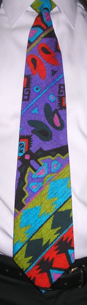 Here's a palette you don't see every day! The almost day-glo inks on this tie from Étienne Caron are printed to resemble a coarser, more textured fabric than the rayon they're printed on.
John Henry swings
 While a good proportion of swing-era neckties featured abstract Art Deco patterns, another major theme was stylized leaves. This modern-day John Henry tie fits that theme, and inasmuch as the red shapes vaguely resemble calla lilies it could plausibly be called an abstract floral as well.
Hallucinatory plaid
 J.T. Beckett occasionally has some pretty out-there designs among its more mainstream offerings. This pattern has some similarities to fused glass, or could be a mod geometric print viewed through a wet window, or a tile mosaic at the bottom of an ornamental pool. It's rather inspired, I think.
Satellite of Love
 I have a Jhane Barnes tie that looks like a satellite photo of Lower Delaware; this tie from Peacock looks like a photo of science-fictional land use, perhaps in a generation ship or other arcology.
Friday, October 22, 2010
Metatie
 If I had to choose an official tie of my tie blog, what could be more perfect than this one of colorful guys wearing wild ties? The tie is from Ralph Marlin's "RM Style" line, with art by Paulette Lust.
Wednesday, October 20, 2010
Tiffany Twisted
 I couldn't pass up an eBay lot of four colorful silk ties from Tiffany, even if I couldn't make out what the designs were from the photos in the auction listing. They turned out to be large-scale prints with an Egyptian theme; this one has an upside-down Egyptian dude with a couple plants, depicted in what I will call a "fanciful" color scheme.
Lands' End
 Before neckties became an obsession for me (roughly ten years ago, when I bought my first tie on eBay), I had a modest collection of ties that took me about a month to rotate through. This autumnal floral from Lands' End was one of them.
Wednesday, October 13, 2010
The Stuff of Nightmares
 What is the fearsome creature depicted on this wide vintage tie from Grenada? Based on the big ears, semi-upright stance, and long, wavy tail, I'm going to guess it's a jerboa. A demonic jerboa that will eat your face.
Out on the Tiles
 Pauline Trigere makes her fifth appearance on the blog with this black and white two-shape tile pattern. The larger of the two tiles (the one with the convex edge) looks almost like one of today's reductionist glyphs for a professional sports team; a frontal view of a wolf looking sideways, perhaps. Alternatively, it could be a vulture's beak, and the other tile the vulture's head overlapped by the next vulture's beak. Or they could just be random shapes. The pattern is woven, not printed, and the weaves of the fabric within the two shapes are different from each other.
Before there was Warcraft...
 There was JCPenney Towncraft, and it was made of polyester. There really are a lot of interesting shapes and textures going in here that don't show up very well in the small photo on the left; click through to the bigger picture to better appreciate its richness.
Neckties Are My Aeroplane
 Jimmy Pike moved away from traditional Aboriginal subject matter to make some colorful airplanes on this Desert Designs tie.
Again with the Modules
 I have more Modules ties than I thought I had; here is another one. This is probably the busiest design of any of them, featuring:
1. Horizontal bands of gray and light blue;
2. Scribbled white waves in the gray bands, horizontal and vertical in alternate bands;
3. Polka dots behind the scribbles: dark blue dots behind the vertical scribbles, black ones behind the horizontal ones; and
4. A highly-textured, almost ribbed, silk fabric.
I would have stuck with a single color for the polka dots.
Wednesday, October 06, 2010
More Modules
 Modules of Japan specialized in Art Deco Revival designs, but they also brought a flair to older patterns. Polka dots have been a design staple since the polka craze of the mid-19th century; Modules packed the dots a little closer than usual for a bolder look.
Dress Like An Egyptian
 On my birthday I wore this ancient-Egyptian-themed tie from The Museum Company, just like the ones worn by office workers in the time of the Pharaohs.
Monday, October 04, 2010
Rustic
 Bob Timberlake made a killing selling reproductions of his rustic kitsch realist paintings of subjects such as old barns, cabins, farmhouses, flowers, and woodland creatures. It is not surprising that he branched out into other forms: furniture, lighting, tableware, luggage, etc., and for a time, neckties. This Bob Timberlake tie looks like a modern abstract graphic at a distance, but come closer and you will see stitching represented, and the pattern reveals itself as an antique quilt. I'm not a big fan of rustic kitsch, but I do like the way this pattern can slip across centuries.
Third-Best Neo-Deco
 My third-favorite Art Deco Revival ties are those of Martin Wong's Screenplay line, designed by Robert Taliver. I see an oceanic theme here with seaweed and pearls, perfect for an Enchantment Under the Sea dance.
Tuesday, September 28, 2010
Taking SoLace
This hand-marbled silk tie is from  SoLace Studios of Elkton, Virginia. The pattern is a traditional nonpareil that has undergone an additional zigzag combing (I think) to create the large "cells".
 SoLace Studios of Elkton, Virginia. The pattern is a traditional nonpareil that has undergone an additional zigzag combing (I think) to create the large "cells".
Desert Designs, yet again
 You might conclude by the preponderance of Desert Designs ties on this blog that I really like Australian Aboriginal art, and you'd be right. This Desert Designs tie is by Doris Gingingara.
Sunday, September 26, 2010
Second-Best Neo-Deco
 While Modules of Japan made my favorite Art Deco revival ties, The Hollywood Collection from Ralph Lauren Polo ran a close second; here at last is an example of that line. The Hollywood Collection recreates a vintage detail that Modules does not: the tail of the tie flares out at the end to about double its narrowest width, just as in the swing ties of old.
Finest Italian Polyester
 Italian silk, mostly from the Lake Como region, has been so highly-regarded for so long that its cachet apparently transfers to lesser fabrics. The label on the tail end of this tie reads, "100% Polyester Imported Fabric from Italy". The pattern in the fabric is typically created by putting salt on painted silk (which makes the different color bands run together), so it's amusing (to me) to see such a pattern mechanically printed on polyester. From Scott's of Cinnaminson, New Jersey, presumably a defunct haberdasher or department store.
A Dress Tie
The label on this tie reads, " Ties by Jon, California". I call it a dress tie because I think the (unnamed synthetic) fabric is more suited for a woman's dress, in both scale of pattern and sheerness. This entry marks the debut of my new lavender shirt from Lands' End. It's my first lavender shirt ever, and it will enable me to wear several ties that I've never managed to match to another shirt. The shirt's "no-iron" pinpoint cotton fabric is quite sumptuous, but here is a helpful hint: there is no such thing as a dress shirt that doesn't need ironing. Don't believe the hype!
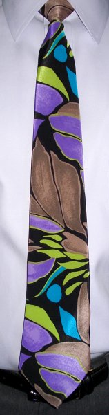 Ties by Jon, California". I call it a dress tie because I think the (unnamed synthetic) fabric is more suited for a woman's dress, in both scale of pattern and sheerness. This entry marks the debut of my new lavender shirt from Lands' End. It's my first lavender shirt ever, and it will enable me to wear several ties that I've never managed to match to another shirt. The shirt's "no-iron" pinpoint cotton fabric is quite sumptuous, but here is a helpful hint: there is no such thing as a dress shirt that doesn't need ironing. Don't believe the hype!
Friday, September 24, 2010
Eros 2
 Nearly three years ago I wore the second vintage tie from an eBay lot of three, and ended my blog post with, "There was a third one, too, and maybe I will remember which one it was." If you have been on tenterhooks since then, I have good news for you: your wait is over! Here it is! Like that second tie, it is a massive woolen creation from Eros. The fuzziness of the pattern is due to the fuzziness of the fabric; that is some nappy wool!
Stradivari 3
 This is the third appearance on the blog of a Stradivari by Park Lane necktie. Like my previous Stradivari tie, this one is made of a super-slick synthetic fabric that I'm guessing is nylon. It may even be indestructible; it certainly holds pigment well!
Thursday, September 16, 2010
Deadstock
 Can you recognize a Chateau et Cie Ltd. tie on sight yet? This is my third one in a month. They all came in the same eBay lot, which must have been deadstock from a menswear store. (One that must have closed in 1975.)
Megaflora
 The designers at Grenada found the largest-scale floral print that could fit on a tie without descending into abstraction, though to do it they had to push the boundaries of necktie width. (And they also did it about forty years ago.)
Thursday, September 09, 2010
Worlds In Collision
 Here is another vintage acetate tie of unknown provenance. (9/13/10: Oops, it's not unknown... it's another one from Chateau et Cie Ltd.) It brings to my mind Immanuel Velikovsky's bestselling book of pseudoscience, Worlds In Collision (and Jerry Harrison's song of the same name), or M.C. Escher's Three Spheres. They don't make 'em like this anymore! (But I wish they would.)
Freeforming
 Hand-marbling doesn't get any more freeform than this! There is actually a layer of more traditional marbling underneath the freeform layer, most visible in the tan blob on the left side. Or is the other layer on top? I can't see it through the white blobs. It's like a whole microcosm to get lost exploring. Hand-marbled tie by Cosette Originals of Austin, Texas.
The Minimal Gene
 Gene Meyer returns to the tie blog after a four-year absence. The pattern is minimal, but the colors are maximal.
Ball lightning?
 Pac-Man as Janus? Protons and neutrons? Another pitch-perfect deco pastiche from Modules of Japan. (And check out that funky jacquard weave!)
Friday, September 03, 2010
Van Sobers
 Highly-textured ties of brocaded polyester were quite popular in the 70s, but I have seen very few examples of them in silk. This tie from the mysterious Van Sobers fits the bill. It is made of raw silk, which looks as if it has a matte finish but reveals a brilliant luster from certain angles, adding yet another textural dimension to the weave.

Square Sigmoids
 Most ties by Ondée that I see are Vitaliano Pancaldi knockoffs, featuring ugly baroque/deco patterns in garish colors. (Who am I to call something ugly and garish, right? Go here to see what I mean.) But I adore this particular Ondée offering, with its squared-off, textured white esses on a background that manages to be both black and rainbow-colored at the same time. It's tikirific!
Monday, August 30, 2010
More Liberty
 Not only do I not know this the name of this Liberty pattern, I had to ask Mrs. V. what kind of flowers are depicted on it. She tells me they are bachelor's buttons, and that seems right to me.
Liberty of London: Ianthe
 Here is a splendid example of Art Nouveau design. According to HistoricStyle.com, the "Ianthe" pattern was "originally designed as a wallpaper border c.1902 by French designer R. Beauclair. Designed as a fabric in 1967 by Liberty of London." It is printed on Liberty's premium Tana Lawn cotton; "Tana" from Ethiopia's Lake Tana, source of irrigation for much of Ethiopia's cotton crops, and "Lawn" from Laon, France, long famous (since around 1400) for its fine linen and cotton fabrics. (I have posted a larger picture than usual, so you can really see the detail if you click through to the full-sized photo.)
Striped circles
 Concentric circles, overlapping, defined more by their interior patterns of multicolored stripes than by exterior borderlines? Yes, please! Tie by J. T. Beckett.
The past is another country
 There is no mistaking this acetate tie by Chateau et Cie Ltd. for contemporary. The pattern looks like something you would find on the cover of a novel about schizophrenia published in 1970. The scary thing is, I have the same tie in two more colorways (which are no more subtle than this one).
Time Passages
 The disjointed chevrons on this Schiaparelli tie remind me of the cover of Al Stewart's 1978 album Time Passages. As Storm Thorgerson explains in For the Love of Vinyl: The Album Art of Hipgnosis:
For Al's Time Passages we showed a radio being tuned on the shelf of a kitchen window but at the same time "tuning" the view of the landscape outside the window.
Subscribe to:
Posts (Atom)