website stats

Friday, September 30, 2005

Renaissance Man


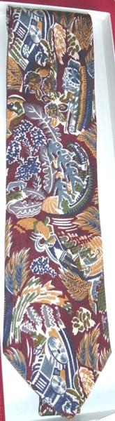
I wore this tie covered with brightly-dressed Renaissance dudes (and I do mean dudes, check out those get-ups!) in honor of the Maryland Renaissance Festival, which is going on right now in Crownsville, Maryland. There is decidedly more medievaling (ale-quaffing, turkey-leg-chewing, jousting, axe-throwing) than Renaissancing (lute- and harpsichord-playing, sonnet-writing, gourmet dining, science dabbling) at the Festival, but since all those pastimes were contemporaneous for a few hundred years while the Renaissance worked its way north from Italy, there's no problem. Some of the family's favorite acts at the fest are "Magic Kind of Guy" Mike Rose's Magic & Wit & Stuff; mime Mimi Flambe and her young assistant Max; Renaissance dance band Wolgemut; juggler/acrobat Michael Rosman, "The Squire of the Wire"; and several other acts listed on this page.

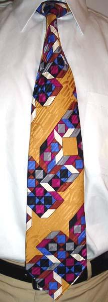
The tie is a vintage number from Giofer of Rome; I have another tie with the same pattern in an even more daring color scheme!

Thursday, September 29, 2005

Marblesque


Today marks a return to the hand marbled tie, the very category which kicked off this blog on August 11. This particular tie is by Marblesque of Australia, produced by Brian O'Malley and Bridget Gardiner for their Rooftop Clothing company. Marblesque ties are generally more adventurous than mainstream marbled ties, which would look perfectly at home in an "Old World" decor store (e.g. Kirkland's, The Bombay Company), while Marblesques could easily grace the shelves of stores like the late, lamented Psychedelic Store of San Francisco's Haight-Ashbury district, or one of its modern online imitators. I don't know if Rooftop Clothing is still a going concern; I do know that Marblesque ties turn up very infrequently in the US, but when they do I'll be snapping them up, thank you.

Rorschach tie


Sometimes a tie design is so stylized that it's difficult to tell exactly what it is. A complicating factor is the shape of a tie, which can present only a narrow slice of what might be a much larger picture. So what's on this tie? It looks to me like an Alpine village, with a ski lift going up the blue mountains covered with green trees. I would go so far as to say it's a single-chair ski lift, like the ones at Vermont's Mad River Glen, which were commemorated with a special beer from the Magic Hat Brewing Company (which has the best website of any brewery, if you ask me). You may see something entirely different, of course; if you do that means you're totally nuts, but that's cool. The tie, by the way, is by "Nouvelle Troupe". The fabric label says it's made in Italy of 100% silk, but I know better: there's no mistaking the coarse weave and slippery texture of pure polyester.

Tuesday, September 27, 2005

Tangrams

The pattern on this Bill Robinson tie (probably produced in the 1990s by Roffe Accessories) is created completely using the six tangram shapes (there are seven pieces to a tangram set, but one shape is used twice). I was surprised to learn (from the Wikipedia entry) that while tangrams are purported to be an ancient Chinese puzzle, no evidence has been found that they existed before 1800. The variety of shapes that can be made out of tangrams is truly amazing; there are fun online tangram puzzle applets here and here.

Once again the jacquard weave of the tie--in this case stripes and circles--presents a pleasing counterpoint to the angularity of the printed design.

Monday, September 26, 2005

Claude Montana

Claude Montana rose to fashion prominence in the 1970s by designing leather clothing with exaggerated masculine lines for women. He started his menswear line in 1979, and did an award-winning but financially disastrous two-year stint designing for Lanvin in the early 1990s. I am fascinated by overlapping geometric mosaics, and the freeform shapes on this tie make it one of the most fascinating of all. The angular jacquard weave (made possible by the Jacquard loom, arguably the first data processing machine) has strong mechanical overtones and presents an interesting contrast to the fluidity of the printed design. The bold color scheme is pure whimsy, but also confounding; it took me quite some time to figure out which pants and shirt to wear with it. After several false starts, I ended up matching (or approximating) the reds with the shirt and the blues (or near-blues, they're more silver, really) with the pants. What an effort--I'll go with something easier tomorrow.

Friday, September 23, 2005

Fish Week Day 4: Mulloways


Unfortunately I got sick and had to stay home from work yesterday, so I didn't get to wear a tie. Therefore Fish Week only has four entries. :-(

Here is another Desert Designs tie by the late Australian Aboriginal artist Doris Gingingara. With the aid of a handy fish identification chart, I have determined that the fish depicted here are mulloways (Argyrosomus japonicus or hololepidotus), which can grow to over five feet long and 120+ pounds. The mulloway's nickname of "jewfish" or "jewie" turns out not to originate in an ethnic slur, but is a shortening of "jewel fish", a generic term for fish with large "ear bones" (otoliths) which are sometimes made into jewelry. There is a picture of an otolith near the bottom of this page. (These days otoliths are marked and reinserted for tracking purposes.) For culinary purposes (fish and chips) mulloways are sometimes known as "butterfish." They are not as fantastically patterned as depicted here, but it's not all artist's fancy: they do have a row of iridescent spots along their lateral line.

Wednesday, September 21, 2005

Fish Week Day 3: Andrew's Ties


This flamboyantly-colored tie, featuring yet another species of angelfish, is from Andrew's Ties of Milano, the fashion capital of Italy (not to be confused with Milan, which is the English name for the same city). Founded in 1991 (as part of parent company Zadi Srl), the company manufactures its own ties and sells them through over 70 retail franchises worldwide, including two in the US (New York and Philadelphia) and one in London. There is also a US-based online store. (Each retail location is supposed to have over 6,000 different designs, but there are just a few conservative designs to choose from on the website.)

I could not find a blue shirt of the right shade to give a proper underwater background to this tie, so instead I went all-out with this genuine London rainbow shirt from Charles Tyrwhitt. The cashier at the grocery store asked me if this was a costume for the current theater production, but most people who know me are used to my extravagances by now, and that they are "for real."

Tuesday, September 20, 2005

Fish Week Day 2: Tina Bromberg

This tie is from the Tina Bromberg Collection from Bert Pulitzer's XMI Neckwear. In addition to textiles, Tina also paints (canvases and wooden bowls) and designs rugs, all in vibrant colors and all fabulous.

Angelfish (the Pterrophylum genus of the Cichlidae family of fish; the yellow ones here) are possibly one of the most painted & drawn genera of fish, due to their extravagant and distinctive shape and their bold, simple markings. The other fish are generic black and red fish, for which I believe the scientific terms are Piscis nigrum and Piscis rufus, respectively.

Note how the background color changes from green to red near the top of the blade, so that the knot is a different color from the main part of the tie. It's a nice effect, and is the entire raison d'etre of The Fortier Tie Company. Robert Fortier has solved the striped-tie-bi-directionality problem: the mechanics of tie knotting mean that the stripes on a tied tie go in different directions on the blade and knot. (Hmm... Is that a problem?) But with a striped Fortier Tie, they will go in the same direction!

Fish Week! Day 1: Grace Newburger

Sometimes I accumulate several ties of a particular category, but I never get around to wearing them because I can't decide which one to wear first. So I'll have a theme week and wear all of them (or five, at least). So this week is Fish Week! To kick off Fish Week I wore a tie entitled "Cool Creek," based on a watercolor painting by New Orleans artist Grace Newburger. Grace has created many neckties based on her paintings, a large sampling of which can be seen here. The ties fall into four general thematic categories: nature, New Orleans life, mythology, and homages to other artists (I had a great Klimt-inspired tie called "Cod's Eye"). Look for her initials sprinkled throughout the tie.

According to Grace's website, her studio was struck by lightning and burned down in August 2003. I can only hope she did not suffer another great loss during the Hurricane Katrina flooding. I've sent an email to the contact address listed on the site, but have not heard back. I'll give an update here if I hear anything.

Friday, September 16, 2005

Mondrian remixed


Piet Mondrian (1872-1944) is best known for his paintings of right-angled geometric shapes in primary colors (such as 1921's Composition with Red, Yellow, and Blue, and 1943's Broadway Boogie-Woogie), a style he described as "neoplasticism." I'm guessing that the unknown designer of this tie (all the labels are gone) may have used Mondrian as a starting point and varied the angles a little bit to come up with this fabulous pattern.

Mondrian didn't hit on his primary colors pallette until around 1920; in the decade before that he painted several abstract pieces in more earthy tones, such as Composition with Gray and Light Brown (1918) and Composition with Color Areas. This period of Mondrian's art inspired the "Mondrian" wedding band from Wedding Ring Originals of New York, which my wife and I both proudly wear.

Mondrian is also a strong influence (apparently) on The White Stripes, as all of their album art is in strong primary colors, and they even named one of their albums De Stijl, after the art journal founded by Mondrian and Theo van Doesburg to promote the theories of neoplasticism.

Thursday, September 15, 2005

Safari!


The vaguely African-looking patterns on this tie make it perfect to wear on a safari. Who wears a tie on a safari, you ask? How about people who shop at (formerly) exotic-travel-themed Banana Republic? They sell ties, after all. Or anyone who ever went on a safari in a luxurious, Naugahyde-covered Mohs Safarikar!

This tie is by "Company." Could there possibly be a more search-engine-unfriendly company name? My sources say no.

The Other Pierre


Who do you think of first when you think of a designer named Pierre? Pierre Cardin, right? Well this tie is by the other (and earlier) Pierre of French fashion, Pierre Balmain. Except this likely came out after Balmain's death in 1982, maybe under Oscar de la Renta's watch (1993-2002). It takes the free-spirited, hand-painted style of 1940s swing ties and updates the colors and dimensions (and production method, it is printed, not painted). A fun exercise with this tie is to figure out how many separate lines there are. It looks at first like a sine wave plotted concurrently with a trochoid (a prolate cycloid, to be precise), but a closer look will show that's not quite what's going on here. Incidentally, by coloring the central pattern in four colors (pink, purple, purpler, and white--I'm not including the black outlines) the designer has neatly demonstrated the four-color theorem. If you are mathematically inclined, you may want a genuine Lifesmith Fractie (extravagantly colored fractal neckties), which all have the generating equation printed on the back. The website says the ties are no longer available via retail, but it probably wouldn't hurt to ask. And secondhand ones turn up on ebay once in while.

Tuesday, September 13, 2005

Encore


Writing about that Gene Meyer tie last night was so exciting I decided to wear another one today. The pattern is actually some sort of rubbery iron-on decal, which I've never seen anywhere else. I don't know if this is an actual production tie or a prototype or sample. Whatever the case, it's certainly original! The design reminds me of a TV test pattern; the gray version of this tie looks even moreso, as the stripe colors are black, magenta, blue, and white. I've been favoring geometric ties lately, I'd better find something wild and swirly for tomorrow.

In these modern times, if you have a computer and a color ink-jet printer, you can make an iron-on transfer of anything you want, thanks to special transfer paper from HP, Epson, etc. (Just remember to reverse the image before printing!) You can even print directly on silk or cotton with printer-sized, paper-backed fabrics. (Don't reverse those images!) I am waiting for a "thought engine," so I can think of a tie design and the engine will read my thoughts and produce that very tie. I assume top scientists are working on it.

Monday, September 12, 2005

Shameless plug: Gene Meyer


I didn't go to work today, so I didn't wear a tie. Therefore today's entry is one I wore BTB (Before Tie Blog). Gene Meyer is arguably the most iconic (and collectible) tie designer of the last twenty years. His big, simple geometric patterns in high-contrast colors are unmistakeable (as is his signature polka-dot tipping), and are a favorite of artistic types; two sightings that spring to mind are Ryan Stiles on Whose Line Is It Anyway? (American version), and Hirshorn Museum and Sculpture Garden Director Ned Rifkin in a feature story about him in the Washington Post Magazine. Gene Meyer began his fashion career designing women's clothes for Geoffrey Beene before starting his own menswear company. I've never owned any Gene Meyer clothing other than ties, but from the pictures I've seen they are pretty flashy and probably too high-fashion for my civil service job. He has also designed a line of accessories for Acme Studios and an amazing line of rugs as well. Maybe someday I will come across one of those in a thrift store...

So what's the "shameless plug?" I am auctioning this tie on eBay right now (September 11-18). This tie is too valuable to just hang in my closet; I need the cash to fund more tie purchases!

Saturday, September 10, 2005

This Land Is My Land


My Steven Land tie, that is. Most Steven Land ties are too gaudy for me, but this one is my kind of gaudy. I like the subtle modulation in the wavy stripe pattern: a pair of 7-stripe blocks with brown on the outside alternating with a pair of 5-stripe blocks with white on the outside. This zebra-like pattern might provide good camouflage on the savannah, but in an office environment it does quite the opposite. Speaking of zebras, that reminds me of an anecdote: I once saw a tigerskin-patterned tie on ebay, which the seller had listed as "golden zebra." D'oh!

Thursday, September 08, 2005

Verner Panton: Geometri 1


Now it's time to mention Verner Panton (1926-1998), Danish design master and creator of the definitive textile pattern of the Mod Era: Geometri 1. Created in 1960, this was Panton's first textile design! Fabrics in this pattern were produced and marketed by Unika Vaev; one such product was sheer curtains, for which the pattern was also known as "Bobinet." I grew up in a house with these sheers in the dining room; seeing this pattern every day for ab out fifteen years, I never grew tired of it, rather I kept marvelling at the pleasant aesthetic effect of its geometric precision. There's a picture of the sheers on the Verner Panton website, but it's a Flash site so I can't link directly to it. To see the curtains, start the Flash app; click the "Fabric" icon (bottom row, second from the right), then click the Geometri 1 thumbnail, then (finally) click the "see variations" button. Look at all of his other wonderful designs while you're there.

I found the tie at K & G Fashion Superstore, of all places. It's by Renzo, the pattern is woven (not printed), and it's incredibly well made for a discount store tie. I would have preferred a perpendicular orientation rather than diagonal, but that's just a quibble. I am thrilled to have a tie related to such an influential visual presence in my life. Another keeper!

Levitated.net is full of nifty geometric Flash animations, including one that rearranges the Geometri design elements at the click of a mouse, in seemingly endless variations. Acme Studios makes a whole line of Geometri accessories, but they are easier to view on the Unica Home website, along with a whole bunch of Panton-designed home furnishings. And finally, Geometri textiles are back in production, from US firm Maharam!

Wednesday, September 07, 2005

Crayon vomit


That's what my wife calls these ties, and I've got to admit she's right on the money. It's as if someone ate a whole 64-color pack of crayons and then, well, un-ate them onto a tie before they had a chance to mix together. But brilliant! This is printed and not hand marbled, but there must have been an original hand-marbled piece from which to create the print. And who knows (do you? If so, please tell me!), maybe that original really was made from melted crayons. I especially like the way the colors remain discrete and don't all run together; there are so many aspects to the pattern, it is fertile ground for extended visual exploration. I think I'll look at it some more right now.

This tie has a label on the back proclaiming, "Specially Hand Made By Pat." Pat must have bought the fabric somewhere; can you picture a whole roll of this stuff?! It seems there was once an era when women made ties for their husbands, ties which were worn lovingly throughout the years, ultimately to outlive their owners and be passed along through an estate sale and eventually end up on ebay to be bought by some tie nut. Thank you, Pat.

Tuesday, September 06, 2005

The Pink Pantser


According to Lands' End, these pants are "marine red," not pink. What do you think? Anyway, they made 'em, somebody's gotta wear 'em, so I have taken that duty upon myself. Here they are with a House of Fraser iridescent shirt and a vintage polyester tie (dig those circles!) of unknown provenance, as all the labels have fallen off. Can't write much tonight, must get back to the PS2 to play more Katamari Damacy, the only game the whole family enjoys.

Monday, September 05, 2005

Labor Day Tie: Collective Farming


Boxelder produced a series of four ties based on Soviet Art; this one is entitled "Collective Farming". And what better way to celebrate Labor Day than with a tie depicting workers who own the means of production laboring together for the common good? The great tragedy of Soviet Communism is that far from being the worker's paradise it was sold as, it was merely another corrupt dictatorship dressed up in labor platitudes, and as such it has tainted Americans' perceptions of socialism and labor movements to this day.

I live in Greenbelt, Maryland, where Labor Day is a Big Deal. Greenbelt Homes, Inc. is one of the largest and oldest cooperative housing developments in the country; our local grocery store and cafe are co-ops as well, with ownership spread throughout the community. The original Elementary School (now the Community Center) is even adorned with socialist-themed bas-reliefs. The Labor Day Festival goes from Friday night through Monday; this year's is the 51st Annual Festival, and features musical entertainment from Herman's Hermits (the one with Peter Noone, not the other one) and Peter Tork's (of the Monkees) Shoe Suede Blues, among others. Long live the weekend, brought to you by the labor movement!

Friday, September 02, 2005

Wassily Kandinsky


Russian-born artist Wassily Kandinsky is credited with the first completely abstract painting, in 1910; he co-founded the avant-garde art collective "The Blue Rider" in Munich in 1911; he was a faculty member of the incredibly influential Bauhaus School from 1922 until its dissolution by the Nazis in 1933; and after that settled in France (Neuilly, near Paris), where among the many visitors to his studio was Joan Miro. Kandinsky and Miro created a visual vocabulary of abstraction that continues unabated today. While Miro's abstract figures look organic, i.e. like living beings, Kandinsky, after working through a progression of styles, ended up with figures that look mechanical, or at least machine-made. "New wave" design of the 1980s owes more than a little debt to Kandinsky's explorations of geometric forms. This tie from the Gallery Collection by Christina Desiree is entitled "Kandinsky -- Black Welft". I can't find a painting with that title; this could be a cross between "Black and Violet" and any one of Kandinsky's later "Compositions" (or "Constructions"). Kandinsky was especially smitten with the circle, of which he wrote:

“The circle is the synthesis of the greatest oppositions. It combines the concentric and the eccentric in a single form and in equilibrium. Of the three primary forms, it points most clearly to the fourth dimension.”

Perhaps he is right; many of my favorite tie designs are composed solely of circles, and will be posted here in weeks to come.

About Christina Desiree I know nothing except that the Gallery Collection of neckties is uniformly excellent; they are a little more lively than the ties made by the major force in art reproduction ties, Boxelder of Milwaukee, but are more difficult to find.

Thursday, September 01, 2005

Guerilla polka dots

The dots are there, not organized like a regular army but spread out and lurking in the camouflage of some crosshatched blood-red flora, waiting for the right moment to burst forth in a visual attack of full polka-dot glory before slipping back into hiding. Except it's not quite blood red, it's more the color of Heinz ketchup. And it doesn't quite match the red stripes in the shirt (another $5 clearance shirt! This is is Merona from Target), which are a little more blue. The difference isn't really noticeable from more than ten feet away, so I deem this combination a partial success. To those co-workers who came close enough today to notice this unfortunate mismatch: Well, EXCUUUUUUUUSE ME!

The tie, by the way, is by Saint Michel. Sometimes it's hard to find a tie to match a multicolored shirt (and, as I've mentioned before, a solid tie simply will not do), so a two-colored tie is a good bet, especially if it has an interesting pattern. And this pattern is interesting, if nothing else.