Here is an Adolfo-branded tie from the tail end of the Great Woven-Patterned Tie Explosion of the early aughties. The use of both matte and lustrous threads creates a nice 3-D effect that unfortunately does not show up in a still photo.
Thursday, August 12, 2010
Sea of Holes
Here is an Adolfo-branded tie from the tail end of the Great Woven-Patterned Tie Explosion of the early aughties. The use of both matte and lustrous threads creates a nice 3-D effect that unfortunately does not show up in a still photo.


Electric Blue
 I would describe this tie as "a cartoon of microscopic life in a dazzling blue Petri dish, in the style of Miro." Maker unknown; some eBay sellers would list the maker as "Reine Seide", as it says on the label, but I happen to know that's German for "pure silk".
Pucci?
 No, not a Pucci, just a Pucci-inspired John Henry tie. (Though I did have a tie made of the same fabric with a Saks Fifth Avenue label, and Emilio Pucci did design some things for Saks in the 70s...)
Monday, August 09, 2010
American Dad
 Red, white, and blue: it isn't just for the Fourth of July any more! This tie is by Pauline Trigere, and like my last Pauline Trigere tie it is made of superfine cotton fabric imported from Switzerland.
Friday, August 06, 2010

Thursday, July 29, 2010
Transatlantic pampering
 By a happy coincidence, the colors in this psychedelic print tie by Pamper Him of Chicago match up very nicely with the colors in my multi-striped shirt from Moss in the UK. Whether it is tasteful to wear such a bold freeform pattern over a striped foundation is quite another matter, and one that does not overly concern me (obviously).
Return of the Green Shirt
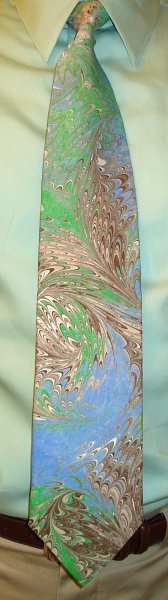 I have been without a green dress shirt for quite some time now, which left a whole bunch of ties in limbo as they really demanded to be worn with a green shirt. Happily, I found a suitable light green shirt at Macy's over the weekend, so I was finally able to wear this hand-marbled beauty from Kriska. It's no Gail Mackenzie (who, by the way, visited the blog and left a nice comment today!), but they can't all be.
Bacteria II
 Last month I wore a tie that looked like a colony of bacteria growing on a flat surface; this tie from Je Suis looks like particolored bacteria in a fluid. Or maybe they are small fish, which are more pleasant to contemplate. Whatever they are, it's pretty clear that they are swimming.
Sunday, July 25, 2010
Paisley Pond
 Here is another paisley tie with an aquatic vibe: the paisleys on this Gabrielle Molteni tie resemble blue koi, swimming lazily beneath a pond surface covered with leaves and myriad reflections of colorful lights.
Big Top Bee Wee
 I could not shake the feeling all day that I was wearing a clown's tie, and that maybe everyone thought I had stolen it from a clown. No, I got it from eBay fair and square, and I believe in its heyday it was actually considered fashionable. The giant label on the back informs me it was made by "Mister D", which may very well be an alias for the devil.
(Probably the strangest nickname I ever had was "Bee Wee", which I more or less brought on myself, but at least its usage never spread beyond two or three people.)
Liberty for Target
 The Liberty of London for Target line was likely the best-looking set of goods ever to grace that chain. Of particular interest to me, of course, were the eight necktie patterns: imagine, real silk Liberty florals for just $17.99! They're a bit on the narrow side, but I suppose to achieve that price point you have to be a little stingy on the fabric, and they still look great. I thought I had missed them all, but I did find one on clearance ($4.49!) in the Meadow pattern. Here it is.
Saturday, July 17, 2010
Butterfly pixels
 This Jhane Barnes tie has its colorful silk threads woven into tiny squares, as if to pixelize the design. The high sheen and rich hues make the squares look almost like the colorful scales on a butterfly's wing.
Solo
 Indonesian batik is the most complex in the world, and has been recognized by UNESCO as an Indonesian cultural treasure. The longtime center of the craft is Solo (a.k.a. Surakarta), on the island of Java, whence comes this cotton batik tie from Batik Semar. There is even a Batik Carnival in Solo every June; that's a fashion show I wouldn't mind attending.
Upstream migration
 After spending their adult years in the Atlantic Ocean, mature paisleys enter the "grilse" phase of their lifecycle. They return to Scotland via the River Clyde, then swim up the White Cart Water--leaping some significant waterfalls--to the stream beds of their birth in Paisley to spawn. Pictured here is an artist's conception (uncredited) of that upstream migration.
Wednesday, July 14, 2010

Incendiary Modules
 Most of the ties by Modules of Japan were in a neo-deco style, but this one has more in common with comic books. Is that a heart (or a beet) holding a gun? One of those shapes looks a lot like a hand grenade. Then there are other shapes that look like explosions. All in all it's a very action-y tie, innit?
Not the Worst-Dressed
 Mr. Blackwell's annual "Worst Dressed" list was quite entertaining to anyone who wasn't on the list. I believe the best defense against appearing on the list is to wear something with Mr. Blackwell's label on it, such as this polyester tie. (And yes, I know it's a moot point now.)
The Three-Color Theorem
 "In mathematics, the four color theorem, or the four color map theorem states that, given any separation of a plane into contiguous regions, producing a figure called a map, no more than four colors are required to color the regions of the map so that no two adjacent regions have the same color. Two regions are called adjacent only if they share a border segment, not just a point." (Wikipedia) However, if all the shapes are rectangles, and each rectangle is either wholly contained within another rectangle or shares all of its vertices with adjacent rectangles, then three colors are enough, as demonstrated in this woven-patterned tie from Bachrach.
Sunday, July 04, 2010
DIY
 When faced with the amazing range of fabric patterns in neckties over the decades, it boggles the mind to think that there are even more patterns that never got made into neckties. Thank goodness home crafters created neckties themselves out of some very alluring fabrics. While many homemade ties have a keeper label that identifies the maker by name, this particular specimen contains no information at all about the maker or the tie or the fabric. But what a print!
Windsor, April 2003
 Here are two more bits of memorabilia from our trip to England in 2003 for Mrs. Veneer's sister's wedding. It was a real peacock year for men's fashions, and I had to get in on it, so I picked up this multi-striped shirt at the Moss shop in Windsor to wear to the wedding with a Pucci tie I had brought with me. But on the off chance that the shirt wouldn't go with the tie, I bought this Dehavilland tie with roughly matching colors. The Pucci tie was a match after all, so this one didn't get worn until we were back in the states, where for once in my life I was the height of British fashion. (And I do mean once: I was very strict about my wear-once-only rule back then, and British men's fashion has moved on since then. And not for the better, in my opinion.)
Saturday, July 03, 2010
Dream City
 In the early 90s it seemed that the ersatz Liberty floral ties from Max Raab's Tango company outnumbered real Liberties, which I can only attribute to lower pricing. Unbeknownst to me at the time, the Tango line also included a "Famous Artists Series," of which #3 was based on Paul Klee's 1921 painting Dream City. Voilà! I also did not know that Raab was the founder of J.G. Hook, and had also been a movie producer, with A Clockwork Orange among his credits. Raab died in 2008, aged 81.
Roar
 Italian designer Regina Schrecker designs theatrical costumes as well as fashion accessories for women. At some point she must have brought out a line of neckties for men; this is one of them. I'll date it at 1978-1980, to give the animal print and narrow width 2-4 years to migrate from punk fashion to mainstream(ish) menswear. They were still migrating well into the 80s, but I'm guessing Schrecker was on the leading edge, on the basis of her theatre connection and her cool name.
Vasarely redux
 From decades past comes another tie inspired by Victor Vasarely's Vega series of graphic constructions (which are not paintings). The manufacturer is indicated in the tipping fabric as Reis of New Haven; the keeper label names Pomeroy's as the retailer. Reis of New Haven was a necktie specialist, founded by Ronald Reis in 1950. He sold the business in 1987, years after his son David left the family business to become a real estate developer. Pomeroy's was a Pennsylvania department store chain that was founded in 1876 and taken over by The Bon-Ton in 1990. But the tie lives on!
Airport Tie
 This is the tie that I call my Airport Tie, because I got it at The Tie Rack at Heathrow on our way out of England in April, 2003. There is a whole rainbow in this tie! Shirts and ties in brilliant blues, purples, and pinks were all the rage at the time, a rage which has since subsided in favor of drabness. Pffft.
Disco Constructivist Houndstooth
 The 70s was a great decade for updating historic styles into something cheap and glossy (could that be the etymology of "cheesy"?); for example, the appropriation of Art Deco for the Studio 54 logo. Thus I like to refer to this navy and gold Pierre Cardin tie as "Disco Constructivist Houndstooth." Mrs. Veneer, on the other hand, thinks it is more evocative of a 1970s airport terminal. What does it remind you of?
Saturday, June 19, 2010
My New Filing Technique Is Unstoppable
 I bought this Keio Select Cravat (of Japan) because I liked the boldness of its modified stripe pattern; it took my wife to point out to me that the irregularities in the stripes resemble the tabs and cuts of office file folders. Hence the reference to the office satire clipart comic by David Rees in the header. (Rees is better known for his political satire clipart comic, Get Your War On. I don't mean to toot my own horn, but I made a clipart comic way back in 1991, in Harvard freaking Graphics. For DOS!)
Retro Modern
 Today's tie is a big retro print from Exotic Silks, made into a perfectly-shaped tie by Pamper Him of Chicago. Similar patterns can be found in Jenn Ski's Pod Series of giclee prints.
Reverse Botanical Silhouette
 Silhouettes are hot in the design world, in animation (both short and longer form), video games, and book covers. Reverse silhouettes (i.e. white instead of black) are also hot, in animation, book covers, and the blogosphere. This tie from Carter & Holmes anticipated all that (maybe).
Blossoming
 Here is another Paul Klee tie from The Gallery Collection by Christina Desiree; this one is based on the painting Blossoming. I think this makes a case for Klee being the father of 8-bit art.
Same tie, different color
 Here is another Liberty of London cotton summer tie, in the same pattern as my previous one, but in brown and peach instead of pink and aqua. Are there any paisley prints as delightful as Liberty's? I don't believe so.
Hubert redux
 Often the difference between conservative and bold, sartorially speaking, is just a matter of scale. If the pattern on this tie from Hubert of Milano were much smaller, it would look pretty ordinary (see my Hickey Freeman tie), but blown up to this size it's a Retro piece. That said, its retro qualities are chameleonic: Modern Art 50s? Pop Art 60s? Tasteless 70s?
Tuesday, June 08, 2010
Bacteria
 The label on this tie reads "Simon," or maybe J Simon, or JG Simon, or even GJ Simon. At first glance the pattern looks like bubbles, but I think it looks even more like a bacteria colony. Ah, the beauty of nature!
Blood?
 This tie from Asutra displays the "stone marble" pattern of marbled silk, in which the dyes are dripped onto the substrate and not manipulated with a comb. Blood red is an interesting color choice for a drip pattern!
Republic of China
 The label on this tie reads, "With the compliments of Tourism Bureau, Ministry of Transportation and Communications, Republic of China." It was made in... Italy. The design does not strike me as very Chinese, but I guess that was not the point for this gift item. I wonder what audience it was meant for.
Go Blue Hens!
 For working the University of Delaware Doctoral Hooding Ceremony and Convocation on May 28, I took a cue from the university president's outfit in the new employee welcoming video and wore a shirt and tie in the university colors (roughly). The rather journeyman tie (the only yellow one I could find, believe it or not) by Giorgio Redaelli has a woodland-themed figural pattern with ducks, deer, rabbits, foxes, and flowers. Hermes and Ferragamo do the best figural ties, combining witty designs with precision printing. And luxury prices.
Gone Troppo
 May 27: the official start of summer is still over three weeks away but we already have tropical heat and humidity. Now that's the good old mid-Atlantic climate I grew up with! What better way to celebrate the return of tropical weather than with a vintage Kanaka Tie from Hawaii* of wonderful lightweight crinkly cotton barkcloth?
* Supposedly... ;-)
Golden Peacock
 I rarely see a hand-marbled tie under a fashion brand, but this modified peacock pattern bears a x'Andrini label and tipping. I like the way the tiny splashes of purple, pink, and white spice up the earthtones palette.
Back in Liberty
 Nothing suits a sunny day like a pink shirt and a Liberty of London cotton paisley necktie. Target scored a real coup this spring with a line of Liberty products; I was too slow to get any of the neckties (I really wanted the one with cars on it!), but I did pick up a couple superb floral print shirts.
Hickey Freeman
 There is a very little bit of Frank Lloyd Wright in the vaguely deco-ish pattern on this tie from Rochester clothing manufacturer Hickey Freeman, though it is more cluttered than anything Wright designed.
Monday, May 31, 2010
Double Marble
 This hand-marbled tie from Cosette Originals of Austin, Texas, has two layers of marbling: a freeform layer in predominantly golds and greens underneath, and a darker layer of the "feather" pattern on top, applied sparsely to let the base layer show through.
Paul Klee - Legend of the Nile
 Egyptian motifs can be found throughout the works of Paul Klee, and Egypt is the primary subject of his 1937 pastel Legend of the Nile. Klee used shades of blue for the background of his piece; Christina Desiree has transposed the blues into a yellow and brown colorway for this tie from the Gallery Collection.
Sunday, May 30, 2010
Jacks Are Better
 Guess what? I'll be reviving the blog, now that I work in a more necktie-ish establishment than I did for the last 3+ years. First I have a little catching up to do; I wore this wide, vintage polyester number last November. Inside each little box is a jack (as in playing cards); see below for an enlargement of the detail. Why jacks? Beats me, but they remind of me of the cut-price cigarettes formerly sold at Sheetz with the slogan "Jacks Are Better" (taken from the oft-invoked poker rule "jacks or better [to open]"). What Jacks were better than was never specified, which was a smart move, because they were certainly not better than any name-brand cigarette, and it's doubtful they were better than any other budget cigarette either. Plus they burned down really fast, or so I am told. ;-)
Sheetz is also home to the elegantly-named Shmuffin, though they have retired their most glorious hot food name ever: Hamzel & Pretzel (the only name more ridiculous than Denny's Moons Over My Hammy). It's now just a Ham Pretzel Melt. Why they got rid of that and kept Shmagelz and Shmiscuits (Sheetz's brands of magels and miscuits, apparently) is one of a million marketing decisions that don't seem to make any sense.

Sunday, January 17, 2010
The Necktie by Jean-François Lévesque
I have no new necktie-wearings of my own to report, but my wife steered me to this wonderful short film presented by the National Film Board of Canada, in which neckties play a central role. The video player is too wide to embed in this blog column (which was designed to be narrow, for posting pictures of neckties), but please take twelve minutes to go watch it on the NFB website.
Tuesday, October 06, 2009
Wallflower
 About half of my work day was spent in meetings, so I wore something nondescript that would help me fade into the background. Today's tie is made of 100% rayon and bears the label of Anthony Sicari, whose website is rudimentary and quite possibly abandoned. This is the scale of print that needs a larger item for fuller display; a sundress would be the ideal vehicle for it, but then I couldn't wear it. At least not to work.
Thursday, September 24, 2009
Bubbles!
 I took advantage of today's perfect tie-wearing weather to flaunt my new tie by New York boutique tiemakers Sovereign Beck. This is the Aqua Cluster design, and like many of my favorite tie patterns it is poised on the dividing line between order and chaos. Like life itself!
Tuesday, September 15, 2009
Last of the summer florals
 Technically it's still summer for another week, and it was a beautiful day sunny today, so I donned an abstract floral tie by Pauline Trigere, of cotton fabric imported from Switzerland. The colors say Liberty, the degree of abstraction says Europe, and the width says 1975. Two ties within a week, I'm on a roll!
Thursday, September 10, 2009
A bug? Where?
 Today's 56-to-72-degree temperature range was just perfect for wearing a tie, so I reached into my tie closet and pulled out this Desert Designs tie by Doris Gingingara featuring flowers and insects of the Outback. I would like our Upstate bugs much better if they were this happy-looking, and didn't try to suck my blood.
Friday, June 12, 2009
Up with ties!
In addition to being an all-around wonderful movie, Up contains one of the best cinematic necktie sequences ever:
What beautiful ties! (Most of them.) Carl's eventual settling for a plain black bow tie is obviously a symbol of spiritual defeat, a foreshadowing of the sadness to come. Is that a spoiler?
What beautiful ties! (Most of them.) Carl's eventual settling for a plain black bow tie is obviously a symbol of spiritual defeat, a foreshadowing of the sadness to come. Is that a spoiler?
Wednesday, May 13, 2009
Wrigley's Fruit Stripe Gum
 That's what Mrs. V. said when she saw this tie, and that says it all, I think. It's from the Upstarts by Fox Hill line of bygone days and is made of an unnamed silky fabric with a wonderful grain to it. It was the perfect tie for one of those glorious, bright, breezy, high-atmospheric-pressure days (if I say so myself).
Thursday, May 07, 2009
Balenciaga
 This vintage tie from Balenciaga looks like a jigsaw puzzle of a contour map. If you look closely enough you can see the word "Balenciaga" tastefully hidden in the red section. Not quite as tasteful as not being there at all, but at least the design is left to speak for itself.
Wednesday, April 01, 2009
MCM (and I don't mean 1900)
 I had so much fun wearing a tie last week, I decided to do it again this week. What this narrow Pierre Cardin tie lacks in color it makes up for in discipline: its grid of eccentrically-nested hexagons in dark gray on light gray (with some blue ones thrown in for an austere kind of flair) is decidedly Mid-Century Modern. The pattern would be perfect for a brushed-aluminum screen between my dining room and sunken living room. If Dwell magazine ever does a feature on my house, I will have to wear this tie for the photo shoot. And maybe clean up a little.
Subscribe to:
Posts (Atom)